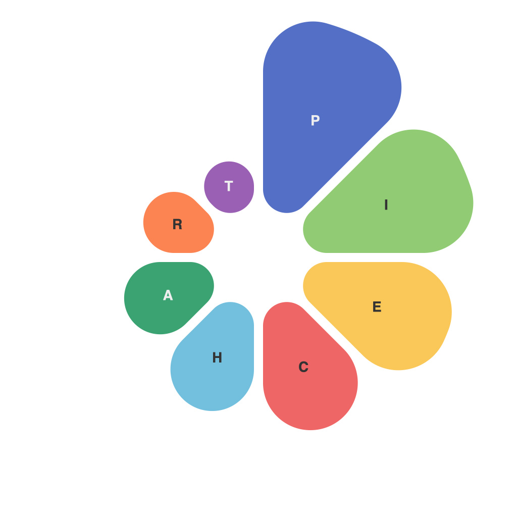
Data visualization is the key to understanding and communicating complex information in a way that’s accessible and actionable. Among the most popular tools for visualizing data is the pie chart. This article delves into the intricacies of pie charts, exploring their creation, potential pitfalls, and the nuances that can make or break their effectiveness.
Pie charts, at their core, are circular graphs where different sections of the pie represent relative proportions of an entire set of data. While they offer a straightforward representation of data distribution, pie charts aren’t without their challenges. Understanding how to create an effective pie chart and being familiar with the common pitfalls can elevate the art of presenting data at a glance.
### Crafting a Pie Chart: Composition and Design
The foundation of a well-crafted pie chart lies in its composition. Here are some key elements to consider:
#### 1. Data Understanding
Ensure you have a clear understanding of your data set. Pie charts are best used to compare proportions among whole groups. If the number of categories exceeds about five, consider using a different type of chart, such as a bar or a doughnut chart.
#### 2. Label Placement
Avoid overloading the chart with text. Choose a font size and style that balances readability with the size of the pie chart. Label each segment clearly, and opt for a simple and straightforward design that doesn’t distract from the data itself.
#### 3. Color Schemes
Use colors that stand out and complement each other, ensuring low-contrast colors are a last resort. Test the visibility under different viewing conditions, such as at various distances or with color blindness in mind.
#### 4. Order of Segments
Arranging segments counterclockwise or in descending order of size can make the chart easier to read. However, do this consistently across all your pie charts for consistency.
#### 5. Legend
Include a legend detailing the color-coding to aid those viewing the pie chart without the accompanying text.
### Mastering the Pie: Avoiding Common Pitfalls
Pie charts are notorious for their potential to misrepresent or mislead. Below are some common pitfalls and how to steer clear of them.
#### 1. Misleading Labels
Be careful not to mislead with the wording on the slice labels. For instance, using labels like “Over 70%” for one segment can make a different segment at 69% look disproportionately larger.
#### 2. Distorted Proportions
Pie charts should not contain 3D effects or gradient fill-ups. These can distort the perception of the size of different parts of the pie. Two-dimensional is the way to go.
#### 3. Small Data Slices
If a chart contains too many small slices, it makes the chart very difficult to interpret. Keep slices at least big enough to see with the naked eye.
#### 4. Insufficient Context
Provide the audience with enough context to interpret the data effectively. Pie charts, especially, should not be the sole source of data presentation.
### Alternative Visualization Techniques
Finally, if pie charts aren’t the best fit for your data, consider alternative visualization methods such as bar charts, column charts, or even heat maps and scatter plots for more complex comparisons.
In conclusion, master the art of the pie chart by understanding its construction and the common weaknesses. By being mindful of each aspect of design and careful to avoid common pitfalls, you can effectively present your data in a digestible, informative format. Remember, the objective is not merely to display data, but to illuminate the insights hidden within.

