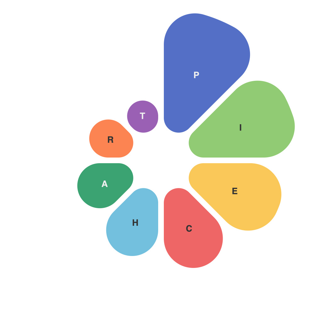
In the landscape of data analysis and visualization, the pie chart has long been a staple, offering a simple, visual snapshot of proportions. Yet, despite its popularity, the pie chart has garnered a reputation for being misleading, complex, and sometimes confusing. This article aims to demystify the pie chart, exploring its intricacies and understanding its proper use and limitations.
The Basics of Pie Charts
At its core, a pie chart is a circular statistical graphic divided into segments that represent either percentages or proportions. Each segment corresponds to a category, with the size of the segment representing the relative share or size of that category within the whole. While this concept seems straightforward, the inherent design and cognitive biases inherent in pie charts can lead to misunderstandings.
The Cognitive Challenge
One of the primary challenges with pie charts is the way our brains perceive them. It’s quite difficult for the human brain to accurately estimate the relative sizes of angles and to compare angles on a circular graph. The psychological phenomenon known as “cognitive illusion” can affect our interpretation of pie charts, making it challenging to discern whether one segment is indeed larger or smaller than it actually is.
The Case Against Pie Charts
Critics argue that pie charts can be deceptive, particularly when it comes to comparing more than two different categories. Because our brains have a harder time comparing angles, it’s often unclear how two or more pie chart slices of different sizes should be ranked. Additionally, pie charts with very few or very many slices can become cluttered and difficult to interpret, which can easily lead to miscommunication.
When to Use Pie Charts
Despite the potential pitfalls, there are situations where pie charts are perfectly appropriate:
1. When few or a small number of categories are being compared.
2. When the pie chart is used to represent the distribution of a single dataset.
3. When the goal is merely to provide an initial impression of the relative amounts.
Improving Pie Chart Design
To minimize the potential confusion and misinterpretation, data presenters can follow a series of guidelines:
1. Use a single pie chart per dataset.
2. Keep the number of slices below 10. Otherwise, consider alternatives to pie charts, such as bar graphs or horizontal bar charts.
3. Label each slice clearly and accurately.
4. Consider setting the size of the segment for the largest slice to have a reference level, for example, 90 degrees, so viewers can use mental comparison to evaluate the size of other slices.
5. Optionally, include a key that explains the colors or symbols used to differentiate between slices.
The Role of Alternatives
While pie charts have their uses, they are not the sole solution for representing distributions. When it’s necessary to compare multiple datasets or when precise comparisons between different sizes are crucial, alternatives such as stacked bar charts, radar charts, or area charts can serve the purpose better. The choice of chart depends on the context of the data and the story the data presenter aims to tell.
In Conclusion
The pie chart is a powerful tool when used properly, providing a snapshot of distribution that can be easily interpreted in certain scenarios. However, it’s crucial to understand its limitations and use it carefully to avoid miscommunication. By considering the context in which data is presented and by employing the best practices in design, presenters can demystify the pie chart and use it to serve its full potential as a valuable visualization tool.

