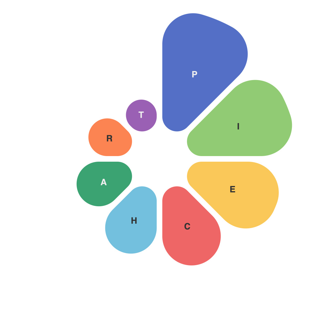
In the ever-evolving landscape of data-driven insights, effective visual communication stands as a key differentiator. One tool that often finds its way into the arsenal of communicators is the pie chart. Despite its popularity, pie charts are often misunderstood or misused, leading to confusion and misinterpretation. Let’s embark on a journey to demystify pie charts, exploring their purpose, best practices, and potential pitfalls.
### Understanding the Pie Chart
A pie chart is a circular graphical representation of data that divides the circle into slices, where each slice’s size represents a portion of a whole. It is one of the most intuitive forms of data visualization, presenting complex statistics in a simple and digestible format. When used correctly, pie charts can enhance understanding, facilitate discussion, and support decision-making processes.
### The Purpose of Pie Charts
The primary goal of a pie chart is to depict proportions and percentages within a whole. It is excellent for highlighting significant differences among the parts and can be an effective tool for conveying simple stories or summaries of the information at hand.
### When to Use Pie Charts
Pie charts are particularly effective when:
1. You want to display a simple comparison of parts to the whole.
2. There are no natural grouping or ranking of the components.
3. The sample size is small, and variations are not drastic.
On the flip side, you might want to avoid using pie charts in the following scenarios:
1. For comparisons without a clear context.
2. When the number of data points goes beyond five or six, as the chart can become cluttered.
3. For comparing two or more pie charts side by side since the area size makes it difficult to compare.
### Best Practices: Crafting a Clear Pie Chart
To craft an effective pie chart, remember the following best practices:
1. **Clarity**: Choose a clear and straightforward design without unnecessary details.
2. **Labeling**: Ensure that all parts are clearly labeled with both the data and the percentage.
3. **Colors**: Use consistent, non-offensive colors to distinguish between slices.
4. **Percentage and Data**: Always include both the percentage and the actual data.
5. **Legend**: Include a legend to help viewers understand the color-coding.
### Common Pitfalls to Avoid
Misusing pie charts is not uncommon. Here’s how to avoid some of the most common mistakes:
1. **Avoid 3D Effects**: The exaggerated perspective can distort the size of the slices, leading to misinterpretation.
2. **Don’t Overload**: Too many slices can make the pie chart impossible to read.
3. **Don’t Compare Pie Charts**: It’s challenging to compare two pie charts since their area sizes can vary, regardless of the data difference.
4. **Ensure Consistency**: If you’re using pie charts to compare similar sets of data over time, make sure to use the same scale and orientation for all charts.
### Conclusion
Demystifying data visualization techniques such as pie charts is crucial for anyone looking to communicate insights effectively. While pie charts can be a powerful tool in the toolkit of data communicators, knowing how and when to use them is key to their success. By adhering to best practices and avoiding common pitfalls, you can ensure that your pie charts serve as a meaningful communication vehicle between data and the audience. Mastering this simple visualization can lead to clearer understandings, more engaging presentations, and more informed decisions.

