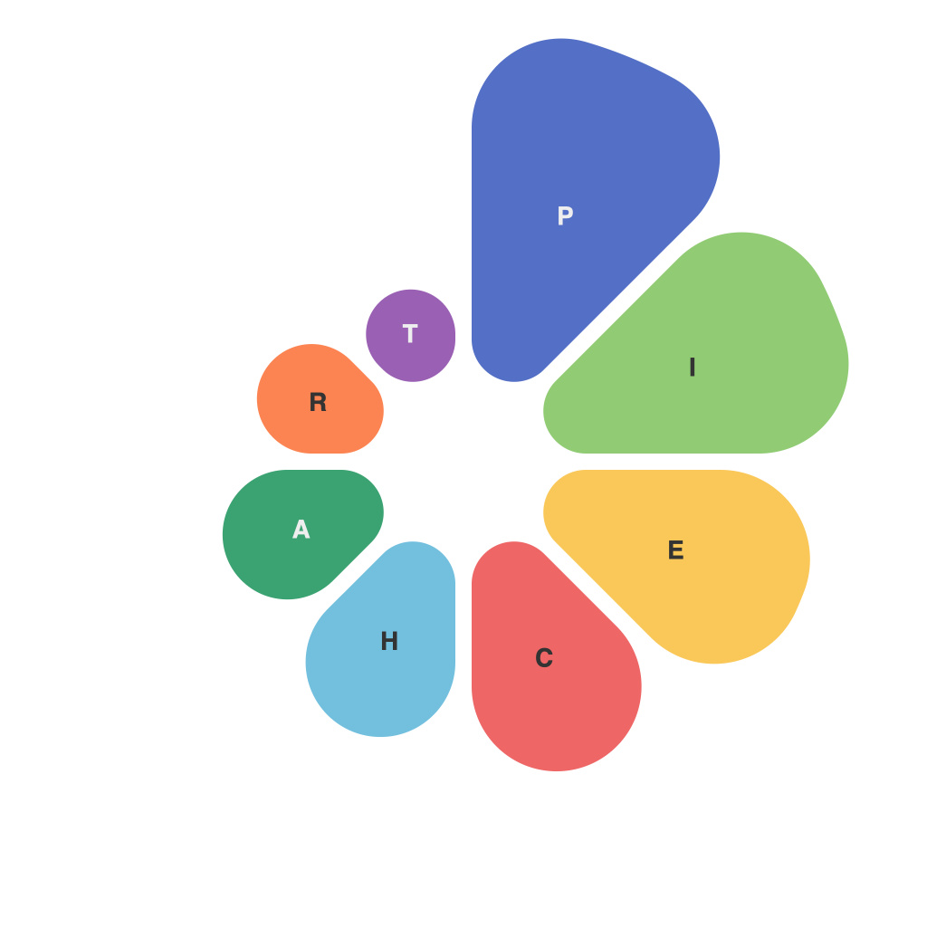
In an era where data drives decision-making and storytelling, the art of data visualization has become paramount. It encapsulates the power of information in a digestible format that can influence, persuade, and inspire. One of the fundamental tools in this visual arsenal is the pie chart, an often misunderstood and misused format. In “PieChartMaster’s Guide to Infographics Mastery,” we demystify the pies and equip you with the knowledge to use data visualization effectively.
**Understanding the Pie Chart: An Ode to slices and Segments**
A pie chart is a circular statistical graphic divided into sectors or slices to represent numerical proportions. Each slice depicts a fraction of the whole, making it a powerful tool for illustrating data distribution and comparison. Pie charts provide an immediate, accessible way to showcase part-to-whole relationships, like sales figures in a business, budget allocation, or population statistics around the world.
However, there’s an art to making a pie chart that communicates effectively, avoiding common pitfalls that can render it less informative or misleading. Let’s unravel some of these mysteries.
**Choosing the Right Data**
The first step in mastering the pie chart is selecting the right data. Pie charts are best suited for situations where different parts are relatively equal and the pie is divided into a small number of slices. This ensures that it is not overly cluttered.
In the wrong hands, a pie chart can be a breeding ground for false impressions, especially when dealing with large datasets. If you have too many categories, slices can become so thin that they’re difficult to differentiate. Conversely, with too few segments, a pie chart may become a bar chart in disguise and no longer convey a proper sense of proportion.
**Strategic Color Coding**
Colors communicate meaning in data visualization, and a pie chart’s color palette should be chosen carefully. It’s essential to avoid clashing colors that can distort the perception of size or overlap too many different segments. A uniform color scheme or a palette with distinguishable shades helps the viewer identify categories at a glance.
**Understanding Pie Slicing**
Pie slices can be plotted in various ways: ascending, descending, or in reverse-alphabetical order by category. The order and angle at which slices are shown can influence how viewers interpret the data. Ensure that the order is logical, especially for audiences that might be more likely to start from the top left as in Western cultures.
**The ‘No Lies Chart’ Principle**
As the old adage goes, “lies, damned lies, and statistics,” but in infographics, it’s even more relevant. Here are a few key principles to adhere to avoid misleading interpretations:
1. **Avoid Pie in the Sky**: Never put text directly inside the circle to label slices; it’s a surefire way to oversimplify and distort the proportions.
2. **Ensure Each Slice Reflects Reality**: Slices should represent actual values. Misrepresenting data is not only dishonest but can also undermine the credibility of the entire infographic.
3. **Use a Hover Effect**: To make interactive pie charts, adding a hover effect that shows the exact percentage of each slice reinforces the importance of absolute numbers with the relative portrayal.
**Conclusion: Embracing the Mastery of Data Visual Pie Charts**
With “PieChartMaster’s Guide to Infographics Mastery,” we aim to liberate you from the constraints of data visualization confusion. By understanding when and how to use pie charts effectively, you’ll be able to communicate your message powerfully and accurately. Remember, a pie chart is a powerful tool, and with proper knowledge, it can truly be the king of data visualization.

