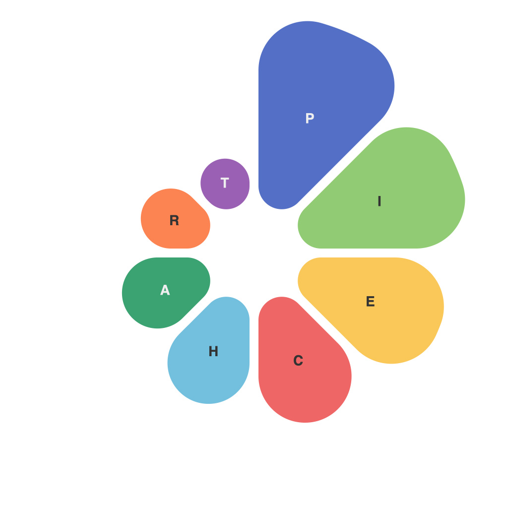
In the realm of data analysis and presentation, visualizations have revolutionized the way we interpret complex information. Among the numerous tools available to data enthusiasts, the pie chart has often been both celebrated and ridiculed. As a staple in presentations, the pie chart can be a powerful and clear way to illustrate proportions, but its misuse can lead to misleading conclusions and misinterpretation. This article aims to demystify the pie chart, providing insights into its strengths, weaknesses, and best practices for mastering this art form.
**Understanding the Basics**
A pie chart is a circular graph divided into sections, with each section representing a portion of the whole. Traditionally, this visualization tool is used to depict proportions or percentages, with individual slices of the pie representing different categories. It’s a simple concept that can convey a lot of information quickly, especially when the dataset comprises a small number of categories that are easily distinguishable.
**When to Use Pie Charts**
Pie charts are best suited when you want to highlight the relative sizes of categories and how each category contributes to the total, such as the allocation of funds between departments or the distribution of votes in an election. They are particularly effective when the number of categories is limited, allowing viewers to recognize and differentiate the parts easily.
**Mastering the Art**
1. **Limit the Number of Categories**: Overloading a pie chart with too many sections can become difficult to decipher. Stick to around 6 or 7 categories at most to maintain clarity.
2. **Use Scaled Slices**: Make sure each section of your pie chart represents a proportion equal to the actual number of items. This creates a fair and accurate representation.
3. **Ensure Legibility**: Use distinct colors for each category so that they stand out. If color is not sufficient to differentiate the sections, add labels or a legend to enhance clarity.
4. **Avoid 3D Pie Charts**: Three-dimensional pie charts can make data appear more dramatic than it is and distort the size of the sections. Stick to flat, two-dimensional pie charts to avoid these pitfalls.
5. **Think About Rotation**: Avoid rotating pie charts to an arbitrary angle. If you need to show multiple pie charts, ensure they are aligned properly for a balanced presentation.
6. **Consider the Audience**: If your pie chart will be printed or viewed on a low-resolution screen, consider adding a higher resolution image to ensure the details are crisp and clear.
**Demystifying the Criticisms**
While pie charts are a popular choice for presentations, they are not without their criticisms. One common critique is their inability to convey accurate information about the actual sizes of different slices. To visualize actual sizes, other chart types like bar graphs may be more appropriate. Pie charts also lack the ability to highlight patterns or trends over time — line charts and area charts are better for temporal analysis.
However, despite these limitations, pie charts serve a purpose when used correctly. They are not meant to show precise data but rather to provide a quick overview of proportions. When used as part of a larger dataset or supported with other types of charts, pie charts can be a valuable addition to any data presentation.
**In Conclusion**
The art of the pie chart is about balance — balancing the data with clarity and accessibility. By understanding its strengths and limitations, you can create pie charts that not only inform but also engage your audience. As with all forms of data visualization, it is critical to know your audience and the context in which you are presenting data. Master the pie chart, and you’ll have a powerful tool in your data arsenal.

