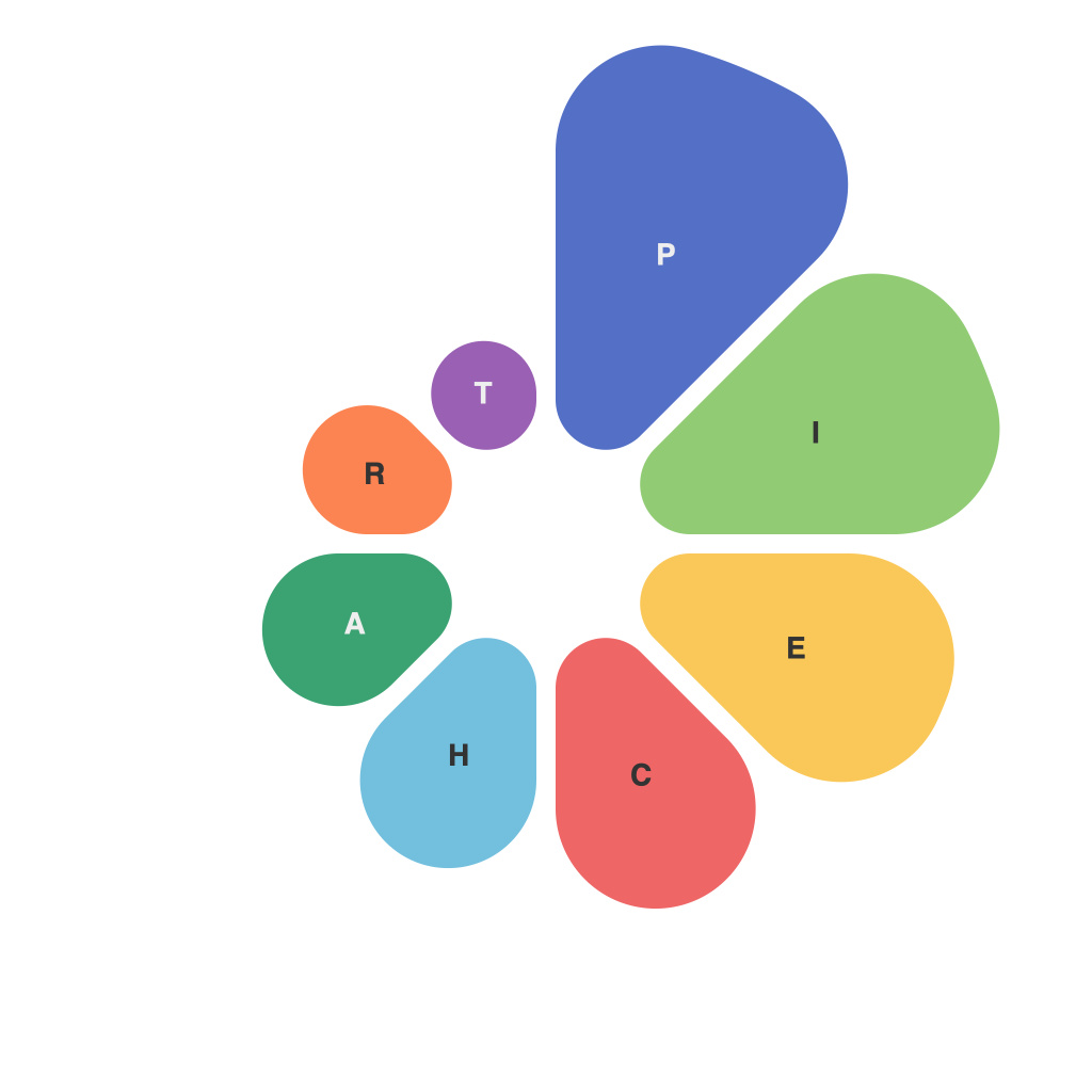
Elevating Data Visualization: Mastering the Art of Pie Charts
In the vast expanse of data analysis, pie charts have long been the star. But just like other design elements, improving the pie chart beyond surface-level aesthetics is crucial. A well-designed pie chart not only communicates information effectively but also enhances the readability and aesthetic appeal of the data presentation. This article dives deep into the nuances of creating compelling pie charts using best practices and innovative techniques.
### Understanding the Basics of Pie Charts
Pie charts illustrate proportions by showing how the entire dataset is divided into smaller segments. Each sector represents a proportionate fraction of the total value. Their simplicity and visual impact make them a go-to choice for displaying data that is naturally categorical and where the relative sizes of categories matter.
### Optimizing Design for Clarity and Impact
#### Choosing the Right Categories
To ensure clarity and maintain clarity, start by carefully selecting categories. Aim for no more than five segments to avoid clutter. If you have many categories, consider grouping smaller subcategories into a ‘Miscellaneous’ or ‘Others’ sector to keep the chart focused and appealing.
#### Using Appropriate Sectors
Ensure that the sectors are clearly distinguishable and readable. Colors and patterns can be used to differentiate categories effectively. However, for accessibility and clarity, avoid using overly bright or clashing colors. The color contrast should be high and contrasting colors should be used in pairs.
#### Text Labels and Legends
Implement the text labels inside the chart segments to minimize visual clutter. This direct labeling approach helps in saving space and prevents the viewer from getting lost in the legend. For labels with long names, use abbreviations or placeholders if necessary.
#### Avoiding 3D Effects and Exploded Slices
3D effects can add depth, but they may distort the perception of the segment sizes. Exploding slices to highlight a specific category might seem insightful, but it can lead to disproportionate visual weight, impacting the overall accuracy of the chart. Opt for simplicity and use these effects sparingly and strategically.
### Enhancing Engagement and Storytelling
#### Incorporating Interactive Elements
For digital presentations, interactive pie charts can transform static data into a compelling narrative. Interactive pie charts allow users to explore data by hovering over segments for additional information or even diving into nested categories for deeper insight.
#### Utilizing Annotations
Annotations can enhance storytelling by adding contextual information or explanations directly onto the chart. This can be especially useful when explaining unusual data variations or emphasizing key takeaways.
#### Employing Aesthetic Enhancements
For a polished look, consider adding drop shadows, subtle gradients, or a consistent and professional color palette. These enhancements not only improve the visual appeal but also ensure the chart is visually appealing across various devices and platforms.
### Conclusion
Mastering the art of pie charts is more than just choosing the right software tools; it’s about understanding the psychological and aesthetic forces at play in data visualization. By focusing on clarity, impact, and engaging storytelling, you can elevate pie charts beyond their generic form, making them powerful tools for presenting complex data with simplicity and elegance. Remember, the effectiveness of a pie chart lies not just in its design but also in its ability to inform and inspire action based on the data it represents.

