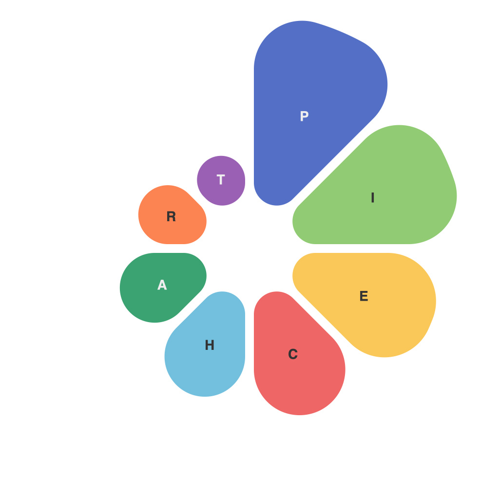
In the realm of information and communication, the ability to effectively present complex data in a simple and engaging manner is invaluable. One of the art forms of data visualization that stands head and shoulders above the rest is the pie chart. Though often misunderstood and misused, the pie chart has the unique power to transform vast amounts of data into a snackable feast for the eyes. Mastering the pie chart craft is not as simple as it appears; it requires a nuanced understanding of design, data, and human psychology. This article explores the depth of expertise required in every slice of a pie chart, highlighting the art mastery involved in data visualization.
Firstly, let’s dissect the anatomy of a pie chart. Unlike some other chart types that may require an intricate structure, pie charts seem straightforward. However, they conceal complex layers of information that one must navigate to create an effective visual representation.
**Choosing the Right Data**
The first step in pie chart mastery is to identify the appropriate data. The golden rule is that a pie chart should represent more than three segments. If the data set comprises more than five categories, it’s advisable to consider alternative visualization methods, as pie charts lose their effectiveness when used with too many slices.
To illustrate, let’s say you’re aiming to visualize market share distribution among five companies. A pie chart, with its distinct slices, is perfect for this task because it intuitively contrasts different pieces of the market pie. Understanding when to employ a pie chart and when to seek alternative chart types is a crucial part of the craft.
**Embrace Color Theory and Design Principles**
Color theory plays a vital role in pie chart design. It is important not to overdo it with colors; too many hues can make the pie chart look cluttered and overwhelming. A good rule of thumb is to use a color to represent each slice, using one base color that differentiates according to tone or shade to indicate a percentage change.
Furthermore, mastering the balance of form and detail means ensuring that the legend and labels are clear and readable, even when the pie chart is scaled down. The challenge lies in conveying the necessary information without creating a pie chart equivalent of a puzzle.
**Pie Orientation and Layout**
The orientation of the pie is also a subtle aspect of pie chart design. The starting point of the slice should always represent the highest share to guide viewer perception. Additionally, the relative dimensions of the slices can reveal a narrative about the data. If certain segments are much larger than others, they may warrant being rotated slightly, creating a more evenly dispersed appearance that’s easier on the eyes.
**Numbers, Labels, and Proportions**
When adding numbers and labels to a pie chart, there’s a delicate balance to be struck between clarity and not overwhelming the viewer. Some pie charts benefit from showing exact numbers, while others have more success when percentage values alone are displayed, allowing the viewer to assess the size at a glance.
Proportionality is key; larger slices should visually appear larger. If the difference between two adjacent slices is minuscule, it can become difficult for viewers to distinguish them, thereby diluting the chart’s impact.
**Interactive and Digital Considerations**
In the digital age, interactive pie charts have grown in prominence. However, design the pie chart with interactivity in mind and viewers can click on slices to learn more, drill down into additional details, or even explore related data. Mastering the interaction element means designing with clarity in mind, ensuring that the interactive pie charts remain functional and intuitive.
**Contextualizing and Telling the Story**
No piece of design exists in a vacuum. The pie chart is just one element of an overall data narrative and design scheme. It is essential that the pie chart complements and enhances the surrounding data visualization framework — it must contribute to an overall effective communication of the data story.
**Pie Chart Best Practices and Common Pitfalls to Avoid**
Here are some best practices and pitfalls to avoid when crafting pie charts:
– Avoid starting slices at odd angles to avoid misinterpretation.
– Make sure every slice has enough space to be identified easily.
– Choose a color palette and design style that aligns with your brand or the presentation’s audience.
– Avoid using 3D effects; two dimensions are more effective from an analytical perspective.
– Do not label the slices directly on the pie unless there’s ample space, as this can clutter the chart.
In summary, crafting a pie chart is not merely a task but rather an art form that requires an understanding of various principles — from understanding the data and applying color theory to considering the context within which the chart exists. Mastering the art of pie chart creation is, in fact, mastering the art of data visualization, where every slice is a testament to the power of effective presentation and storytelling.

