Title: Mastering Data Visualization: The Art and Science Behind Creating Compelling Pie Charts
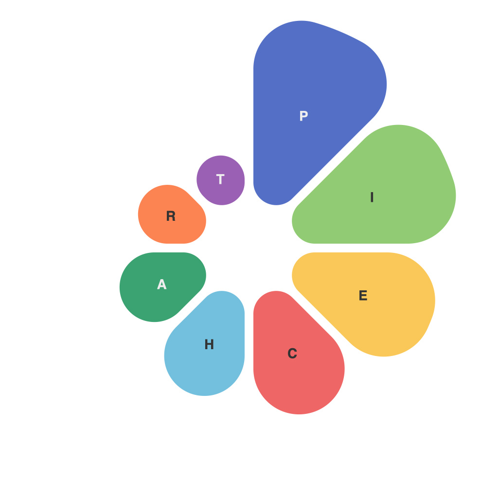
Pie charts are one of the most commonly used data visualization tools, primarily due to their simplicity and ability to visually convey proportions or distributions at a glance. They essentially represent data in a circular graph split into sectors, each representing a certain category, and the size of each sector indicates the relative importance of the corresponding category in comparison to the whole.
Creating a compelling pie chart involves a blend of artistry and science. Designers and data analysts require a strong understanding of how best to present information visually, along with the technical skills necessary to convey meaningful insights. This article will explore the key aspects of data visualization using pie charts, covering both the creative and scientific principles underlying effective pie chart design.
### 1. Data Selection
First and foremost, the data you choose to represent is crucial. Pie charts work best when you need to compare proportions within a single, all-encompassing dataset. They are ideal for visualizing data that can be categorized into distinct parts of a whole, like sales by product category, market share by industry, or demographic breakdowns. Limiting the number of categories to around five or fewer also enhances the clarity and readability of the chart.
### 2. Design Principles
Aesthetics and clarity go hand in hand in ensuring a pie chart’s effectiveness. Here are some basic steps:
#### **Color Usage**
– **Distinct Color Choices**: Each category should be easily distinguishable. Avoid using the same color or too many similar colors, as this can lead to confusion. Use a color contrast that appeals to the eye but also remains professional.
– **Accessibility**: Consider the color blindness or blindness, using contrasting colors which are distinguishable by more than three colors for the visually impaired.
#### **Labeling**
– **Balanced Importance**: Label slices with percentages and, ideally, the actual category names. This ensures that the viewer can quickly understand the data without needing to refer to a legend.
– **Limitation**: Generally, avoid extensive text within the pie slices. If many labels are necessary, consider using a legend placed outside the chart to avoid clutter.
#### **Simplicity**
– **Avoid Overcrowd**: Ensure the focus remains on the data rather than the design elements. Overly decorative features can detract from the clarity of presenting the information.
### 3. Contextualization
Providing context for the data enhances the interpretability and utility of the pie chart. This includes captioning the image, describing the source of data, and outlining any necessary background information or benchmarks, such as target or industry standards.
### 4. Tools and Software
Modern tools like Microsoft Excel, Adobe Illustrator, Tableau, or Google Charts make creating pie charts quicker than ever. They offer easy-to-use interfaces and a wide range of customization options, allowing you to adjust colors, labels, and other design elements seamlessly. Being proficient in these software tools can significantly enhance the quality and effectiveness of your pie charts.
### 5. Evaluation
Finally, ensure that your chart effectively communicates what you want to convey. Test your chart with a small audience to get feedback about clarity, accuracy of representation, and overall effectiveness. Refine based on the feedback received, adjusting colors, labels, and layout if necessary.
By blending a solid understanding of data, design principles, and the use of advanced tools, you can create pie charts that are not only visually appealing but also highly informative. The mastery of the art and science of data visualization, through the lens of pie charts, enables you to communicate complex information succinctly, making your data accessible and understandable to a broad audience.

