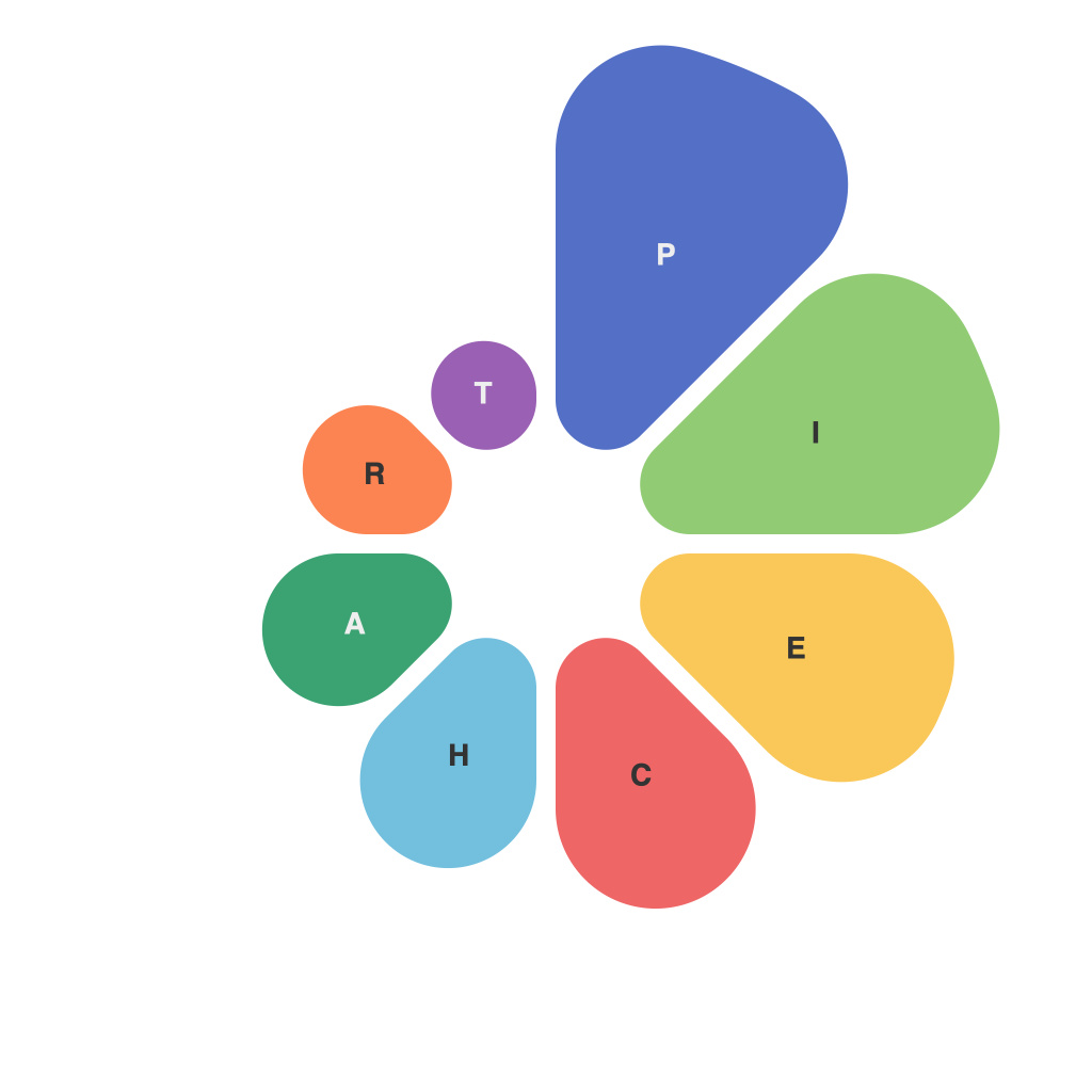
In the vast tapestry of data visualization, the pie chart stands as a cornerstone, a simple yet profound tool for conveying complex information with ease and clarity. Mastering the art of piechart creation is not merely about understanding software commands; it’s about the nuanced skill of conveying a story through numbers, colors, and design. This article delves into the intricacies of piechart mastery, uncovering the secrets behind effective data communication.
**Pie in the Sky: The Essence of a Pie Chart**
At its core, a pie chart is a simple, circular layout of data slices that are proportional to the value they represent. Each segment is a slice of the whole pie, representing a particular dimension or category of the data, and the size of each slice is proportional to the amount it represents relative to the total data set.
Where pie charts excel, particularly over other types of data visualization, is in making the relationship between parts and the whole readily apparent. They are, after all, the perfect metaphor for division – each slice is its own unit, while the pie represents the whole picture.
**Crafting Clarity: The Do’s and Don’ts**
Pie charts are powerful, but misused, they can be a data disaster. Here is a guide to mastering the pie chart with a keen focus on the do’s and don’ts:
**Do:**
– Limit the number of slices. Generally, more than 6-8 slices can be overwhelming and distracting.
– Use clear, easy-to-read colors. Each color should be distinct from one another, avoiding the need for a legend.
– Size slices proportionally; the visual emphasis should align with the data’s relative magnitude.
– Include a key or legend if the category labels are too small or complex.
– Label each pie slice with a clear, informative title or description.
– Align the chart with common axis styles, using zero to anchor the scale for accurate reading.
**Don’t:**
– Overload labels. Large numbers of labels make the chart difficult to decipher.
– Go beyond complex color palettes. Bright, contrasting colors are key for clarity.
– Use shades of a single color, as it can be difficult for viewers to differentiate between them.
– Include 3D effects. They can distort the perspective and, worse, create the illusion that slices vary in size.
– Add too many decorations and animation. Their overuse can distract viewers from the intent of the data.
– Place numbers outside of the pie chart. This can confuse the audience, since the visual alignment between a category and its value may not match the number displayed.
**Understanding the Audience**
The ultimate mark of pie chart mastery lies not in the skillful creation of the chart itself, but in its effectiveness at informing and engaging the audience. When designing a pie chart, ask yourself these questions:
– Does the pie chart align with the audience’s preferences and understanding of the data?
– Is the message conveyed clearly and logically?
– Is there a narrative in the pie chart that guides the audience’s understanding of the data or its implications?
**Piecing Together Purpose**
A well-crafted pie chart serves a precise purpose; to strip away complexity and reveal the story held within the data. Whether it be a report, a business presentation, or a simple document, pie charts have the remarkable ability to break down intricate data sets into something tangible and accessible. It’s an art to ensure the story of the pie chart is not only told but told effectively.
In the realm of data visualization, pie charts are not just another tool to be mastered; they are the architects of communication. By following these principles, one may truly excel in the art of piechart mastery, transforming data into a language that resonates with clarity and impact.

