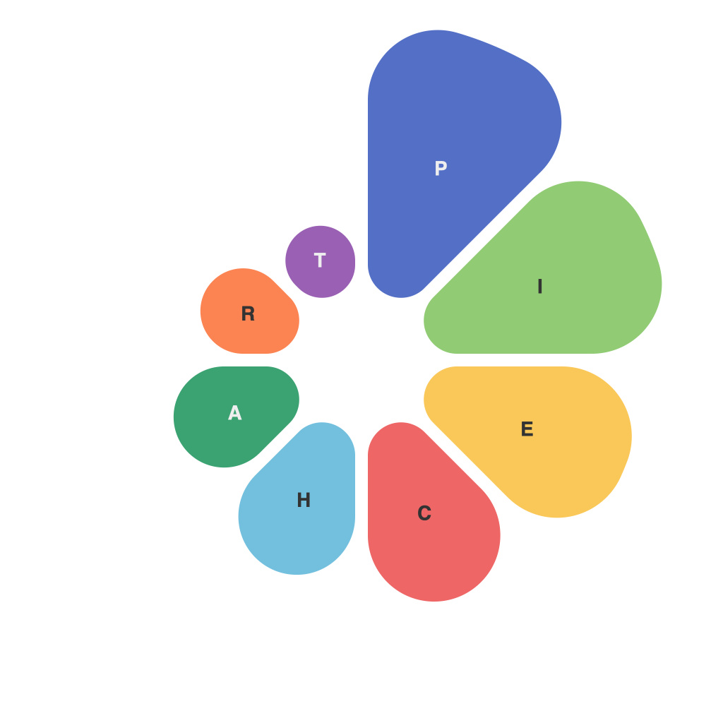
In today’s digital landscape, where data is king and visual storytelling is the currency of effective communication, mastering the art of data presentation has become an indispensable skill. Among various chart types, the pie chart stands out as a tool that can both engage and enlighten. This guide, crafted by the PieChartMaster, demystifies the art of creating impactful visual representations that encapsulate essential insights in a single view.
**Understanding the Pie Chart’s Fundamentals**
To begin your journey towards pie chart mastery, it’s crucial to understand the very essence of the pie chart. First and foremost, a pie chart is a circular graph divided into segments, each representing a proportion of a total. These segments, or slices, visually indicate the relative size or proportion of different categories or data points within a dataset.
A well-crafted pie chart is intuitive to read; it is clean, uncluttered, and the viewer can quickly grasp the main data points without getting lost in details. Whether it is for corporate dashboards, academic research, or infographics, the pie chart remains a versatile and effective choice when the goal is to illustrate comparisons among parts of a whole.
**Selecting the Right Data Sources**
The foundation of any successful pie chart is robust data. As the PieChartMaster emphasizes, quality data is your canvas. When selecting your data sources, consider the following best practices:
– Ensure the data is accurate and complete to avoid misrepresentation.
– Choose a dataset that is appropriate for use in a pie chart – data that lends itself to proportional comparison.
– Pay attention to the granularity of your data slices. Overly detailed categories can clutter the chart and impair readability.
**Design Principles for the Artful Pie Chart**
The visual appeal is key to the effectiveness of the pie chart. Here are the PieChartMaster’s tenets for designing pie charts that dazzle:
1. **Consistent Colors**: Use a palette that is consistent with your overall design theme. Make sure that colors chosen are contrastive enough for differentiation but subtle enough to facilitate an easy-on-the-eye viewing experience.
2. **Logical Layout**: Arrange slices in descending order so viewers can immediately see which category holds the largest piece of the pie.
3. **Pie Size**: If using the pie chart for comparative purposes, consider using a percentage scale rather than absolute numbers, especially if your chart is to be viewed across different devices.
4. **Labels and Legends**: Ensure that all slices are clearly labeled, and include a legend if the chart needs to be viewed independently from the presentation.
5. **Avoid Clipping**: Ensure that all labels and annotations fit within the confines of each slice’s boundary to maintain clarity.
6. **Keep It Simple**: Overcomplicating the chart with too many elements can obfuscate the message. The PieChartMaster advises prioritizing the most essential data.
**Common Mistakes to Avoid**
With great power comes great responsibility, and with pie charts, it’s not just the data representation that’s at stake—it’s the clarity and integrity of the message. Avoid these common pitfalls:
– **Overload of Data**: Don’t try to squeeze too much information into one pie chart. Multiple charts, perhaps utilizing different types like bar graphs or line charts, may be a more effective choice.
– **Clashing Slices**: More slices than can be visually distinguished (typically more than 5-7) can make the chart look cluttered.
– **Pie Size Misconceptions**: Viewers often misinterpret 3D pie charts, assuming the depth adds to the size of a slice. Stick to a 2D pie chart to avoid perception distortions.
– **Incorrect Scaling**: Slices must be scaled proportionally. Evenly spaced wedges may not be accurately proportional.
Mastering the art of data presentation is no easy feat, but with the PieChartMaster’s thorough guide, you are well on your way to creating pie charts that are not just well-crafted, but impactful. As the master of this genre, the PieChartMaster encourages and empowers you to continue honing your skills, experimenting with different approaches, and learning from each presentation you craft. Remember, your visual communication doesn’t just represent numbers; it influences perception and drives action.

