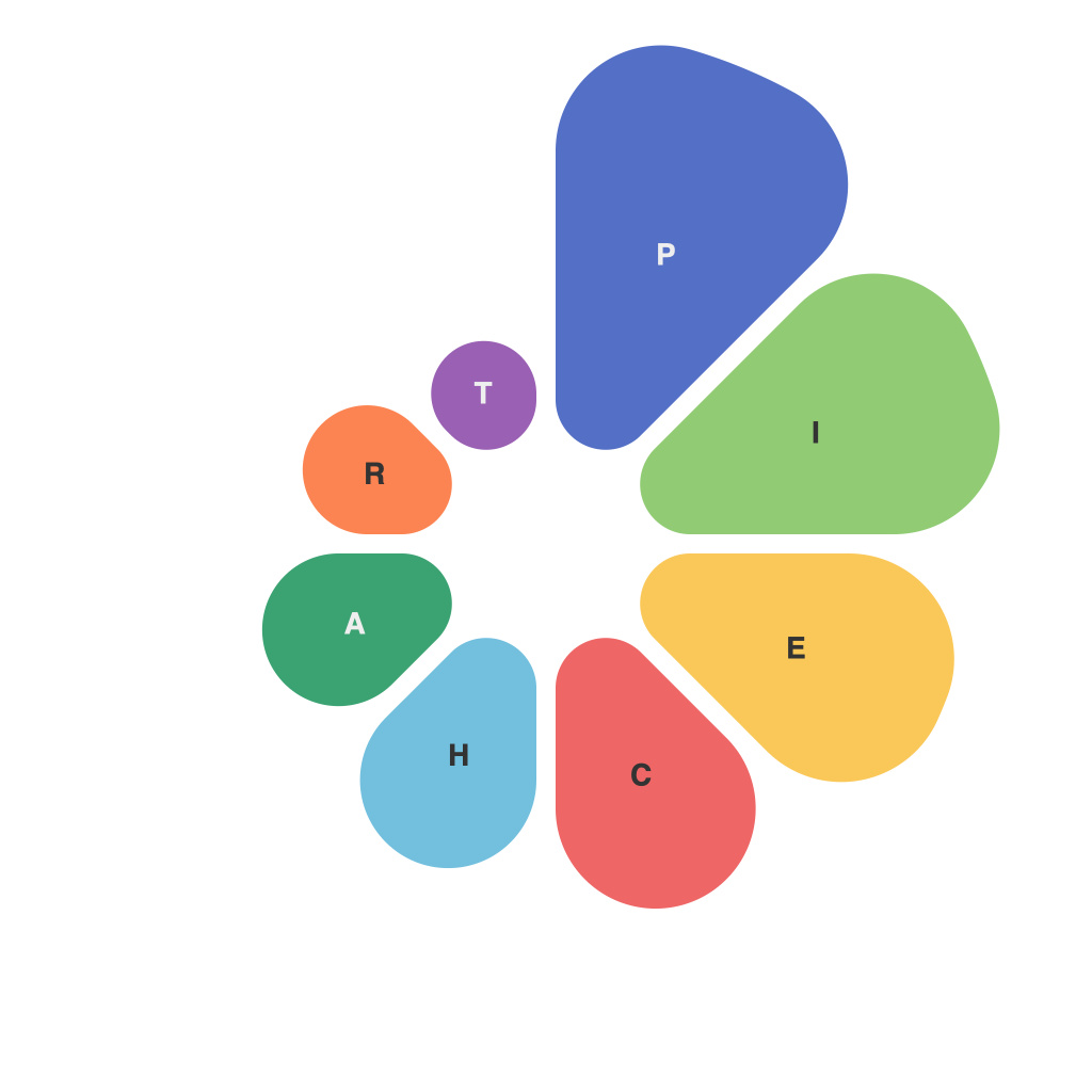
Title: Mastering the Art of Data Visualization: A Comprehensive Guide to Creating Compelling Pie Charts
Introduction:
Pie charts, a fundamental tool in data visualization, allow users to quickly understand proportions and distributions within a data set. However, simply presenting raw data in a circular format doesn’t guarantee an effective or engaging visualization. To truly master the art of creating compelling pie charts, designers should incorporate essential principles such as clarity, simplicity, and aesthetic principles that enhance data comprehension. This comprehensive guide outlines key strategies to achieve effective data representation through pie charts, providing practical advice and design considerations for maximum impact.
Understanding the Basics:
First, ensure you understand the data you are visualizing. Pie charts are ideal for showing shares or proportions for categories within your dataset. Before creating a pie chart, classify your data into segments and determine which categories contribute the most significant proportions. This helps in deciding which parts should be emphasized, potentially using a color gradient or unique patterns.
Designing Effective Pie Charts:
1. **Limit the Number of Slices**: Stick to no more than five to seven slices to maintain readability and understanding. For datasets with more categories, consider using a stacked bar chart or a doughnut chart. Slices that make up a small proportion can be grouped together under an “Others” segment.
2. **Sort the Slices by Size (Descending or Ascending)**: Arrange the slices in the order of their size to indicate hierarchy and reinforce comparisons. This visual organization guides the audience’s eyes through the data intuitively.
3. **Use Clear Labels**: Label each slice with its corresponding category name and percentage. Avoid overlapping text by either using a more compact font size, a donut hole for space, or a chart legend to the side.
4. **Select Color Wisely**: Employ different colors that clearly distinguish each slice category. Typically, it’s advisable to have no more than seven distinct colors. Consider using color schemes that enhance contrast and readability. A unique color or gradient can be assigned to the “Others” segment to visually differentiate it from the other slices.
5. **Choose Appropriate Typography**: Opt for clean, readable fonts with reasonable sizes. Ensure that all text is legible, even in smaller slices, and avoid overly decorative fonts that could be distracting.
6. **Consider a Doughnut or Exploded Pie**: While standard pie charts are suitable for direct comparisons, in some cases, a doughnut chart can provide a cleaner view by eliminating the center, displaying key metrics at a glance, or offering exploded slices to highlight specific categories. An exploded pie can also clarify the composition of larger slices.
7. **Use Space Effectively**: Leave adequate space between slices and the chart boundary to reduce clutter. Add padding around the edges for a more polished appearance.
8. **Incorporate Data Drifts**: Include data drifts to display the distribution of proportions over time, enhancing the readability of dynamic data series.
Conclusion:
Mastering the art of creating compelling pie charts involves strategic planning, attention to detail, and an understanding of how different factors influence data interpretation. By adhering to best practices such as limiting slice numbers, sorting by size, using color wisely, and enhancing readability through typography and spacing, designers can create pie charts that effectively communicate insights and draw meaningful connections. Whether tackling internal reports or presentations for a broad audience, applying these tips will help ensure that your data visualization is not only aesthetically pleasing but also scientifically accurate and accessible.

