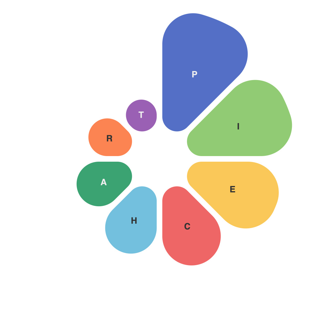
Mastering the Art of Data Visualization: A Comprehensive Guide to Creating Effective Pie Charts
In the intricate dance of data communication, pie charts emerge as one of the most cherished narrative instruments, serving as elegant, simple, and effective illustrations that convey complex information in an accessible manner. This guide aims to demystify the art of crafting effective pie charts, dissecting the components essential for success and offering practical advice that every aspiring data communicator should consider.
**Understanding Pie Charts:**
First and foremost, it’s crucial to understand the fundamental nature of pie charts. Conceptually, they represent parts of a whole, making them ideal for visualizing distributions, proportions, or percentages. Each sector (or slice) corresponds to a dataset component, visually expressing its relative prominence within the total. The versatility of pie charts can vary, from simple compositional breakdowns to more complex comparative analyses between multiple sets of data.
**Design Principles:**
1. **Clarity and Simplicity:** Keep designs uncluttered to ensure readability. Optimal use of charts often means avoiding too many categories (typically recommended for no more than 5 to 7 segments). When dealing with more categories, consider using a legend or a separate table for detailed information.
2. **Use of Color**: Colors play a pivotal role in enhancing readability and engagement. Employ a color scheme that is both distinct and aesthetically pleasing, aiding in quick recognition of segments. It’s crucial to differentiate colors effectively, ensuring that for cases of color blindness, the data is still understandable. Incorporating patterns as an alternative to color can serve as a useful strategy, provided the design does not clutter the chart significantly.
3. **Labeling:** Sufficient and readable labels are essential. Ideally, include numerical percentages for accuracy, accompanied by descriptive text. Avoid overcrowding the chart with labels; for instance, utilizing hover labels in digital formats can be more practical.
4. **Comparison and Contrast:** When multiple pie charts are presented, use a consistent design to maintain visual coherence. This alignment assists in facilitating quicker, more intuitive comparisons. Adding a common variable along with labels can also help in making the comparison more informative.
**Techniques to Avoid:**
– **Avoiding Color Blindness Issues:** Avoid relying solely on color for differentiation, particularly in critical decisions or in presentations targeting a wide audience.
– **Overloading Information:** Resist the urge to stuff information into a pie chart. Instead, consider using the space for more impactful visualizations or opting for a separate table for comprehensive data.
– **Misrepresenting Data Scale:** Be cautious with data scaling. Ensure that the chart size does not give a misleading impression about the magnitudes of the data categories, particularly focusing on the sizes of the slices.
**Real-World Applications:**
Pie charts are used across multiple sectors, ranging from market analytics and financial reports to simple, everyday insights in education and health. Their utility lies in their straightforward representation, making complex information digestible to a broad audience.
**Summary:**
Mastering pie charts involves a deep understanding of both data interpretation and design principles. It’s a collaborative process blending mathematical accuracy with aesthetic and functional considerations that aim to enhance, not complicate, data communication. By adhering to these guidelines, you embark on a journey to creating pie charts that inspire clarity, engagement, and informed decisions. Remember, it’s not just about presenting data but making it impactful and meaningful for your audience.

