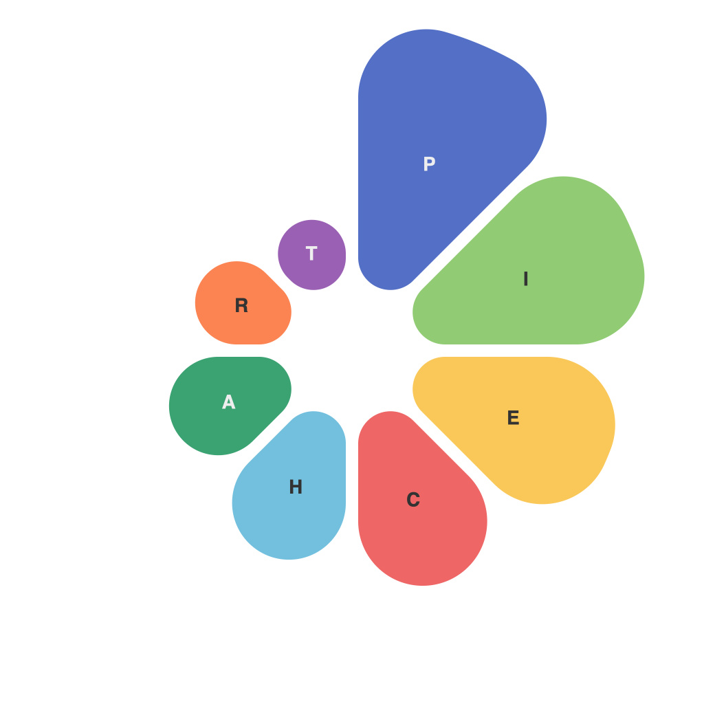
In an era where data reigns supreme, the ability to transform raw figures into compelling visuals is more critical than ever. At the heart of effective data communication lies the pie chart—its circular format, segments, and clear labeling make it a staple in business reports, marketing collaterals, and educational materials alike. Crafting a pie chart that not only presents data accurately but also captivates the viewer requires a certain level of artistry and proficiency. Welcome to PieChartMaster’s guide to achieving data visualization expertise with masterful pie chart creation.
**Understanding the Pie Chart Basics**
Before diving into the intricacies of pie chart design, let’s backtrack to the fundamentals. A pie chart is a circular statistical graphic divided into slices to illustrate numerical proportions. Each slice represents a part of the whole, with the size of the piece being proportional to the magnitude of the data it represents.
**Step 1: Plan Your Chart**
The beauty of a pie chart lies in its simplicity, but this simplicity requires careful planning. Begin by compiling your data. Ensure that it is accurate and reflective of the story you wish to tell. Ask yourself why you are creating this pie chart; is it to show a product’s market share, the distribution of revenues among different departments, or the breakdown of an expense budget?
Pie charts can accommodate various types of data, but they are most effective when there are five to ten slices. Overloading the chart with too many segments can lead to a cluttered look, making it difficult for viewers to extract insights.
**Step 2: Choose the Right Size and Aspect Ratio**
The size of your pie chart should be commensurate with the amount of space available and the detail you need to convey. Smaller pie charts, like pocket-sized infographics, might best be left to basic features like a simple legend or data labels. On the other hand, larger charts can have more detailed labels and interactive features to engage the audience.
Aspect ratios can influence how your pie chart is perceived. A standard pie chart is typically represented with an aspect ratio of 3:1. If this looks too narrow or too wide for your needs, don’t hesitate to modify it.
**Step 3: Optimize Color Selection**
Color is crucial to pie chart design, as it can greatly enhance comprehension or mislead if used carelessly. Pick colors that complement each other without overwhelming the chart. Avoid overly bright, neon colors that may detract from the message. A coordinated color scheme ensures that the chart is visually appealing while maintaining readability.
To prevent confusion, assign consistent colors throughout all of your pie charts. Utilize color blind-friendly palettes, especially when the data must be understood by a broad audience.
**Step 4: Use High-Quality Graphics**
The resolution of your pie chart is critical for its overall appeal. Ensure that your design appears sharp and clear, especially when the chart is viewed on high-resolution screens or printed on posters. This can be easily achieved by using vector-based graphics rather than pixel-based ones, which may pixelate when scaled.
**Step 5: Add Labels and Legends Thoughtfully**
Labels and legends are essential for clarity and context. Data labels should be easy to read and accurately represent the slice it belongs to. Consider the placement of labels; sometimes, the best placement may not be directly adjacent to the slice. If the chart is part of a larger document, include a legend. Place it in a location that is easily accessible but doesn’t obtrude on the central focus of the chart.
**Step 6: Use Donuts as a Creative Variation**
When dealing with data sets where small segments might not be discernible, donut charts can be an innovative solution. This variation of the pie chart removes the central wedge and spreads the segments wider. Don’t forget that this change could also alter the perception of the data, so use donut charts thoughtfully.
**Step 7: Emphasize Key Segments with 3D Effects or Highlights**
While it might seem tempting to give key segments a three-dimensional boost or a vibrant highlight, be cautious. These effects can actually distort the scale and lead to misinterpretations. Use 3D effects and highlights sparingly to draw attention to the most significant insights without causing the chart to become cluttered or misleading.
**Step 8: Integrate with Other Visual Components**
A pie chart can stand on its merit, but it can be a powerful partner within a broader data visualization strategy. Place it adjacent to other graphs, such as bar or line charts, to contextualize the information. Conversely, pie charts can serve as a concise summary of the data, pointing readers to other charts for more granular details.
**Step 9: Iterate and Refine**
Just like any design masterpiece, a pie chart is never perfect in its first iteration. Use the feedback from your audience to refine your chart. Perhaps they found certain labels too cryptic, or they could not immediately identify a specific slice—the insights they provide can guide you in making small yet impactful adjustments.
Mastering the art of pie chart creation is, in itself, an art. It requires a balance between adherence to aesthetic principles and data accuracy. By using the insights found in this guide, you can create pie charts that not only convey your message but also captivate and engage your audience. Remember, the goal is to simplify complex data into a digestible, visually appealing format that helps tell your story.

