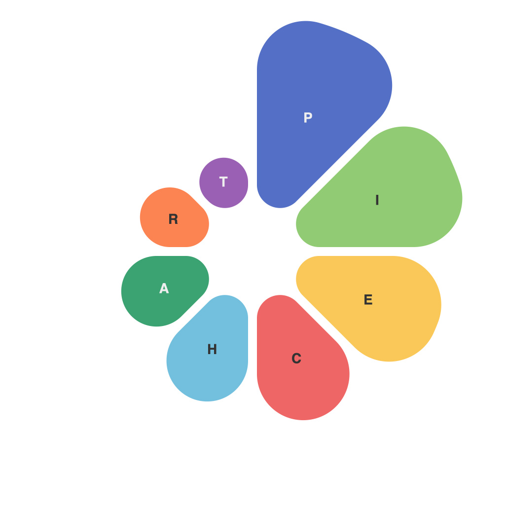
Navigating the data-visual world can be daunting, filled with a plethora of tools and techniques aimed at making complex information accessible. Among these tools, the pie chart stands as a timeless favorite, a canvas upon which data can be artistically sliced and served. Whether presenting findings to an audience, analyzing market share, or tracking progress over time, the pie chart can make sense of a multitude of data points with a single glance. In this guide, we aim to transform any data enthusiast into a PieChartMaster, elevating the art of pie chart creation from mere illustration to a refined craft.
Starting from the basics, let’s delve into what makes a pie chart click with audience members and data professionals alike.
**Understanding the Pie Structure**
A typical pie chart consists of a circle that is divided into sectors. Each sector represents a proportion of the total, and the size of these sectors should correspond to the size of the data they represent. A successful pie chart doesn’t just show the data, but it also tells a story, allowing viewers to grasp key information at a glance.
**The Right Data**
Choosing the data to be represented in your chart is the cornerstone of good pie chart design. Use pie charts exclusively for showing parts of a whole, and ensure that the data is mutually exclusive and collectively exhaustive. In other words, the total of all parts should equal the whole.
**Choosing Your Color Palette Wisely**
Colors can communicate emotion, importance, and direction. When selecting colors for your pie chart, use a palette that is visually appealing yet easy to read. Avoid using too many colors or clashing hues that may overwhelm the chart. For a professional look, stick to a color scheme that is consistent with your brand or presentation.
**Consider the Number of Slices**
The rule of thumb is that a pie chart with too many slices can become difficult to interpret. If you have more than five or six categories, consider other visualization methods such as bar or line charts that offer more space on the page or screen to convey the data effectively.
**Labeling for Clarity**
Pie charts need clear and concise labeling. Ensure that the entire label of each category is visible by avoiding placing it in the middle of a large slice. It’s recommended to rotate labels as needed or include a legend at the bottom if space permits.
**Using Data Labels and Percentage Slices**
For a more detailed look, you can include data labels, which show the precise number or percentage of the total. In some cases, adding a secondary axis (a percentage slice) can help illustrate the relative magnitudes of different segments.
**Adding Interactivity**
In digital platforms, enhance your pie chart with interactivity. Users should be able to click or hover over different slices to see more detailed information. Interactive elements can greatly increase the story-telling capabilities of pie charts and enhance the user experience.
**Pie Charts vs. Donut Charts**
Many beginners confuse pie charts with their cousin, the donut chart. While both display data in a circular format, a donut chart removes the outer boundary of the pie, typically using the remaining area to include a label or logo. Be selective in using donut charts and ensure that this design does not mask too much data within the gaps of the “donut.”
**Mastering the Art of Pie Charts**
To transform yourself into a PieChartMaster, experiment with your charts, study examples, and learn from successful presentations. Pay attention to the context in which your chart is used, as this will directly impact the choices you make regarding its design and layout.
In summary, pie charts are an age-old and versatile tool for data visualization. They can be simple and elegant, yet powerful in conveying complex and significant information. By mastering the fundamentals and understanding that your audience’s experience with your pie chart is just as important as the data itself, you can elevate the art of pie-charts and leave a lasting impression on anyone who views them.

