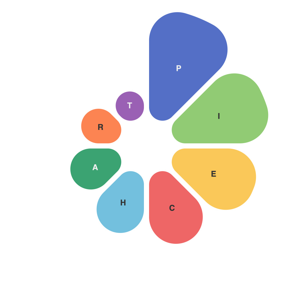
Mastering the Art of Pie Charts: A PieChartMaster’s Perspective
In the vast landscape of data visualization, the pie chart stands as a classic, almost evergreen figure; a ubiquitous method for presenting proportions where each segment symbolizes a portion of a whole. As a PieChartMaster, I am often approached by individuals and corporate entities seeking to understand the intricacies of this time-honored graphic. Allow me to take you through a thoughtful exploration of mastering pie charts, offering insights and best practices I’ve gathered over the years.
The first step in pie chart mastery is to recognize the power of simplicity – perhaps the single most critical factor in its有效性. A pie chart should ideally convey a single message, simplifying complex data into a digestible format. Overloading the chart with too many segments can detract from its clarity and dilute the intended message.
Pie Chart Composition:
1. **Simple Segments**: A common mistake is including too many segments. Aim for eight or fewer; otherwise, the chart can become cluttered and the viewer may have difficulty distinguishing the relative sizes of different segments.
2. **Order of Segments**: Place the most significant data first. Often, it’s valuable to lead with the largest segment, as it will immediately draw the viewer’s attention and set the tone for the rest of the data presented.
3. **Color Scheme**: A consistent and complementary color palette enhances readability. When working with many colors, be mindful of color theory and accessibility for color-vision deficiency.
4. **Legend and Labels**: Always include a clear legend and labels. This is especially important for complex pie charts with a high number of segments, as it helps viewers quickly interpret the figures.
Effective Communication:
The primary goal of a pie chart is to communicate a story or analysis. As a PieChartMaster, I have learned that the effectiveness of the chart is dependent on how well the story is crafted.
1. **Contextual Information**: Pie charts work best when integrated with other supporting data or text. Provide context by using numbers or percentages, especially helpful when presenting a pie chart that covers a longer time span.
2. **Comparative Analysis**: Pie charts are fantastic for comparing proportions. Consider how pairing two pie charts can highlight trends over time, differences in two distinct groups, or comparisons involving multiple variables.
Pie Chart Designs:
Design elements in pie charts should serve the story, not distract from it. Here are some key design considerations:
1. **Perspective**: The most common type is horizontal, but vertical is used when pie charts have to be printed out with space limitations. Choose the orientation based on personal preference and where the chart will be displayed.
2. **Center Hole**: While often ignored, the hole in the center (often referred to as a donut chart) provides real estate for additional information or to provide perspective on the entire pie. It might be overused, so use it judiciously.
3. **Animation**: While not always necessary or recommended, adding animation can make the chart more engaging. Ensure that the movement between segments is smooth and clear.
4. **Data Interaction**: For interactive pie charts, consider adding features that allow users to drill down to more details or to highlight specific segments for emphasis.
Pie charts have evolved over the years, and with the advent of data visualization tools, we can now create advanced interactive pie charts for the web. However, the principles of clear communication and simplicity underpin the chart’s enduring value.
As a PieChartMaster, my perspective is clear: to truly master pie charts, one must strike a balance between aesthetic appeal, utility, and story clarity. In doing so, every pie chart you create can communicate a data story with purpose and engagement.

