Mastering the Art of the Pie Chart: A Comprehensive Guide for PieChartMaster
In today’s age of big data, visual representation of numerical data has become crucial for conveying complex information at a glance. Among the numerous graphical tools available, the pie chart often takes a leading role, due to its intuitive nature. This guide is crafted for the aspiring PieChartMaster to delve into the nuances of pie charts, offering insights into their effective use, types, design tips, and common mistakes to avoid.
**Understanding the Fundamental Concept**
To master the art of the pie chart, one needs to understand its essence. A pie chart is a circular statistical graphic, where the whole circle is divided into slices that each represent a proportion of the total information depicted. The size of the slice corresponds to the portion of a whole that it represents.
**Varieties of Pie Charts**
Pie charts can be simple, complex, or interactive, each designed to accommodate different types of data and convey varying degrees of information. Here are the most common types:
1. **Basic Pie Chart**: Used simply to display proportion among categories.
2. **Percentage Pie Chart**: Where the size of each slice is proportional to the percentage it represents.
3. **3-D Pie Chart**: Less recommended due to visual distortion.
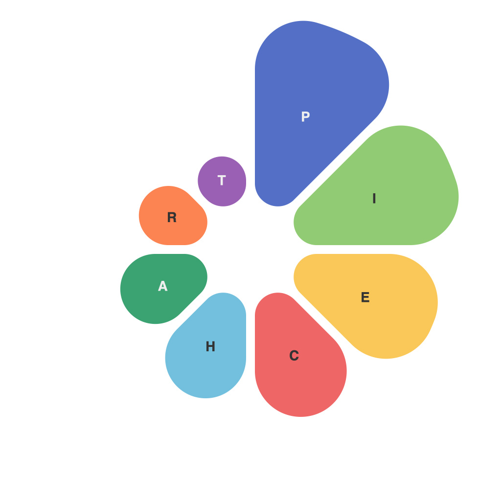
4. **Exploded Pie Chart**: Where a slice is offset from the center to highlight a particular category.
5. **Donut Chart**: Similar to a pie chart but representing the data in a ring shape.
**Design Tips for Crafting a Masterpiece**
When creating a pie chart, the design principles that underpin its visual clarity and user comprehension are paramount.
1. **Limit Number of Categories**: A rule of thumb is to never put more than five to seven slices in a pie chart. More slices lead to complexity and difficulty in tracking the data.
2. **Color Scheme**: Use a color palette that is easy on the eyes, and make sure there is a clear contrast between different slices to avoid confusion.
3. **Legible Labels**: Include concise, readable labels for each slice. Avoid dense, overcrowded text placements.
4. **Legends**: Sometimes, it is better to use a legend if the labels become lengthy to maintain chart readability.
5. **Center Text**: For exploded pie charts, text labels can be positioned in the center of slices for better readability and emphasis.
**Avoiding Common Mistakes**
Pie charts, when poorly created, can mislead viewers and undermine their effectiveness. Here are some common pitfalls to avoid:
1. **Circular Distortion**: Use a non-circular pie chart format, like a donut chart, when possible to mitigate the circular distortion that can affect data perception.
2. **Incorrect Proportions**: Always double-check that the pie chart accurately reflects the proportion of the whole. Incorrect proportions cause misinterpretations of the data.
3. **Misleading Slicing**: Avoid slicing and dicing data in a way that can misrepresent it, such as creating an ‘executive slice’ or slicing a pie into segments that have no meaningful comparison.
**Applications of Pie Charts**
Pie charts are versatile and can be applied in multiple contexts, including:
1. **Marketing**: Displaying market share statistics.
2. **Finance**: Representing the distribution of investment funds.
3. **Healthcare**: Tracking patient compliance with medicine usage percentages.
4. **Education**: Visualizing survey results or data interpretation in a classroom setting.
**Conclusion**
As a PieChartMaster, it’s pertinent to understand that your pie chart is more than just data visualization; it is a storytelling device. It distills complex information into a simple, comprehensible format. By following this comprehensive guide, you can ensure that your pie charts are not just accurate representations of the data, but also captivating, informative, and ultimately, persuasive.

