Mastering the Art of Visualization: An In-depth Guide to Creating Effective Pie Charts
Pie charts are one of the most commonly used chart types in data visualization. This type of chart is particularly effective when you need to present data that can be divided into various categories and you are particularly interested in emphasizing the relative sizes of each of these categories. This article aims to offer an in-depth guide on how to create effective pie charts, emphasizing their importance and application, types, structure, design considerations, and best practices.
### Importance of Pie Charts
Pie charts serve the purpose of dividing a total into manageable slices or categories, showing the proportional relationship between each slice in relation to the whole. They are highly visual and, therefore, make the presentation of parts of a whole easy for understanding. Pie charts can convey information accurately to the audience very quickly and are especially useful for visualizing data where comparing the relative sizes of different groups is crucial.
### Types of Pie Charts
There are two main types of pie charts, each with its own purpose:
1. **Simple Pie Chart**:
– This type represents data where each slice corresponds to a single data point and shows the proportions of each category within a whole.
2. **Exploded Pie Chart**:
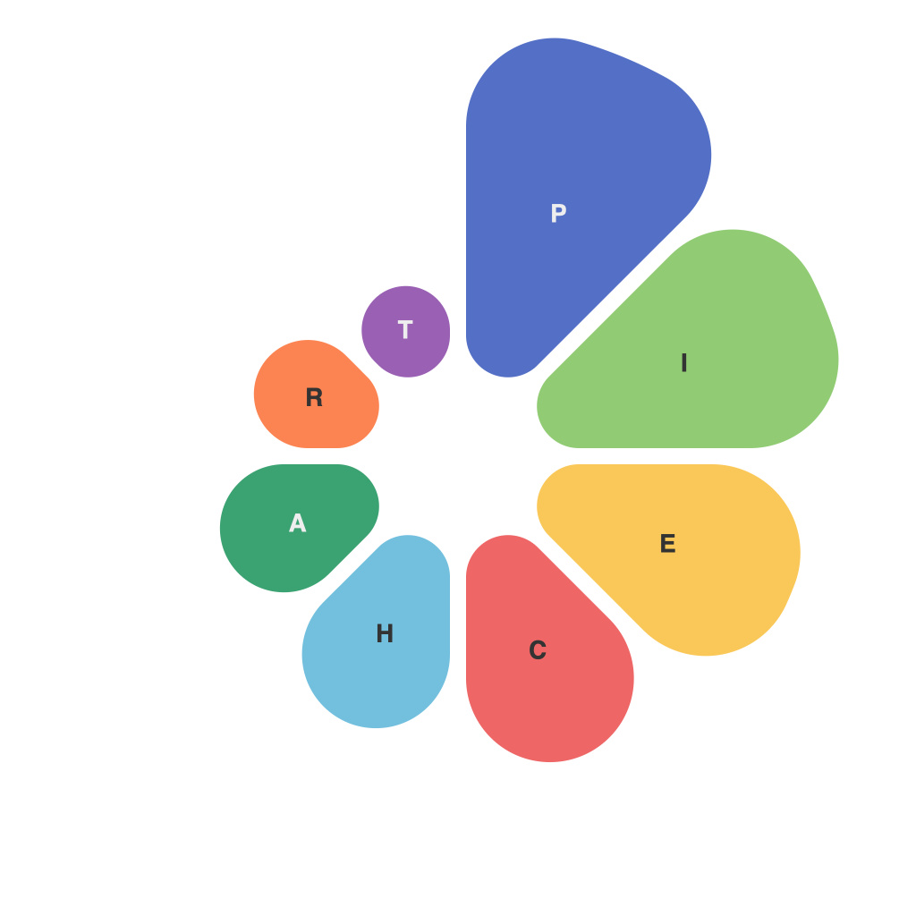
– An exploding pie chart separates one or more slices from the center of the chart to emphasize the importance of specific data points.
### Design Considerations for Creating Effective Pie Charts
Creating effective pie charts involves various considerations to ensure clarity, simplicity, and engagement among your audience:
1. **Limit the Number of Categories**: Pie charts become difficult to read when there are too many categories. Generally, the rule of thumb is to limit the number of slices to no more than 5-7. If you need to include more than this, consider other chart types, such as a stacked bar chart or a different visualization technique.
2. **Use Consistent Colors**: Each slice should be clearly distinguishable from the others to facilitate quick comparison. However, avoid using too many different colors as it may complicate the chart. Opt for a color palette that is not overly saturated or distracting.
3. **Emphasize Important Data**: If there is a particular category that you want to highlight, use the exploded pie chart technique or label it prominently. This will draw your audience’s attention to it.
4. **Label the Slices**: Provide clear labels for each slice to ensure easy interpretation. Use the space efficiently, avoiding unnecessary white space and making sure the text is readable.
5. **Simplify Text**: Unless specific values are crucial, displaying percentages for each slice is sufficient. Avoid cluttering the chart with additional text or details that could obscure the main message.
6. **Provide Context**: Always include a title or caption that explains what the chart represents, its main insights, and the context in which it applies. It helps viewers understand the purpose of the chart and interpret the data correctly.
7. **Use 3D Effect with Caution**: While some might argue that adding a 3D effect can make the chart look more appealing, it can also distort the perception of sizes, making it deceptive. Stick to a 2D pie chart unless the 3D effect truly enhances the visual storytelling of the data.
### Best Practices for Creating Effective Pie Charts
– Always test your chart with a peer or subject matter expert to ensure that it is understood and the message is clear.
– Use tools like Microsoft Excel, Google Sheets, or specialized chart creation software to facilitate the process and ensure accuracy.
– Regularly review and revise your pie charts based on feedback and user experience.
– Consider your audience’s level of expertise and adjust the complexity of your chart accordingly.
By following these guidelines, you can create effective pie charts that not only present data clearly and accurately but also engage and inform your audience effectively. Remember, the primary goal of a pie chart is to make data accessible and its insights digestible, so maintain simplicity and clarity in your design.

