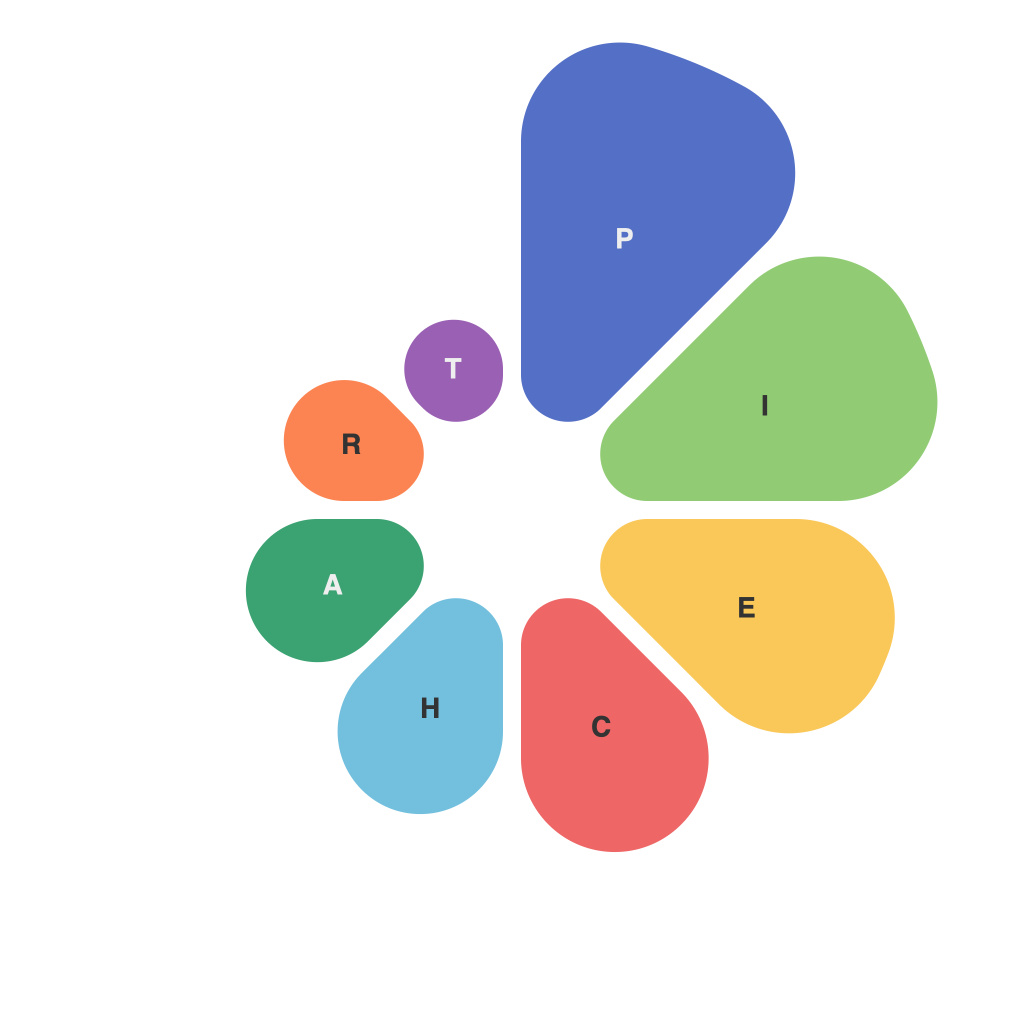
Pie charts remain one of the most iconic and pervasive visualizations in statistics and data analysis. For several years, they have been gracing journals, websites, and presentations, often wielding a strong appeal to the human eye. Despite their ubiquity, pie charts are steeped in a paradox of perception: while they offer convenience and clarity to some, they also serve as a fertile ground for misleading claims and misconceptions. Here, we delve into the art of mastering the pie, dissecting insightful insights and the misleading myths behind these ubiquitous graphical creations.
### The allure of simplicity
Pie charts are heralded for their simplicity and ease of understanding. Their circular structure metaphorically evokes the concept of a whole, with each slice representing a segment or category within that whole. The ease with which one can compare the sizes of pie slices has led to their pervasive use. However, the simplicity can mask deeper complexities in the data they represent.
### The Myth of Visual Clarity
One of the most pervasive myths about pie charts is that they convey information clearly. In reality, unless the pie slice sizes are distinctly different from one another, identifying the size差别 becomes challenging. When the slices vary significantly in size, the pie chart can indeed convey the message effectively; however, when slices are relatively similar, the comparisons can be problematic.
### The Illusion of Proportions
Another common misconception is that pie charts accurately represent proportions. While proportional pie charts do try to ensure that each slice’s angle and relative size correspond to its actual data size, this can still be a faulty assumption. Research shows that comparing angles on a pie chart is less accurate than comparing areas on a bar graph. The human brain is primed for linear comparisons but not for angular estimation.
### Aesthetics over Accuracy
Pie charts are often appreciated for their aesthetic value; their geometric symmetry is pleasing to the eye, and they look elegant. However, striving after aesthetics at the cost of data accuracy can be deceptive. The more slices added to the pie chart, the harder it becomes for the viewer’s brain to discern differences in angles or relative sizes.
### The Misconception of Easy Comparison
It is commonly believed that pie charts facilitate easy comparison across categories. But consider scenarios with more than three or four categories; in such cases, the pie chart can become cluttered and chaotic, diluting the value of clarity. Moreover, when viewers should compare multiple pie charts side by side, the pie chart format often falls short of efficient visualization.
### Insuring Effective Use
So how should one master the pie, then? Here are a few recommendations:
– **Use less is more:** Apply pie charts to a single data set with no more than 5-7 slices to ensure viewer comprehension.
– **Emphasize comparisons:** When multiple comparisons are necessary, consider using a variation of the pie chart, like a radar chart or a donut chart, which can help clarify relative sizes.
– **Provide context:** Ensure that supporting text or additional charts are there to clarify percentages or ratios if the pie chart itself is not making the point clear enough.
– **Validate your choice:** If you’re using a pie chart, make sure others would reach the same conclusions based on the chart alone.
### Conclusion
Pie charts have become embedded in our visual language, but with great power comes great responsibility. It’s time to shed old misconceptions and embrace a more nuanced understanding of how we perceive and communicate with pie charts. By doing so, we can master the circle and help our readers and viewers draw insightful conclusions from data, rather than being guided by misleading myths.

