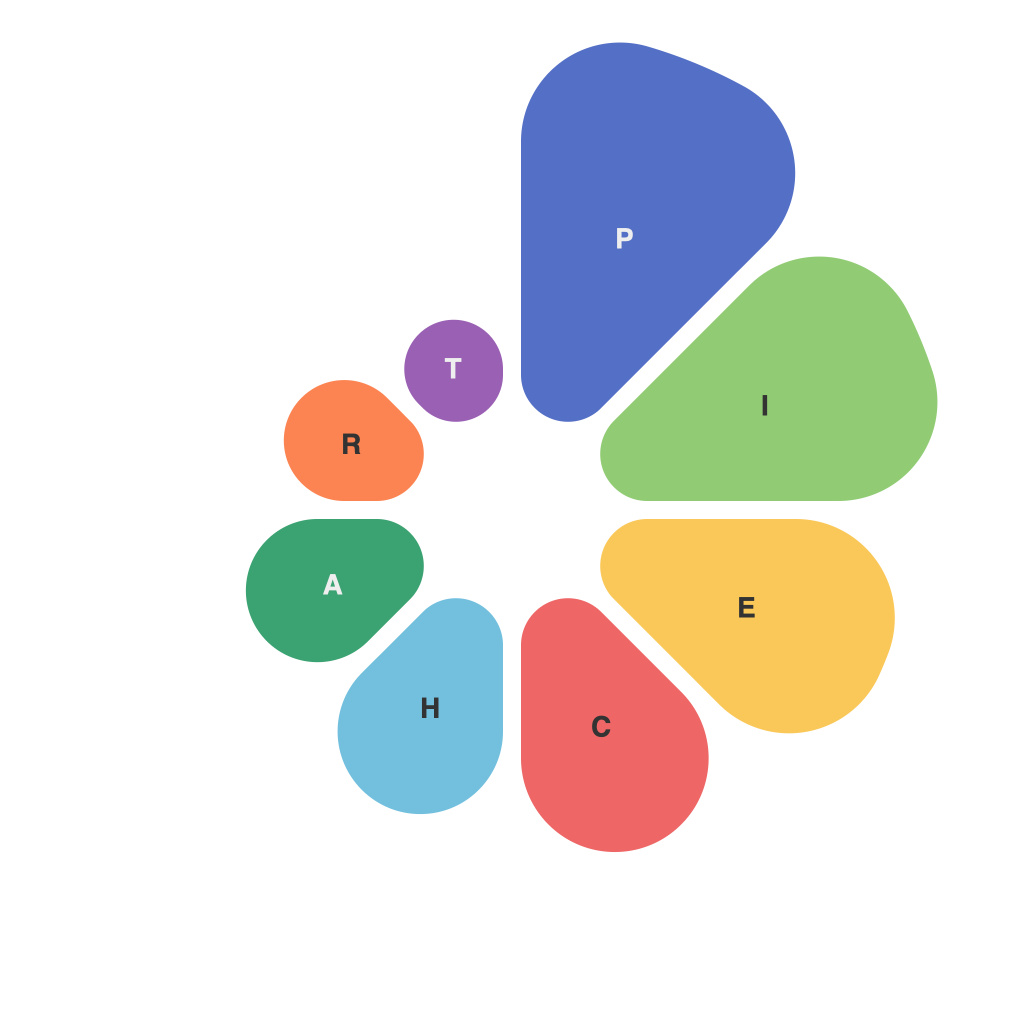
In the vast field of data visualization, one chart holds a unique place for its simplicity and versatility – the pie chart. Often dismissed as simplistic, pie charts can be a powerful tool when used correctly. This comprehensive guide, brought to you by the expert master of pie charts, PIEChartMaster, dives deep into the art of mastering pie charts. Here, we explore the nuances of pie charts, their ideal uses, and techniques to enhance their effectiveness when presenting data.
## Understanding the Pie Chart
Before diving into crafting a pie chart masterpiece, it’s crucial to understand its basic components and capabilities. A pie chart displays data as a slice of a pie, with each slice representing a proportion of the whole. These slices are labeled according to the categories they represent, often accompanied by their numerical value for transparency and clarity.
### Key Elements of a Pie Chart
– **Slices**: The segments of the pie, each representing a different category.
– **Labels**: Identifying each slice with text for clarity.
– **Legend**: If labels are insufficient, a legend can be used to match colors with categories.
## When to Use a Pie Chart
Understanding the right time to use a pie chart is as crucial as understanding its workings. PIEChartMaster advises that pie charts are best suited for displaying the composition of a whole when there are a limited number of categories. They excel in showing a comparison of values with respect to the whole, especially when there are a few major contributors and several minor ones.
### Use Cases
– **Market Share Analysis**: Illustrating how a particular product or service holds a portion of the market.
– **Budget Allocation**: Showing how funds are distributed among various departments.
– **Survey Results**: Displaying responses to a question across different segments, where the total responses add up to the whole.
## Enhancing the Effectiveness of Pie Charts
While pie charts are a powerful way to present information, there are a few techniques to refine and enhance their effectiveness, making them more accessible and appealing to the audience.
### Tips for Better Pie Charts
1. **Limit Categories**: As PIEChartMaster emphasizes, do not include more than five to seven categories. More categories diminish the readability and effectiveness of a pie chart.
2. **Use Color Wisely**: Employ colors to distinguish between categories. Avoid overly bright or clashing colors, and utilize color contrast for categorical clarity.
3. **Sort Slices**: Arrange the slices in a natural or descending order, placing the largest slices towards the top left to facilitate easier comparison and quicker comprehension.
4. **Incorporate Data Labels**: While color coding is effective, adding data labels next to or within each slice ensures that absolute values associated with each slice are accessible and comprehensible.
5. **Avoid 3D Effects**: 3D effects can distort the perception of the size of the slices, making it difficult for the audience to accurately compare the values. Stick to a flat 2D representation for clarity.
6. **Use Annotations**: For complex or comparative pie charts, consider using annotations to highlight specific data points. This enhances the interpretative capabilities of the chart while adhering to the pie chart’s primary objective of clear visual representation.
## Conclusion
Pie charts, when judiciously used, are indeed a masterstroke in data visualization. By following the guidance provided by PIEChartMaster, mastering the dynamics of pie charts becomes an achievable and rewarding endeavor. Whether you’re presenting detailed market analyses, budget allocations, or survey results, pie charts can serve as a compelling tool to communicate the essence of your data succinctly and effectively. Remember, simplicity does not always translate to simplicity; instead, it’s about simplicity in implementation and impact.

