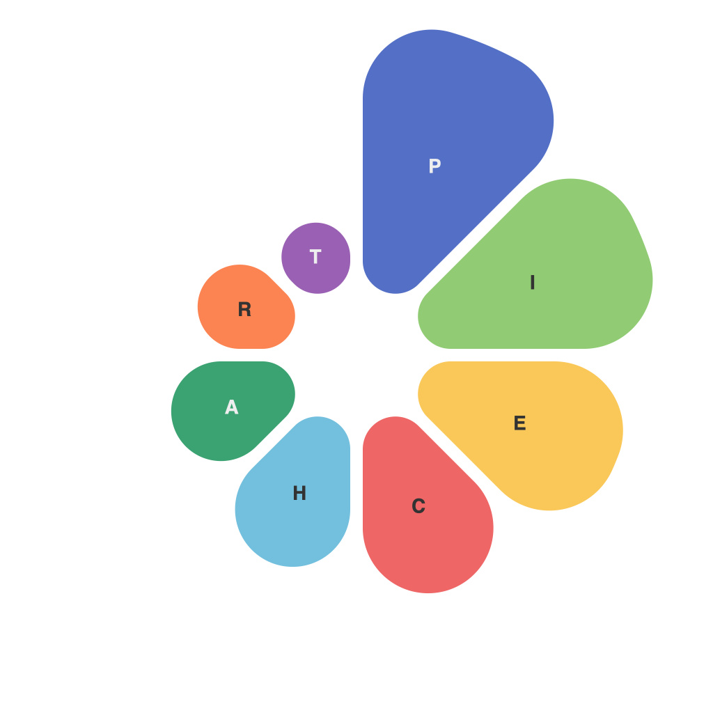
In an era where data visualization has become as essential as the data itself, masterfully conveying insights and knowledge through graphical representations is a valuable skill. Within the vast arsenal of data visualization tools, pie charts stand out as one of the most straightforward and intuitive ways to display proportional relationships in data. This comprehensive guide will explore the ins and outs of pie charts, offering insights for those looking to craft perfect pie charts for data visualization.
**Understanding Pie Charts**
Pie charts are circular graphs subdivided into sectors, each of which represents a proportionate part of a whole. The total area of the pie corresponds to the whole dataset, while each slice represents an individual data subset. The pie chart is perfect for showcasing the percentage that each category contributes to the overall dataset, making it an ideal choice for displaying parts of a whole.
**Choosing Appropriate Data**
Selecting the right data for pie charts is crucial. The data should be categorical and easily divided into parts, with distinct categories and a clear total. Pie charts are best suited to data that can be expressed as straightforward percentage contributions, like market shares, population distributions, or survey responses.
**Design Principles for Perfect Pie Charts**
1. **Keep Chart Size Reasonable**: A pie chart loses its effectiveness when it becomes too complex. If there are too many categories, it becomes difficult to discern distinct slices, causing visual clutter. Aim for five to ten categories for a pie chart to remain effective.
2. **Order Sectors Strategically**: Place the largest slice first, followed by the sectors in decreasing order of size. This logical progression helps the viewer understand the data at a glance. Moreover, if there are two nearly equal slices, it’s helpful to stack them together to signify their equivalence.
3. **Use Recognizable Colors**: Ensure that the colors used are distinctive and meaningful. Color is a key element in pie charts, as it can help differentiate between slices at a glance. Utilize color consistency within your series and consider contrasting colors for highlighters or important data points.
4. **Consider a Gradient**: If you’re dealing with a dataset with many categories close in size, use a gradient instead of different shades for the colors. This helps differentiate the sizes more effectively.
5. **Text Labels**: Use labels that are easy to read and succinct. If a slice is too small to read or if text is overlapping, consider using a legend or an interactive element that allows viewers to hover or click to reveal text labels.
**Layout and Dimensions**
1. **Avoid Rotations**: While it may seem intuitive to rotate the pie chart for readability, this often results in confusion and disorientation. Instead, present the pie horizontally or vertically without rotation.
2. **Center Text**: Placing the labels at the center can be helpful, but avoid cluttering the pie. If there are too many labels or they’re too close together, place them near the slice edges or use a legend.
3. **Space for Labeling**: Be mindful of the space around each slice—there should be enough room for labels to fit without crowding.
**Interactive Pie Charts**
Interactive pie charts offer an enhanced user experience by allowing viewers to explore each part of the pie chart independently. Hoverover features can display additional data or tooltips, and clickable sectors can focus on one category at a time, providing an immersive way to explore the data.
**Pie Charts vs. Other Charts**
While pie charts are excellent for showing part-to-whole relationships, they aren’t the only choice. Consider using other charts, like doughnut charts (which leave a space in the middle for further emphasis on a single value), donut charts (which are similar to doughnut charts with more empty space in the center), or even bar charts or line graphs when a simpler view of the data is needed.
**Best Practices for Perfect Pie Charts**
– Aim for simplicity; don’t overcomplicate the chart.
– Prioritize readability and ease of interpretation.
– Use contrast to make key pieces of data stand out.
– Test your pie charts on various devices and screen sizes to ensure they’re always accessible.
– Be consistent with your design, style, and color schemes throughout all of your data visualizations.
By following these guidelines, you can craft pie charts that excel in their purpose, providing precise insights and effective communication of your data. Whether you’re a seasoned data visualization professional or just starting out, mastering the art of creating perfect pie charts will undoubtedly enhance the clarity and impact of your data presentations.

