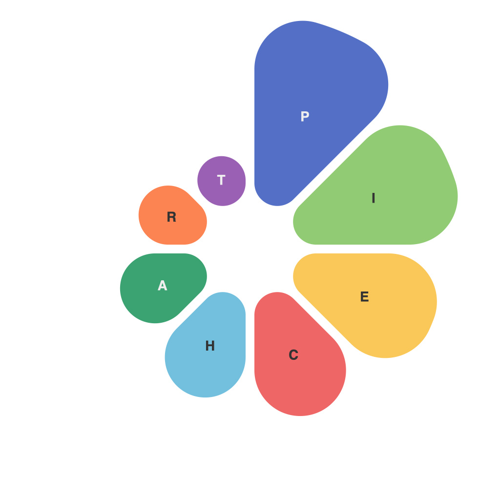
Mastering the Pie Chart: A Comprehensive Guide by PieChartMaster
Pie charts, simple yet often undervalued, play a significant role in the vast universe of data visualization. Mastering pie charts can make the difference between presenting data that’s merely read and data that’s remembered. As PieChartMaster, I provide a comprehensive guide that delves into the nuances of crafting powerful pie charts, ensuring they deliver impact in any data storytelling scenario.
### The Essence of Pie Charts
Before we dive into technical details, it’s crucial to understand when and why you’d opt for a pie chart. Pie charts excel at presenting data as percentages of a total, making them especially useful for visualizing parts of a whole. They are most effective when you have fewer than seven categories, as more categories can become cluttered and less readable. Pie charts are particularly apt for scenarios where the emphasis is on understanding the proportion each element of a group represents to the total.
### Choosing the Right Data
For a pie chart to be effective, select data that is naturally suited for comparison by percentage. Consider data that shows the distribution or proportion of different categories within a single dataset. Industries like finance, marketing, and education often utilize pie charts to illustrate budget allocations, market share, and demographic composition, respectively.
### Designing for Clarity and Impact
1. **Simplicity in Structure**: Ensure the pie chart is not overcrowded. Include labels for each slice, and use simple, readable fonts. Legend may be an alternative if the number of slices exceeds eight for ease of understanding.
2. **Color Selection**: Use contrasting colors but avoid overusing bright or clashing colors, which can be distracting. Pastel or softer colors are often more aesthetically pleasing and less overwhelming on the eye.
3. **Sorting Slices**: Arrange your slices in descending order of size. This arrangement, known as “Descending order”, helps the viewer quickly recognize which categories dominate the whole immediately.
4. **Slice Segmentation**: Large slices can obscure critical information. If a single slice is exceptionally large, consider further dividing it to maintain clarity for all represented data.
5. **Interactive Elements**: In digital formats, interactive pie charts can be incredibly effective. Allow users to hover over each slice to see specific statistics, making the data more engaging and easier to interpret.
### Best Practices for Data Interpretation
– **Avoid Comparisons within the Same Chart**: Pie charts are great for showing parts of a whole but not for comparing multiple sets of values. Consider using stacked bar charts or line graphs for comparative analysis.
– **Use “Other” or “Miscellaneous” Wisely**: Only categorize data into “Other” if it comprises less than 5% of the total. Labeling large percentages as “Other” can provide an inaccurate representation of the data distribution.
– **Keep Text Minimal**: While labels are essential, overload can detract from the chart’s readability. Ensure each label is succinct and directly relevant to the percentage it represents.
### Creating Pie Charts in Popular Tools
Whether you’re using spreadsheet software like Microsoft Excel, Google Sheets, or dedicated data visualization tools like Tableau or Qlik, the process involves data preparation, chart selection, and customization. In tools like Excel or Google Sheets, input your data, select the ‘Insert’ menu, choose ‘Pie Chart,’ then adjust properties like color, label, and slice order directly from the chart properties pane.
### Ensuring Accessibility and Ethical Presentation
– **Accessibility**: Always provide a legend for those who cannot interpret colors, which is crucial for accessibility and inclusivity. Ensure charts are readable and understandable to everyone, including those using screen readers.
– **Ethics of Data Presentation**: Be transparent and honest in your data presentation. Avoid distorting data through misleading sizes or colors, ensuring that the chart accurately reflects the dataset.
### Conclusion
Pie charts, when wielded with care and precision, can be indispensable tools in data communication. By understanding their essence, choosing the right data, designing for clarity, and adhering to best practices for interpretation and implementation, you can harness the power of pie charts to convey complex information succinctly. Remember, the key to mastering pie charts lies in leveraging their simplicity to make intricate data presentations universally graspable and compelling.

