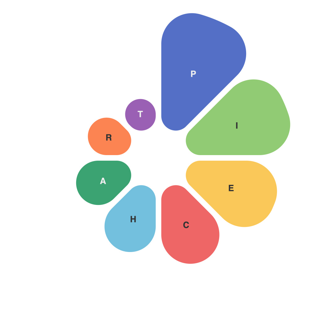
As a data visualization expert, mastering the art of pie chart creation is vital to convey information in a clear, concise, and visually appealing manner. The pie chart, a circular statistical graphic, is particularly effective for displaying data series that sum to a whole, such as population statistics, market shares, and survey results. This essential guide will equip you with the skills to become a pie chart maestro, distilling best practices, design principles, and common pitfalls to avoid.
### Understanding the Basics of Pie Charts
Pie charts consist of a single,圆圈 divided into segments, each of which corresponds to a part of the whole. The size of each segment is proportional to the value it represents. In simplest terms, a pie chart provides a snapshot of the parts-to-whole relationship in a data set.
### Selecting the Right Data
The primary rule of pie chart creation is to choose the right data. Ensure that you are using figures that can genuinely fit within the entire circle. If too many values are included or the values differ widely, the chart may become cluttered and unreadable. It is often better to use a bar or line chart for more complex or large data sets.
### Design Principles to Embrace
Creating an effective pie chart requires attention to a variety of design principles:
#### 1. Clarity and Simplicity
Avoid cluttering the chart with too many slices, as this can distract from the message. Typically, stick to five segments or fewer to maintain clarity.
#### 2. Color and Contrast
Use colors that are distinct yet complementary to stand out. Ensure there is a clear contrast between segments to make them easily distinguishable. Too many colors or an ineffective color scheme can be visually overwhelming.
#### 3. Labeling
Always label each segment clearly, so viewers can understand what each segment represents. Labels also make pie charts more informative and self-explanatory.
#### 4. Label Positioning
Position the labels outside the pie or use a different font style for them to avoid clutter in the center. Placing labels inside the chart may interfere with the reader’s ability to clearly differentiate segments.
### Effective Usage Cases
Pie charts excel in showing:
– Market share comparisons
– Survey results
– Budget allocations
– Comparative frequency distributions
– Simple proportional relationships
### Avoiding Pitfalls
Here are some common mistakes to avoid when crafting pie charts:
– **Circular Misconceptions**: Don’t mistake straight lines for arc lengths when estimating percentages. It’s best to use percentages and angles for accurate comparisons.
– **Overly Complex Data**: Stay away from pie charts for highly complex data sets or data with more than around five values.
– **3D Pie Charts**: Avoid adding depth to pie charts as it makes it more difficult to perceive size differences between segments.
– **Using Labels Inside Pie Charts**: Keep labels outside the pie chart for better readability. Inside pie charts are harder to read and draw attention away from the value of the segments.
### Advanced Techniques
For more advanced users, consider these techniques to enhance your pie chart:
– **Adding a Secondary Dimension**: If you have two or more related figures to report, you might overlay them by dividing a pie into multiple segments within the same chart.
– **Using Donut Charts**: If the pie chart feels cluttered, consider reshaping it into a donut chart, which reduces the visual weight of the center and gives the chart more space to play with.
– **Interactivity**: Create interactive pie charts that users can slice to explore data segments or use hover effects that show detailed information when over each slice.
Mastering the pie chart is both an art and a science. By adhering to best practices, understanding your audience, and incorporating advanced techniques as needed, you can create pie charts that not only convey information but also engage and educate your viewers. With this guide as your compass, you’re well on your way to pie chart excellence.

