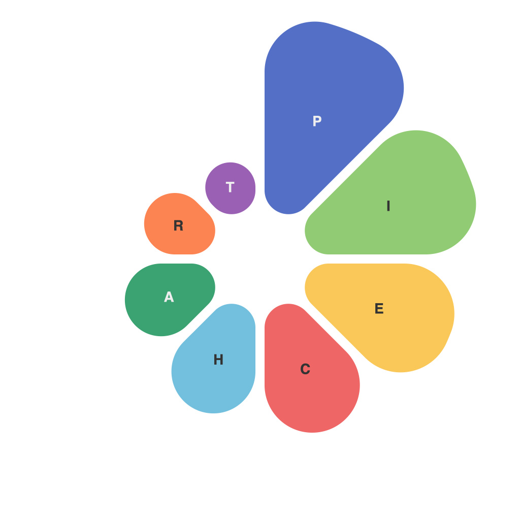
**Mastering the Pie Chart: PieChartMaster’s Guide to Data Visualization Perfection**
Pie charts have long been a staple of the data visualization toolkit, providing a simple, straightforward way to represent the composition of a whole. However, while they might appear effortless, creating a pie chart that effectively communicates complex data can be a delicate balance. This is where PieChartMaster comes in, with our comprehensive guide to help you achieve data visualization perfection through pie charts.
**Understanding the Pie Chart’s Purpose**
To start, it’s essential to understand the purpose of pie charts. These visuals are best used when you want to show how individual parts contribute to the overall whole. It’s particularly effective with just a few slices, as the human brain struggles to accurately assign values to numerous segments. If the pie chart is going to have more than five or six slices, consider using a bar or a line chart instead.
**Choosing the Right Data**
Select your data carefully; it should be straightforward and represent something that can be understood at a glance. Avoid using pie charts for displaying trends over time (that’s the domain of line charts) or for making comparisons between different datasets (this is better suited for side-by-side bar charts).
**Keep It Symmetric**
Ensure that the slices of the pie chart appear as identical as possible to avoid any unnecessary perception of bias. The symmetry makes the chart fairer and can help prevent visual misinterpretation. When displaying percentages, always consider rounding these numbers to simplify understanding. For example, instead of 25.55%, the figure can be presented as 26%.
**The Perfect Balance: Too Many Slices v. Not Enough**
If you end up with a pie chart that has too many slices—a few beyond the five or six slice threshold—it can be overwhelming and confusing for the viewer. Consider breaking the chart into multiple pie charts or using a different format. Conversely, if there are not enough slices, the chart becomes less effective in conveying the proportion of data points relative to the whole.
**Labeling and Color Coding**
Properly label your pie slices with clear, concise text. Descriptive labels improve the chart’s readability and eliminate confusion. When using colors, choose a palette that contrasts well, making it easy for the eye to delineate between slices. The colors should be consistent throughout to maintain the chart’s visual narrative and avoid distractions.
**Legends and Titles**
Include a legend if you’re using multiple colors to represent different categories. However, a well-constructed pie chart should be self-explanatory, so it is critical that each slice’s color is distinct and easily identifiable without referencing a legend. A title should succinctly reflect the pie chart’s purpose, adding context to what is being shown.
**The Art of Arrangement**
A common misconception is that pie charts should start at 12 o’clock. This isn’t a strict rule; in fact, the arrangement should not bias the reader. Placing the largest slice on the left or at the top can naturally draw attention, but it’s important to choose a layout that doesn’t imply a comparative superiority of one part over the other.
**Interactive vs. Static Pie Charts**
Static pie charts do not offer the same interactivity as other forms, so they can be limited to visual storytelling rather than analysis. However, there are interactive elements that can be added such as clickable slices for detail, or the ability to transition from one view to another with a single click or swipe, providing a richer user experience.
**Pie Chart Alternatives**
Remember that pie charts have their limitations. Sometimes, a different type of chart might be more effective. For example, a bar chart might be used if your data is more about comparisons than proportions.
**Expert Tips From PieChartMaster**
1. Keep the chart simple by removing any non-essential elements such as gridlines, which can clutter the display.
2. When presenting a pie chart, be sure to clarify the reference point—it could be the entire pie itself or a particular category.
3. Remember that humans are generally better at comparing lengths rather than angles. Therefore, pie charts that can be split or compared side-by-side may be more effective.
Pie charts can be a powerful tool in your data visualization arsenal when used correctly. With PieChartMaster’s guide to data visualization perfection, you’ll be able to create pie charts that effectively communicate your data and help your audience understand the story that the numbers tell. Embrace these principles, and your pie charts will no longer be mere decorations on a dashboard—they will be the heart of a compelling narrative, telling your data’s story with clarity and impact.

