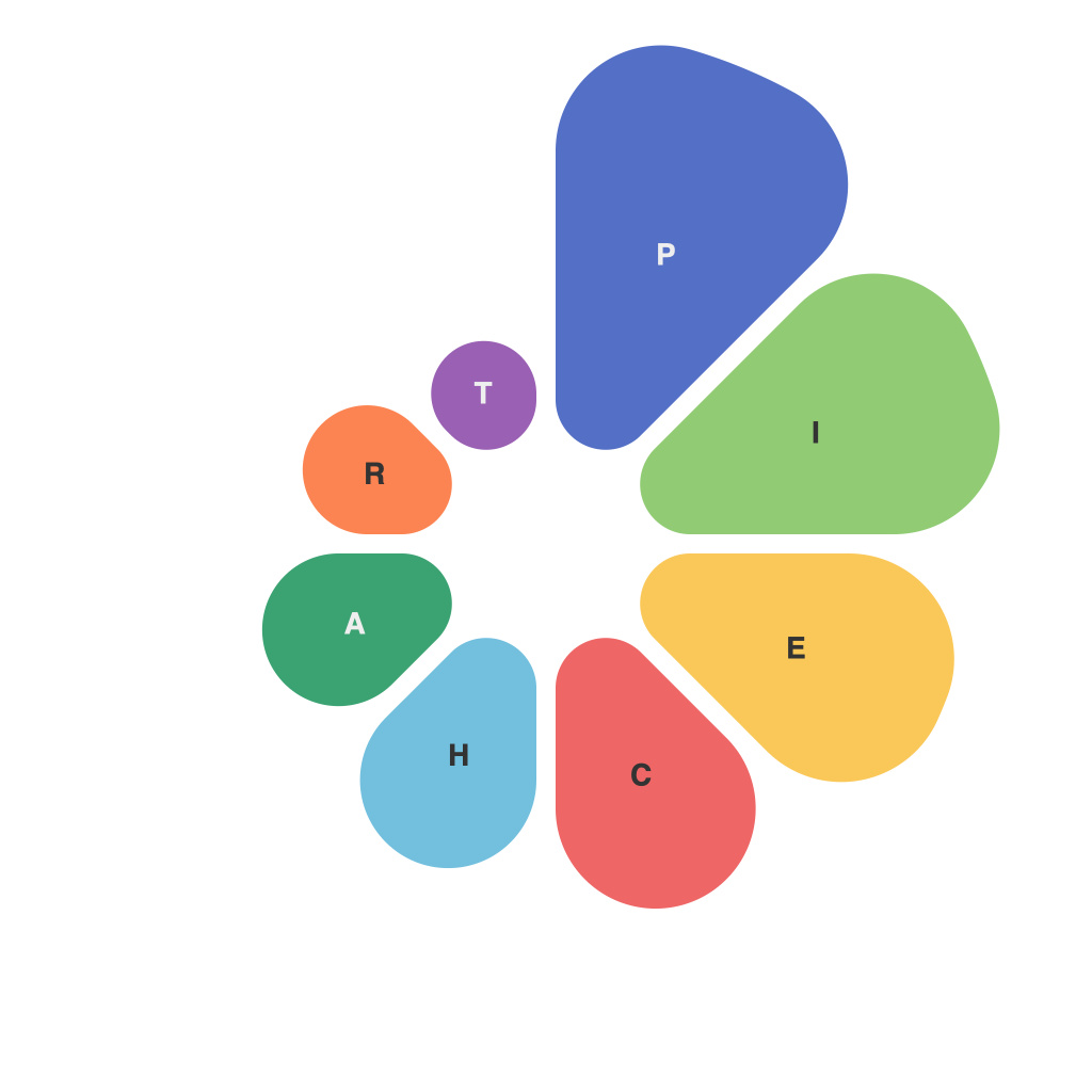
Mastering the Pie Chart: The PieChartMaster’s Ultimate Guide to Data Visualization Mastery
In the world of data visualization, the pie chart has long been a staple. This round, segmented graph can effectively show proportions, percentages, and comparisons of different categories within a whole. Its simplicity makes it a frequent choice for presentations and dashboards alike. However, to truly master the art of the pie chart, one must go beyond the basics and understand the nuances that can elevate this chart from mere reportage to insightful visualization. Welcome to the PieChartMaster’s Ultimate Guide to Data Visualization Mastery.
**Understanding the Basics**
**What is a Pie Chart?**
A pie chart divides the total data value represented by the entire circle into slices. Each slice represents a category with a size proportional to the amount it represents. The whole circle represents the sum of all parts.
**When to Use a Pie Chart?**
Pie charts are best employed when presenting data with exactly two variables: one that divides the data into categories, and one that measures the size of the categories.
They shine when you want to:
– Highlight the composition of something (e.g., sales by region).
– Make proportional comparisons between categories (e.g., revenue distribution).
**Choosing the Right Pie Chart Format**
**Standard Pie Chart:**
This is the classic format where slices are labeled with data and percentages, ideal for 4-6 slices.
**Donut Chart:**
Removing the center allows more space for labels. This format works better for displaying proportionally-sized parts compared to the rest of the data.
**Exploded Pie Chart:**
The slices are “exploded” out for emphasis, which can work well for fewer slices but might be overwhelming with many.
**3D Pie Chart:**
While visually appealing, 3D effects often distract from the data and are generally not recommended.
**Mastering the Art**
**Clarity and Simplicity:**
1. Keep the number of slices at less than 6-8 to avoid clutter.
2. Use legend and data labels as needed, but too many labels can be distracting.
**Labeling Wisely:**
Labels provide context and aid comprehension. Place them outside the chart when possible. For labels within, keep the words short, but include the category name if there’s space.
**Color Palette:**
A color palette that contrasts with the background should be used. Avoid clashing colors and ensure there are strong contrasts for all slices if color-dependent perception is vital.
**Comparison Charts:**
Use a technique like the pie-of-pies or donut chart if you need to compare two data series.
**Understanding Proportions:**
Ensure the size of each slice matches its actual proportion in the data—it is not just visually appealing when it looks right; correctness is key.
**Interactivity and Tools:**
With modern tools such as Tableau, Power BI, or other data visualization software, pie charts can be made interactive. Use dynamic slices and mouseover effects to enhance user engagement.
**Common Mistakes to Avoid**
1. Avoid adding too many slices.
2. Don’t use the pie chart for large datasets.
3. Steer clear of 3D pie charts and unnecessary visual effects.
4. Don’t compare pies from different data sources.
**Final Thoughts**
The pie chart is not a one-size-fits-all solution but a powerful tool in the data visualization toolbox. By becoming a PieChartMaster, you can effectively articulate complex data stories through this unique format. Remember, the goal of data visualization is not just to show numbers but to help your audience grasp the story the data is telling. Keep your slices simple, your labels clear, and your message bold, and your pie charts will not only stand out but also provide deep insights to your audience. Happy visualizing!

