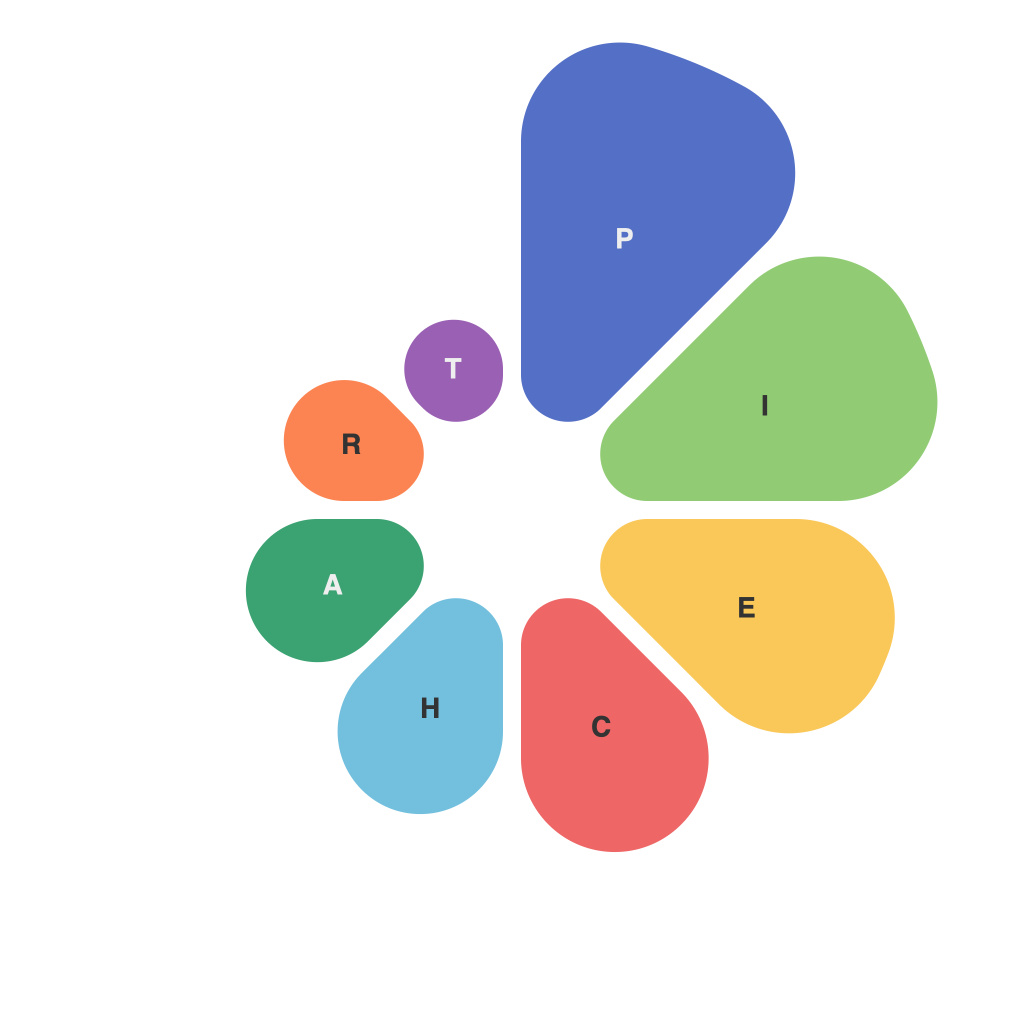
Pie charts are an invaluable tool in the world of data visualization, allowing us to distill complex sets of data into easy-to-understand, circular representations. They are used in a variety of contexts to depict proportions in a single category, making them an ideal choice when you want to quickly understand the relationship between parts and whole.
While pie charts have been widely utilized for decades, harnessing their full potential requires an intimate understanding of best practices. This guide, crafted by PieChartMaster, aims to be your comprehensive resource for mastering the art of pie charts.
### The Basics ofPie Charts
At their core, pie charts display data in slices of a circle, where each slice represents a proportionate share of a whole. A well-crafted pie chart can quickly summarize large amounts of data, but it is crucial to recognize the limitations of this format. When pie charts are used excessively or incorrectly, they can lead to misconceptions and misinterpretation of information.
#### Understanding Proportions and Perspectives
One of the key aspects of a successful pie chart is ensuring that each slice is accurately proportionate to the data it represents. The relative sizes of the slices must be easily discernible, allowing the viewer to quickly compare proportions between different data points.
To keep the viewer’s perspective accurate, PieChartMaster recommends using straightforward comparisons between slices, especially with only a few slices. When a pie chart has many small slices, they might appear nearly identical, rendering it difficult to discern even with the most skilled eye. A good rule of thumb is to keep pie charts to no more than six or seven slices, but this number can be adjusted depending on the complexity of the data and the specific context of usage.
### Color Theory for Impact
Color plays a crucial role in the perception of pie charts. Colors should not only differentiate one slice from another but also be visually appealing and easy to interpret. PieChartMaster emphasizes the following color theory principles:
– **Contrast**: Use contrasting colors to distinguish slices and highlight important data points.
– **Minimalism**: Stick to a color palette that doesn’t overwhelm the chart. Too many colors can easily become confusing.
– **Consistency**: Choose a color scheme that fits the data and reflects the brand or theme behind the presentation.
### Choosing the Perfect Title and Labels
To provide context and guide the viewer’s eyes through the pie chart, it is important to utilize clear and concise titles and labels. PieChartMaster’s guide suggests:
– **Titles**: Make them informative and memorable without being overly complex.
– **Labels**: Use legible fonts and make sure that the labels for the slices directly match up with the data represented.
### The Case for Labels Inside and Outside
When it comes to label placement, the debate is as contentious as the use of pie charts itself. PieChartMaster’s guide advocates for a combined placement, including labels inside and outside the pie chart:
– **Inside Placement**: Saves space and keeps the chart clean, but can become cluttered and make the chart look busy.
– **Outside Placement**: Increases readability and reduces the potential for confusion, but might leave the viewer feeling disconnected from the actual pie chart.
### The Power of Interaction
Interactive pie charts offer new opportunities for data exploration, allowing users to hover over or click on different slices to uncover more details. PieChartMaster advises on the following interactive design principles:
– **Consistency**: Ensure that the interactive features are intuitive and work consistently across the entire chart.
– **Focus**: Allow users to focus on and manipulate the slice they are interested in without cluttering the overall view.
– **Efficiency**: Make sure that the interactive elements enhance understanding rather than distracting from it.
### Beyond the Standard Pie Chart
PieChartMaster’s guide touches on alternative pie chart styles, such as donut charts, where the center of the circle is removed to emphasize the pie components. This variation can offer better readability and space utilization when the data distribution is highly uneven.
### Data Accuracy and Assumptions
It cannot be overstated that the credibility of pie charts hinges on the accuracy of the data they represent. PieChartMaster stresses the importance of:
– **Data Sources**: Ensure the data is reputable and reflects the reality you aim to illustrate.
– **Transparency**: Always disclose any assumptions or adjustments made to the data.
### Concluding Thoughts
Mastering the pie chart may seem daunting, but with PieChartMaster’s step-by-step guide, you now have the knowledge to create effective pie charts that stand the test of time. Just remember, while pie charts are a powerful tool for data visualization, they should always be chosen with intention. Use them to enhance understanding and insight, but never sacrifice data clarity for convenience. With practice and adherence to the principles outlined here, your pie charts will become effective and compelling representations of your data’s story.

