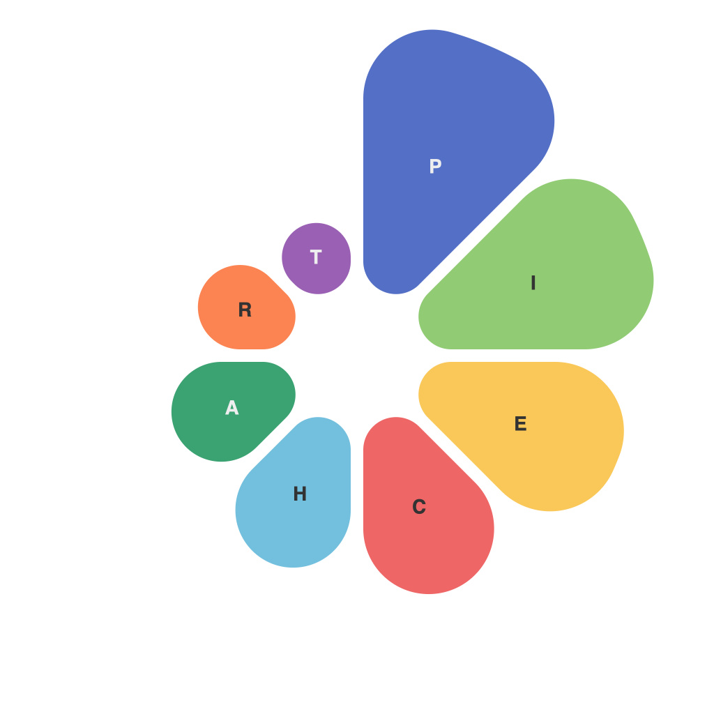
Pie charts are one of the most common visual tools used in data analysis and representation. Their simple, round design allows for quick comprehension of large sets of data at a glance. Crafting a perfect pie chart begins with understanding the purpose of your data visualization, learning the techniques for creating effective charts, and ensuring clarity and consistency in design. This ultimate guide will walk you through the process of mastering the pie: from pie chart fundamentals to expert-level best practices for data visualization mastery.
### Understanding Pie Charts
#### 1. Basic Concept
A pie chart is a circular statistical graph where segments are sliced to represent the portions or percentages of a whole. Its appeal lies in its ability to compare the size of different categories quickly and efficiently.
#### 2. Use Cases
While pie charts are often misunderstood or misused, they are particularly useful when dealing with a limited number of categories and when the pie chart design communicates its message effectively. They excel in visualizing the distribution of a single variable across a small number of categories.
### Choosing the Ideal Pie Chart Design
#### 1. Limit Number of Categories
Pie charts are most effective with a small number of categories—usually five or fewer. If there are too many, it can become cluttered and challenging to interpret.
#### 2. Color Coding
Use a palette of distinct colors to clearly differentiate between the portions of the pie chart and aid in quick identification. Ensure that the color scheme is accessible for all viewers, especially those with color vision deficiencies.
#### 3. labels and Legend
Ensure clear and concise labels on each slice. A legend can be included to help viewers understand the meanings of the different colors if needed, though it’s often unnecessary.
### Crafting a Perfect Slice
#### 1. Segment Size
Properly proportion the segments so that they visually represent the size of each category accurately. Ensure they are slices, not wedges, for a more traditional and intuitive layout.
#### 2. Alignment of Slices
Order the slices from smallest to largest around the circle where they intersect the pie to make viewing easier.
#### 3. Avoid 3D and Transparent Effects
The 3D effects and transparency can distort the perception of the data, so it’s best to stick to a 2D flat design.
### Effective Data Representation
#### 1. Include Data Label
Place the exact percentage or number inside each slice for precise understanding. Position these labels either inside or outside the pie chart, depending on the space you have and the level of detail you want to showcase.
#### 2. Avoid Splitting Slices
Dividing slices into wedges for additional data points can make the chart difficult to interpret. If you have additional information, consider a different chart type, like a donut chart.
#### 3. Center Information Vertically
Centralize the information that appears as text vertically for better alignment and aesthetic appeal.
### Mastering the Art
#### 1. Telling a Story
A perfect pie chart not only presents data—it tells a story. Your chart should communicate a clear message or insight about the data it represents.
#### 2. Adapting for Different Audiences
Tailor the design and the level of detail based on the audience’s expertise and the context in which the chart is used.
#### 3. Consistency Across Projects
Develop a set of design principles for your pie charts. Apply this consistency to ensure brand identity and familiarity for your viewers.
### Conclusion
Pie charts can be a powerful tool for data visualization when wielded with care. By following this ultimate guide, you can craft clear, impactful, and accurate data visualizations that tell stories, enhance understanding, and assist in decision-making. Remember, the perfect pie chart is not just about the pie—the masterpiece lies within the narrative it weaves.

