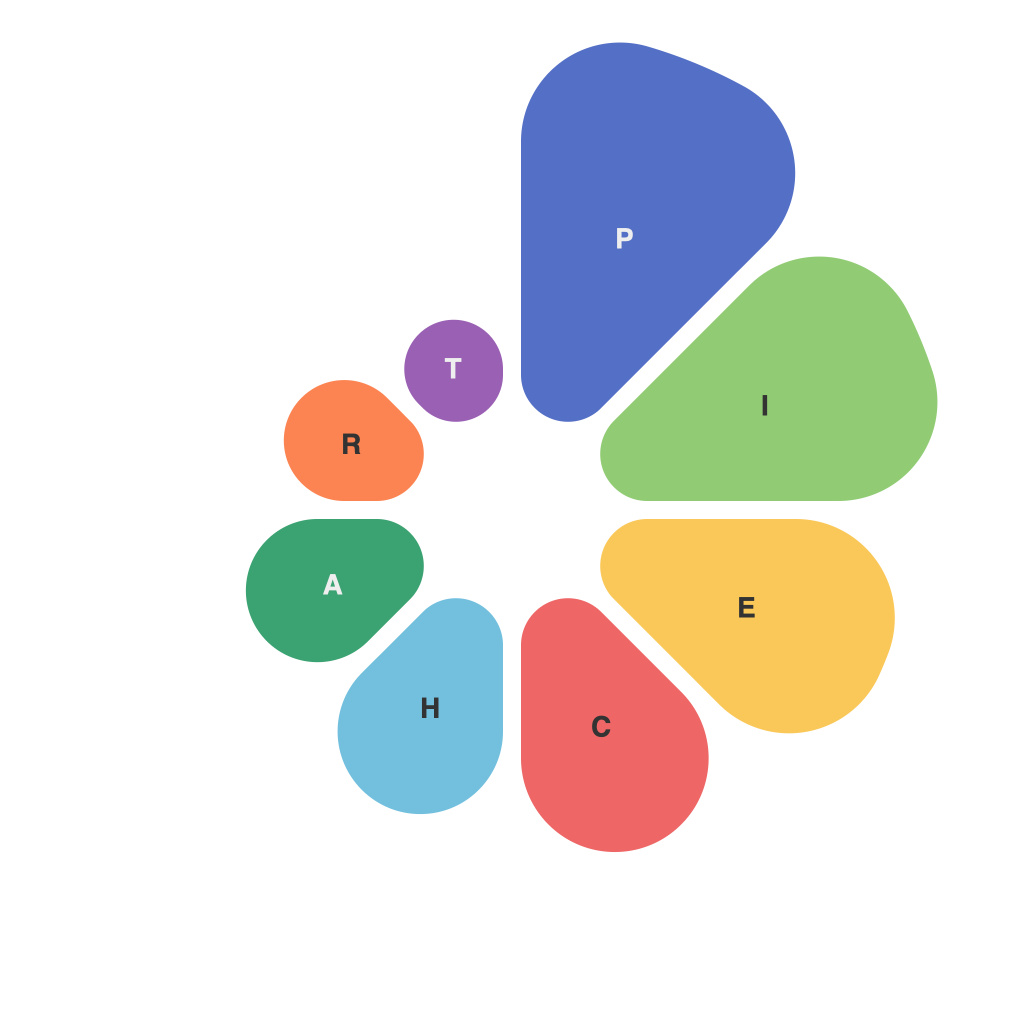
In the realm of data visualization, the pie chart stands as a versatile and often captivating way to represent proportions and sizes. It’s a visual form that has been with us for generations, yet for every master who crafts compelling and easily interpreted pie charts, there are countless missteps that leave the audience baffled and overwhelmed. Welcome to the PieChartMaster’s workshop, where we endeavor to unveil the secrets that separate the average pie from a masterpiece.
The first principle for any PieChartMaster is precision. Accuracy in every detail is critical. It starts with the data itself. Whether sourced from complex algorithms or simple surveys, the numbers must be reliable and accurate. The PieChartMaster meticulously verifies every piece of data before it touches a chart.
Once the data is secure, the next step involves selecting the right pie chart type. There are several options, including the standard pie chart, doughnut chart, or segmented pie with a map. The PieChartMaster considers the story they want to tell, understanding the strengths and limitations of each. For example, the segmented pie can sometimes make comparisons easier while the doughnut chart leaves more room for textual information.
A key to ensuring visual data excellence is the arrangement of pie slices. The master crafts pie charts with a logical order that is reflective of the narrative they wish to convey. Whether it’s arranging slices from the largest to smallest or by categories that are contextually relevant, the PieChartMaster prioritizes the arrangement to communicate meaning without confusion.
One must not overlook the colors used in pie charts. hues can guide the viewer’s eye to the most important data, and it is up to the PieChartMaster to use them wisely. A good rule of thumb is to employ a palette that can stand out against the background and differentiate every slice with distinct colors that are not just pleasing to the eye, but also communicate meaning effectively.
Text and labeling are integral to a PieChartMaster’s work. Verbose labels can overwhelm a pie chart, so it’s all about finding the sweet spot. The master uses clear and concise labels and can take advantage of hover effects, legends, or interactivity to display all necessary information without clutter.
Legibility is a cornerstone of the PieChartMaster’s craft. Text should be easily read and large enough to stand out, while the chart should be adjusted according to the audience’s viewing distance. Charts that require the viewer to squint or strain their eyes are no longer effective.
Another nuance lies in the design. The PieChartMaster understands that clean lines and a minimalist aesthetic can significantly enhance the pie chart’s effectiveness. Clutter with unnecessary borders, shadows, or decorations can lead to distractions and confusion.
Animation can be powerful in pie charts, but it must be used judiciously. The PieChartMaster knows how to animate transitions with an emphasis on smoothness and clarity, ensuring that the viewer can follow changes and updates effortlessly.
Finally, the PieChartMaster never loses sight of the audience. Consider who will be consuming the pie chart and why. Is the goal to inform, persuade, or motivate? The master creates with the end-user in mind, tailoring the chart to meet their needs.
In mastering the pie, the PieChartMaster’s journey is one of understanding and balancing the art and science of data visualization. It is a blend of meticulous attention to detail, creative design, and a deep connection to the message and the audience. Through these secrets, the PieChartMaster can turn a mere pie slice into a beacon of visual data excellence.

