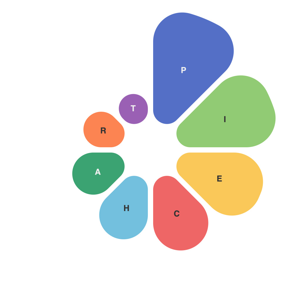
Data visualization is an art and a science, intertwining the ability to interpret complex information with the creativity to craft visuals that captivate audiences. In this world, the pie chart stands as a staple, a timeless graphic that beautifully expresses proportions and percentages in a single, easy-to-understand slice. As a data visualization expert, mastering the pie chart isn’t merely about crafting an image, but about conveying the nuanced story hidden within your data. Read on to unlock the secrets of pie chart mastery, and discover how to use this visual tool to its full potential.
**Understanding the Basics**
Pie charts are round shapes divided into sectors that correspond to the relative magnitude of the categories or pieces of data they represent. A full pie is 100% and if it’s divided into four equal sectors, each slice will represent a quarter or 25% of the whole.
Pie charts work best when there are between 5 and 8 categories. This simplicity makes them an effective way to highlight a few key data points or compare whole proportions, but too many segments can make the chart difficult to read and understand.
**Choosing the Right Colors and Labels**
The choice of colors can either enhance the readability of the chart or detract from it. It’s crucial to use a color palette that not only distinguishes different sectors but also aligns with your brand guidelines or preferences. Colors should be consistent throughout the pie chart and avoid clashing so it doesn’t confuse viewers.
Labels play an equally important role. Use clear and concise language to describe the categories or data points. When dealing with numerous categories, consider using a legend on the side of the chart to make it easier for viewers to reference categories corresponding to specific color slices.
**Selecting the Right Font and Size**
Font choice and sizing have a substantial impact on a pie chart’s readability. San serif fonts, like Arial or Helvetica, are often the go-to choices due to their clarity and clean lines. For the font size, ensure that labels and the legend are legible at all times. The key is to not overwhelm the information with text but to have a balanced amount of detail for understanding.
**Optimizing for Context**
Before diving into the design of a pie chart, always consider the context. If your goal is to illustrate a change over time or compare data across more than one variable, a pie chart might not be the ideal choice. Bar charts or line graphs (for trends) could be more suitable.
However, if a pie chart is the right tool for your data, make sure the visual elements work together. Align the sectors with the major sector first on the right or the bottom to start from the largest segment and work your way down if needed, as the human eye naturally reads in a circular motion from the edge inward.
**Emphasizing Key Data Points**
Highlight the most critical data point in your pie chart by making it larger than the others. This can be done by using a different color or filling it with a contrasting color. You could also add a label directly to the largest slice for emphasis. It’s important to balance the visual emphasis so that it doesn’t misrepresent the value or importance of the piece relative to the whole.
**Avoiding Misinterpretation**
To prevent misinterpretation, ensure that your pie chart aligns with the actual data it represents. Watch out for common missteps like:
– Starting the angle at a random point instead of a convenient interval like 12 o’clock.
– Not making clear what the chart represents; for example, a pie chart showing a company’s market share might need a caption to remind viewers the pie segments represent percent of sales.
– Overusing pie charts, when a different visualization tool would make the data far more digestible and informative.
**Pie Chart Alternatives**
Remember, a pie chart is just one tool in your data visualization arsenal. As a data expert, be prepared to pivot to other tools if a pie chart would not serve your data well. Bar charts, radar charts, or even bubble charts are just a couple of examples that could also be used to present the data you have.
**Conclusion – The Grand Finale**
Mastering the pie chart is more than just understanding the mechanics of creating a round, segmented graphic. It’s about conveying a story, making a point, and impacting the way your audience looks at the world through your data. By carefully choosing colors, labels, and presentation style, and always keeping user comprehension at the forefront, you can unlock the power of pie charts in your data visualization endeavors. With the right strategy in place, your pie chart will stand as a beacon of clear communication, helping your audience see the big picture and dive deeper into the data with confidence.

