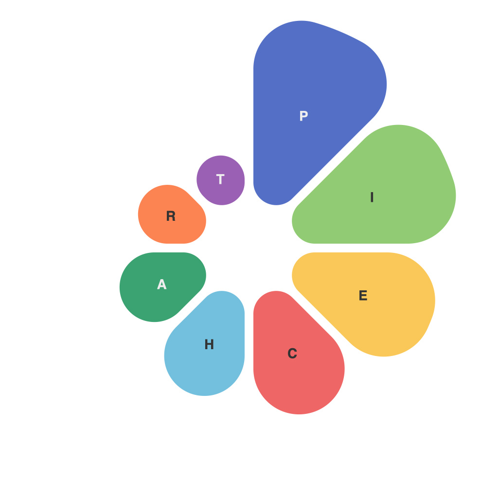
Creating effective and impactful visual representations of data often requires thoughtful selection of the appropriate graphical format. Pie charts, in particular, are a popular choice for demonstrating proportions or parts of a whole. They can provide a clear, at-a-glance understanding of relationship structures, particularly when there are a limited number of categories involved. However, to truly harness the power of pie charts to effectively communicate your data insights, it’s crucial to master several key aspects and nuances. This comprehensive guide aims to outline best practices and strategies for constructing pie charts that are not only visually appealing but also fully informative for their intended audience.
### 1. **Understanding Pie Charts**
Pie charts depict data as a circle, partitioned into slices or wedges representing each value. Each slice’s angle is proportional to the value it represents. This graphical tool is particularly useful when the goal is to compare parts of a whole or to illustrate the relative size of several categories.
### 2. **Definitive Categories**
To maximize effectiveness, pie charts should be used for a limited number of categories, ideally between 2 and 7. More categories can make it harder for viewers to distinguish between smaller slices, leading to misinterpretation.
### 3. **Label Clarity**
Each slice should be clearly labeled with the category’s name and its percentage. Ensure that labels are concise, readable, and placed in positions that do not overlap or obscure adjacent slices. Avoid cluttering the chart with too much text.
### 4. **Consistent Data Proportions**
The size of each slice should exactly reflect the proportion of the whole that it represents. This visual consistency allows viewers to quickly compare the relative sizes of different categories.
### 5. **Color Choice**
Colors can enhance the visual appeal and make certain slices more noticeable. Use a color scheme that is easy on the eye while also providing contrast between different slices. Consider using a colorblind-friendly palette to accommodate users with color vision deficiencies.
### 6. **Accessibility**
Pie charts should be designed with accessibility in mind. This involves ensuring that the chart can be easily understood by those with visual impairments. Use high-contrast colors, larger font sizes for labels, and consider incorporating text descriptions of the chart’s main findings.
### 7. **Legend Utilization**
For charts with complex labels or multiple colors, a legend can be helpful. However, this should be done sparingly as overuse can detract from the chart’s simplicity and ease of understanding.
### 8. **Simplicity Over Complexity**
Maintain simplicity in design to avoid overwhelming the viewer. Avoid extraneous elements, such as multiple datasets on a single chart, which can dilute focus and make the information more difficult to comprehend.
### 9. **Purpose and Audience**
Before creating a pie chart, consider the purpose of your data visualization and the characteristics of your audience. Ensure the chart aligns with the message you wish to convey and is understandable to your specific audience.
### 10. **Testing and Feedback**
Before finalizing your chart, test it with a sample audience to gauge their understanding and digestibility. Use this feedback to make necessary adjustments, ensuring your chart effectively communicates the intended information.
By adhering to these guidelines, you can create pie charts that are not only visually appealing but also highly effective in communicating complex data in an accessible and understandable manner. Remember that the heart of any data visualization should be clarity, ensuring that the numbers tell a compelling story that resonates with your audience.

