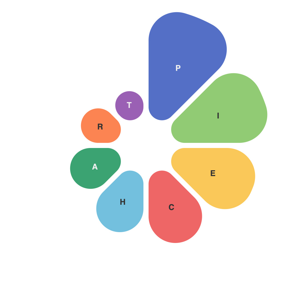
In the vast ocean of data presentation, the humble pie chart has long been a staple, floating with its slices across PowerPoint slides, infographics, and reports since the early 20th century. While the simplicity of its circular shape and segmentation may deceive, the true art and strategic mastery behind choosing the perfect pie chart palette are not so simple. A well-crafted pie chart palette has the power to illuminate data, misguide the viewer, or worse, leave it to the viewer to navigate a visual maze of color confusion.
**The Core of the Palette**
The foundation of any effective pie chart begins with the palette itself; it must serve as a map to the data’s meaning. A strategic palette helps users visualize proportions without confusion. Here are core principles to consider:
**1. Contrast and Distinction**
Choosing colors that stand in stark contrast to one another is crucial. Sufficient color contrast ensures that different slices are easily distinguishable, providing insight into the data without requiring close-up scrutiny. A well-known contrast ratio, the Web Content Accessibility Guidelines (WCAG), provides a quantifiable standard for readability.
**2. Consistency Over Creativity**
While creativity may lead to dazzling hues, consistency is more vital in the context of data visualization. When building a palette, consider hues, saturation, and lightness. Varying these in a harmonious way can highlight patterns and trends in the data but avoid stark, distracting changes that could confuse the viewer.
**3. Limited Palette**
The human eye works best with a limited color palette, so avoid overwhelming it with too many hues. A small, meaningful list of colors will streamline interpretation, making it easier for the reader to grasp complex information.
**4. Color Psychology**
The colors we choose are not just about visual impact; they imply feeling and emotion. Warm colors like reds and oranges might suggest danger or importance, while blues and greens evoke trust and calm. Strategic use of color psychology can add depth to the story your pie chart is telling.
**Strategic Use of Slices**
In pie charts, the size of each slice should directly correspond to its value within the data set. The strategy behind the palette extends beyond the color itself—it also influences how much attention each slice garners. For instance:
**1. Highlight Key Segments**
One approach is to make the largest slice — which often represents the top value in the data — larger and more prominent. This can draw immediate attention to the most significant data point.
**2. Sequential Patterns**
Using colors that fade from one to the next can create a sense of sequence or progression, aiding the viewer in following the data’s trajectory.
**Avoidance of Pitfalls**
Mastering pie charts also involves avoiding common pitfalls:
**1. Grouping Information Incorrectly**
It’s easy to make the mistake of grouping data incorrectly. Ensure that slices are as uniform as possible to accurately represent values, avoiding pie charts that become “pinwheel” or “pile” shapes from data grouping that doesn’t reflect true proportions.
**2. Overuse of Color**
While color is a powerful tool, too much can lead to distraction. Keep the palette focused and concise to maintain clarity.
**Visualize the Data Without Words**
The best pie charts can convey data proportions without the need for numerical labels. If the colors are chosen wisely and used with purpose, one’s eyes alone can determine the size of each slice relative to the others.
**A Palette Strategy in Action**
When crafting a pie chart palette, a methodical approach is beneficial. Here’s an example process:
* **Identify Key Segments:** Acknowledge the most vital pieces of data to be shown.
* **Choose Color Based on Value:** Assign a color to each value, ensuring they are distinct from one another.
* **Test for Legibility:** Ensure your chosen palette allows for clear visual separation.
* **Incorporate Gradient or Pattern:** If the data is more complex, a subtle gradient or pattern within the chart could enhance the viewer’s ability to extract information.
* **Review Through Accessibility Filters:** Ensure that the color choices are readable and intuitive for all viewers, especially those with color blindness.
The art and strategy of mastering the pie chart palette is both a science and an art form, where colors are carefully chosen to guide viewers through the data with accuracy and clarity. Whether it’s highlighting market shares, illustrating survey results, or any other scenario that benefits from visualizing segments, understanding the psychology and principles behind pie chart palettes can lead to a more impactful and informative visual storytelling.

