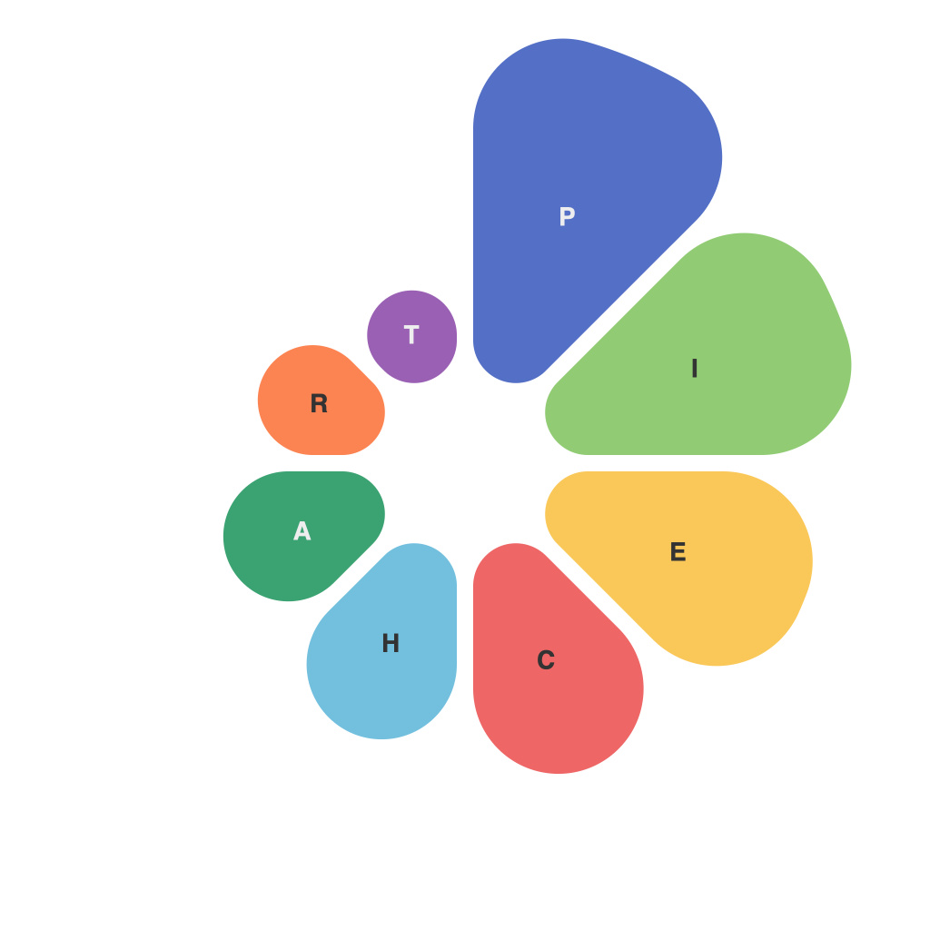
Maximizing Insights: The Art and Science of Crafting Effective Pie Charts for Data Visualization
In an era where information overload is a constant threat, effective data visualization stands out as a true ally. Among the myriad methods available for presenting information, pie charts remain a versatile and widely understood option. These circular diagrams offer a snapshot of relative proportions, making them perfect for highlighting key trends, comparisons, and insights. Crafting effective pie charts is both an art and a science, blending creativity with analytical rigor. Let’s explore the art and science of pie charts to help you turn your data into a powerful narrative.
**The Art of Pie Charts**
The aesthetic quality of a pie chart can enhance or detract from its effectiveness. Here are several artistic considerations:
1. **Color Coordination**: Colors should be chosen thoughtfully to convey meaning and to avoid distraction. Using the same color scheme as your brand or document can add to consistency and professionalism. Yet, ensure colors are not too identical, as that can make the chart difficult to read.
2. **Labeling**: Labels that are clear, concise, and readable contribute significantly to the pie chart’s art. Avoid clutter; too many or incorrectly placed labels can lead to confusion. Using the first letter of a category within the slice can sometimes be an elegant solution.
3. **Design Elements**: Simple pie charts can be powerful, but adding a few design elements like outlines or gradients can enrich the look without overpowering the data points.
4. **Whitespace**: Proper use of whitespace ensures there isn’t too much clutter, which allows the pie chart to breathe and be digested more easily.
**The Science of Pie Charts**
The scientific aspect of pie chart creation revolves around how data is arranged, analyzed, and presented to gain insights:
1. **Limiting Number of Categories**: Too many slices can overload the viewer’s cognitive processing. Aim for a maximum of five or six categories to avoid an audience losing the central message of the chart.
2. **Order of Slices**: Present slices from largest to smallest to focus on the most significant pieces of data initially. This helps the viewer build their understanding of the data in context.
3. **Use of Zero Degrees**: A slice should not take up any degrees on the pie if it represents zero data. Neglecting this can misrepresent even small amounts of data.
4. **Contextual Information**: Embedding text that provides broader context can add meaning. This might include a chart title, a legend, or data labels.
5. **Legible Font**: The choice of font can make or break your pie chart. It should be large and readable, but not so large that it distorts the pie’s proportions.
**Cases for and Against Using Pie Charts**
Despite their age, pie charts offer unique advantages, but they are not a one-size-fits-all solution:
**When to Use Pie Charts:**
– To show how the whole is divided among sub-sections.
– When illustrating the relative proportions of categories within a dataset.
– For highlighting significant deviations from expected proportions.
**When NOT to Use Pie Charts:**
– When the data set has more than five to seven categories, as it becomes too crowded and difficult to discern the information.
– When precise values are critical because pie charts do not typically provide exact numeric data.
In conclusion, pie charts are an invaluable tool when used correctly. By respecting neither the art nor the science of pie chart creation, one can effectively narrate the story that lies within a dataset, helping your audience to make sense of complex information with clarity and ease. The secret lies in a balance: tell the story through your design while ensuring your audience can understand and interpret the data.

