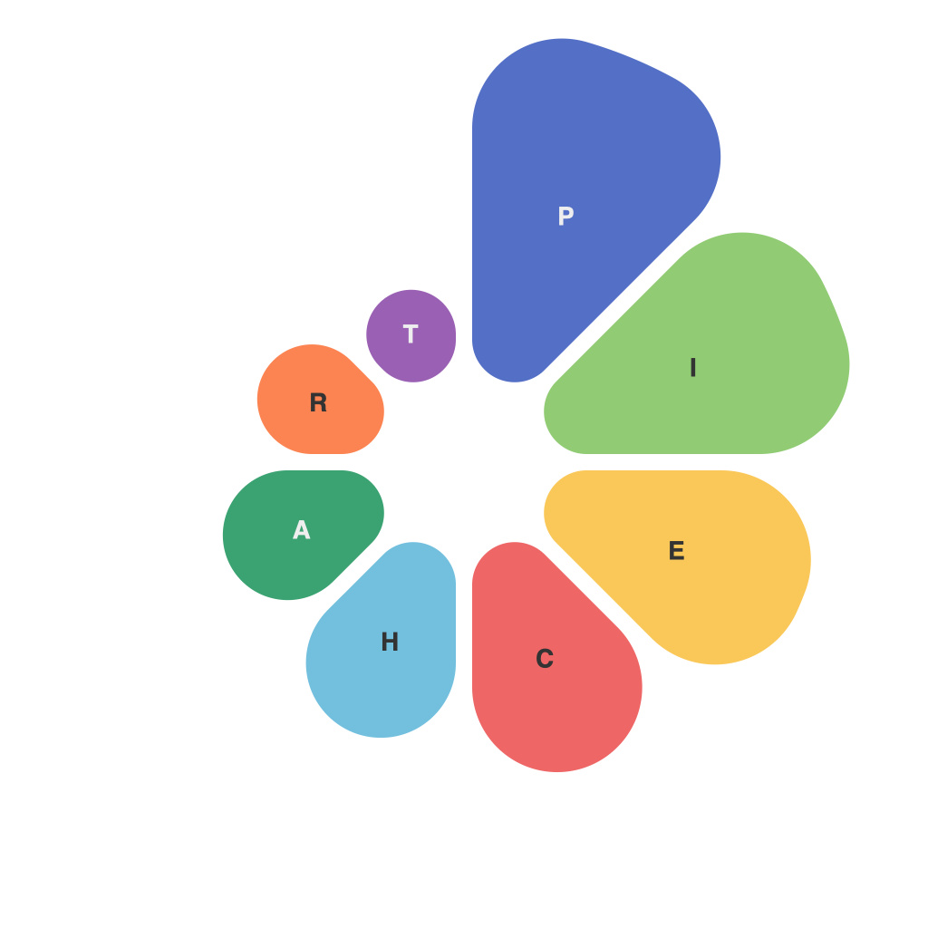
The realm of data storytelling is increasingly becoming a crucial skill in our data-driven world, where the ability to present and communicate complex information through compelling narratives is paramount. Among the many visual tools at our disposal, the pie chart is uniquely placed as a versatile medium capable of illuminating structure and proportion. This article delves into the nuances of pie chart design and representation, offering actionable strategies that will guide you in mastering the art of pie chart storytelling.
**Understanding the Pie Chart’s Purpose**
The first step in the journey towards pie chart mastery is to understand the purpose it serves. Pie charts are most effective when used to show whole-to-part comparisons, where each slice represents a proportion of the whole. However, overreliance on pie charts for complex data or sequential comparisons can lead to misinterpretation.
In the context of data storytelling, the pie chart is not merely a data display; it is a narrative device that visualizes the story you’re trying to tell. Whether you are illustrating market share, survey results, or demographic statistics, the story embedded in the pie chart must be clear, relevant, and engaging.
**Choosing the Right Data to Represent**
Selecting the right data for a pie chart is often a judgment call that must be made with the intended audience in mind. High-level and aggregate data are typically better suited for pie charts, as they are most effective when making clear comparisons between parts of a whole.
Before you start charting, ask yourself:
– Is my data qualitative or quantitative?
– Does the data show proportions or a hierarchy?
– What are the key takeaways I want the audience to derive?
For instance, if you are analyzing the distribution of a fixed number of units across categories, a pie chart is an excellent choice. Conversely, a bar chart may be more appropriate if you would need to depict changes over time or if the numbers involved are too large to fit sensibly on a pie chart.
**Designing for Clarity and Impact**
The design of a pie chart can greatly affect its clarity and the storytelling experience it facilitates. Here are a few best practices to consider:
1. **Use Simple and Consistent Colors**: Use a palette that is easy on the eyes and distinct in color, avoiding overly complex combinations that may create visual noise or confusion.
2. **Label Carefully**: Label each pie slice clearly to ensure that the relationship between the whole and its parts is understood right away. If there are many slices, consider using a legend or annotations.
3. **Limit the Number of Slices**: Too many slices (typically more than 7 or 8) can make a pie chart difficult to interpret. Combining slices with similar statistics or opting for a different chart type might be more effective if you need to convey complex data.
4. **Prioritize the Largest Slices**: Organize the chart from largest to smallest slice to draw attention to the most impactful data initially. This hierarchy can be visually established through size, color, or position.
5. **Consider Layout**: The layout of the pie chart (whether it’s a simple pie, a doughnut chart with a hole in the middle, or an exploded pie, giving more context to a single slice) can affect how the data is perceived and how clear the story becomes.
**Leveraging Design to Enhance Storytelling**
The design aspects of your pie chart do not just serve to enhance its aesthetic appeal but also to amplify the storytelling impact. Here are some techniques to think about:
– **Visual Hierarchy**: Employ the principles of design to create a visual pathway for your audience—guide them through the chart with your design choices to highlight the most significant slices first.
– **Interactive Elements**: If the context allows, utilize interactivity to allow viewers to select different slices, revealing additional information and evolving the narrative accordingly.
– **Contrasts**: Employ contrasts such as lighting on the slice you want to highlight or a contrasting background to draw focus to key bits of your story.
**Overcoming Pie Chart Limitations**
While a well-designed pie chart can be an effective storytelling tool, it’s important to be aware of its limitations. Pie charts can suffer from several cognitive biases that can lead to misinterpretation, such as:
1. **Circular Cue**: Humans are prone to misJudge angles, making pie charts with slices of similar size or angle difficult to compare accurately.
2. **Overuse and Misuse**: Pie charts are sometimes overused for the sake of decoration rather than communication, leading to less effective narratives.
To address these challenges, consider the following:
– **Validate the Data**: Before embedding a pie chart into a presentation or report, walk through it yourself—ensure the story it tells makes sense when considering all the context and nuances of the data.
– **Test the Audience’s Understanding**: Present your pie chart to a small group of non-experts and solicit their thoughts. If they interpret your data differently than you intended, reconsider the design or consider a different visual medium.
In conclusion, pie chart design and representation are both an art and a science. Mastery of these elements can transform the presentation of data from a passive depiction into an active conversation with insights and narratives that resonate with your audience. By thoughtfully considering these recommendations and remaining open to iteration and improvement, you’ll be well on your way to becoming a connoisseur of data storytelling through the pie chart.

