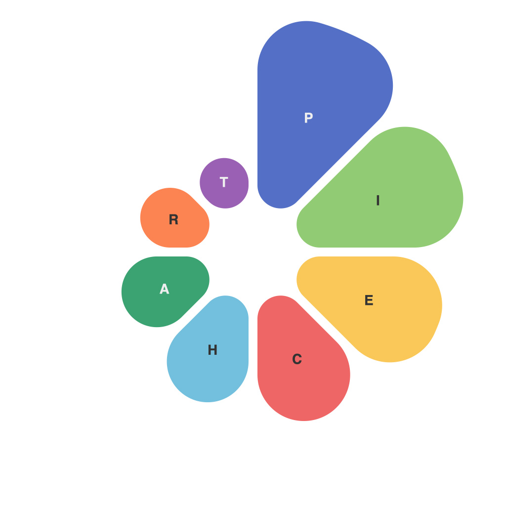
Understanding data is as important as managing it, and pie charts are a fundamental visual tool that bridge the gap between raw figures and actionable insights. At the heart of data representation lies the art and science of pie chart design and analysis – a discipline that requires both an eye for aesthetics and a sharp analytical mind.
Pie charts are a round, circular graph where various slices, each representing a proportion of the whole, depict the relationships between different categories or elements. Their simplicity makes them a go-to choice for presenting percentages, but their effectiveness hinges on how they are designed and interpreted. Let’s dive into the intricate balance between the art and science of pie charts to navigate data with precision.
**The Art of Pie Chart Design**
The aesthetic aspect of pie charts lies in the way the information is visually composed, ensuring that the final output is both pleasing to the eye and accurate. Key aspects of design include:
1. **Color Selection**: Using contrasting colors can make it easier for viewers to differentiate between pie slices. However, too many colors can clutter the chart and dilute the information conveyed.
2. **Labeling**: Clear and concise labels for each slice can help the audience immediately grasp the data being presented. Overly long labels may cause the pie to become cluttered, so balancing labeling with chart size is crucial.
3. **Legend**: In cases where multiple data series are represented in the pie chart, a well-placed legend can be essential. It should be intuitive for readers to follow, often placed to the right of the chart in vertical orientation.
**The Science of Pie Chart Analysis**
Beyond the aesthetic considerations, the true value of a pie chart lies in the insights extracted from its data. Here are some scientific considerations that ensure precise analysis:
1. **Relative Proportions**: Pie charts are ideal for showing relative proportions. However, they are not the best choice for absolute values as it can be difficult to estimate actual figure sizes from the angles of the slices.
2. **Order of Slices**: The placement of the slices is important because the order can influence perception. If there is a significant order in the data that is important for the analysis, that should be reflected in the chart design.
3. **Data Limitations**: Pie charts are only as good as the data they represent. Be wary of charts that may subtly bias interpretation. Double-checking the data and understanding the purpose of the chart will help in its accurate interpretation.
**Best Practices for Pie Charts**
To ensure that pie charts are a powerful tool in your data navigation toolkit, here are some best practices to follow:
– **Limit the Number of Slices**: A pie chart is best used when displaying no more than six categories. With too many slices, the chart may lose its clarity and become more difficult to interpret.
– **Avoid Donut Charts**: While donut charts have become popular as they show the insides of pie slices, they often compromise the ability to accurately convey the size of each category.
– **Use Interactivity for Larger Data Sets**: For complex datasets, interactive pie charts can be more informative. Users can click to expand or contract pie slices to see more detailed data.
Pie charts, at first glance, seem like simple tools—merely a round representation of data. However, once one navigates the art and science of pie chart design and analysis, it becomes apparent that they’re far more intricate. Navigating data with precision involves not just understanding the visual representation of numbers but also the context and limitations that are uniquely associated with this style of chart. By honing these skills, you can unlock the insights that hidden within your data, making both the art and science of pie chart design a fundamental part of your analytical toolkit.

