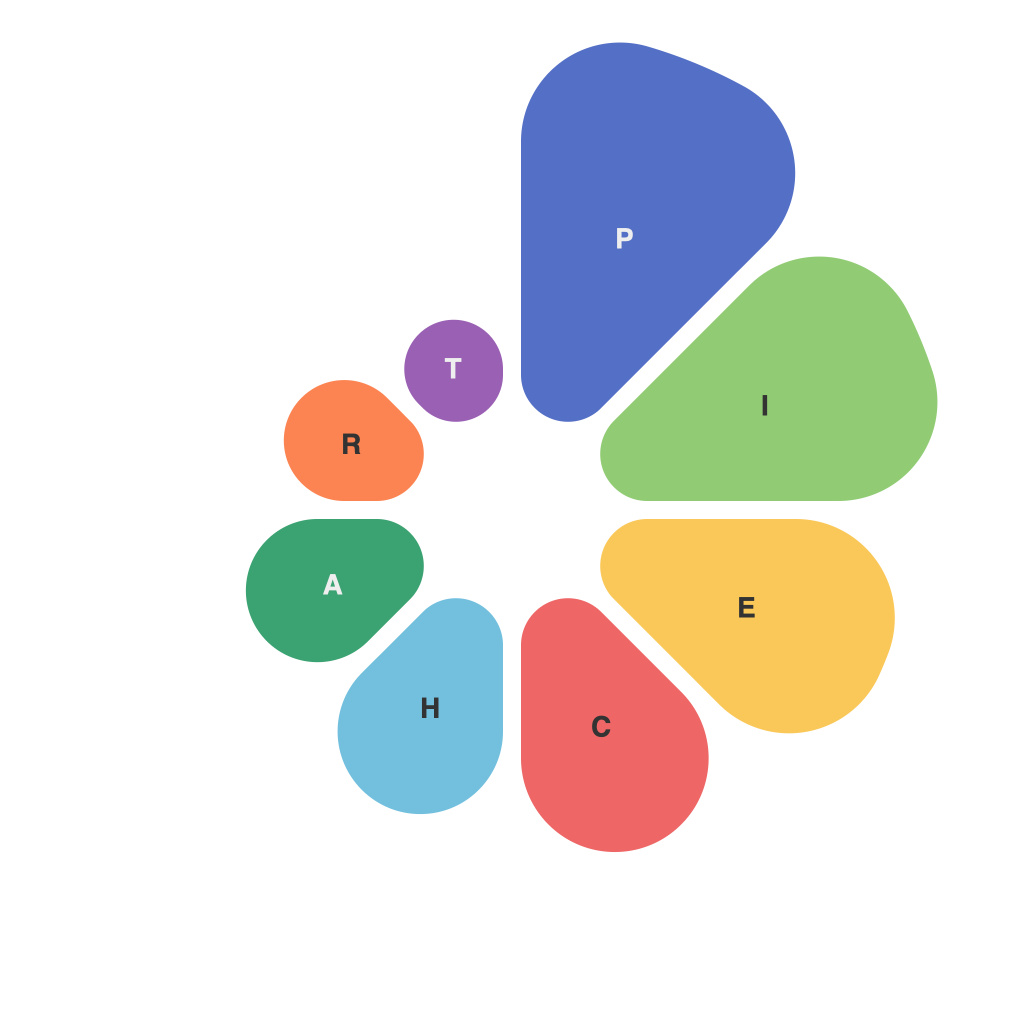
In today’s data-driven world, the ability to master the art of visualizing data is a powerful tool required to communicate complex ideas and patterns in a digestible and captivating manner. Among various graphical representations, pie charts have emerged as a popular choice for conveying a percentage distribution of items in a dataset. To truly harness the power of pie charts in data visualization, one must understand their nuances, use them effectively, and be aware of their limitations. This article aims to delve into the intricacies of pie charts, offering insights into their creation and highlighting their visual strengths and weaknesses.
**Understanding Pie Charts**
At their core, pie charts represent data through whole segments of a circle. Each segment is proportional to the value it represents, and the sum of all these segments equals 100%. As a circular graph, pie charts are intuitive, since they echo the concept of a ‘whole’ and its ‘parts,’ making it a simple way to understand proportion and relationship.
**When to Use Pie Charts**
Pie charts are best suited for comparing parts of a whole and showing the makeup of a single category when the number of categories is relatively small. They fare particularly well in scenarios where:
1. The total is made up of three or more categories.
2. The reader is familiar with percentage relationships.
3. There is little variation in size among the categories.
4. You want to highlight a single category or compare two categories directly.
**Crafting an Effective Pie Chart**
Creating a pie chart involves more than just throwing a dataset into a software program. Effective pie charts follow certain rules and principles:
1. **Limit the Number of Items**: With more than seven categories, a pie chart can become confusing to read. Each item should be easily distinguishable.
2. **Start from 12 O’Clock**: Position the largest slice at 12 o’clock, ensuring a clear visual reference for relative sizes.
3. **Text over Image**: Label the slices directly with percentages or values to facilitate reading at a glance; relying solely on hover-over text is counterproductive.
4. **Avoid Data labels**: Using labels to denote the exact percentage over each segment can clutter the pie and make it unnecessarily difficult to follow.
5. **Equal Slice Widths**: Ensure the arc lengths of the slices are the same, as this helps in understanding proportional comparisons.
6. **Consistent Layout**: Choose either a horizontal or vertical layout and stick to it for all your pie charts for consistency.
**Pie Chart Alternatives**
Despite being useful, pie charts aren’t without their drawbacks:
1. **Difficult to Compare**: Human perception is generally poor at comparing angles in two different pie charts unless they are very similar in size.
2. **Misleading**: If the slices are arranged strategically, it’s easy to mislead viewers about the proportion of each category.
3. **Complexity with Labels**: Adding labels to several slices can significantly dilute the chart’s simplicity and readability.
4. **Confusion with 3D**: The use of 3D effects makes slices pop out which can fool the viewer into perceiving size differences.
For situations where pie charts fail to provide clarity or are not appropriate due to the reasons mentioned above, many prefer alternatives like bar charts, line graphs, or column charts that can more effectively communicate the data.
In conclusion, pie charts are a valuable tool in the visual data arsenal, capable of conveying the layout and relationships of data succinctly. However, to truly master the art of visualizing data with pie charts, one must be careful in design choices and understand the visual pitfalls that can accompany these graphics. By following the insights provided here, anyone can improve their data visualization prowess and communicate their insights more effectively through the art of pie charts.

