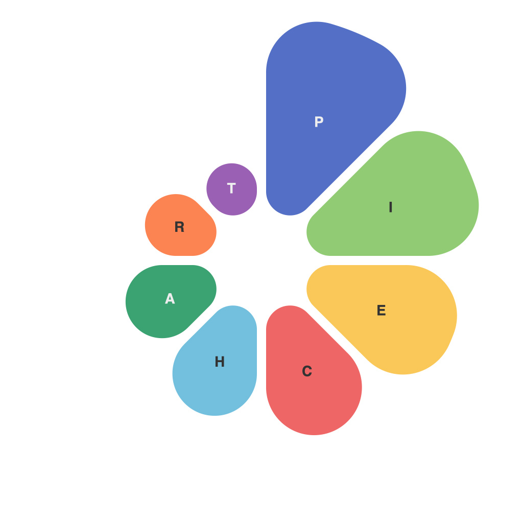
In the realm of visual communication, pie charts serve as a cornerstone for representing complex data within a digestible format. These circular displays are not just a graphical choice but an art form, combining the practicality of conveying information with the aesthetic of simplicity. In an era dominated by data-driven narratives, the optimization of data presentation through pie charts becomes a critical skill for anyone aiming to communicate effectively.
Introduction to Pie Charts
The humble pie chart has been around for over two centuries, popularized by Benjamin Gough’s ‘Diagram of the Earth’s Surface’ in 1822 and later by Charles Joseph Minard in the 19th century. Since then, pie charts have become a staple in various fields, from financial reports to demographic statistics.
The Art of the Pie
There’s an artistry to crafting a pie chart that can stand the test of presentation—be it in a boardroom or a classroom. The art lies in the understanding that the chart should not only present its content accurately but do so in a visually appealing and understandable manner.
Selection and Arrangement
Choosing when to use a pie chart is akin to selecting the right canvas for a painting. They are most effective in comparison scenarios—where you want to illustrate how parts contribute to the whole. For instance, a pie chart can effectively convey the allocation of funds in a budget or the proportion of different age groups in a population dataset.
Pie chart organization should be straightforward and intuitive. Each section should be distinct, and the slices should be ordered from largest to smallest or by some other logical sequence. The reader should be able to easily discern the size and position of each slice against every other one, which means avoiding too many categories or using an excessive range of colors.
Color and Contrast
Colors play a pivotal role in visual distinction. The right color palette can make the chart pop off the page or screen, making data easier to interpret. However, excessive usage of different colors can lead to confusion and dilute the visual impact. It’s important to ensure that colors have high contrast against the background and that adjacent colors are not too similar in hue to avoid overlap when printed or displayed.
Labeling and Titles
Labels should be direct and clearly legible. Placing them outside the pie and using a pointer tool—or a different color on the edge of the slice—helps direct the viewer’s attention to the category. A well-crafted pie chart does not leave the reader guessing; each slice, label, and percentage work together to tell a story.
The Utility of Pie Charts
The utility of pie charts in visual communication cannot be overstated. Here are a few key benefits they offer:
1. Memory Retention: A well-structured pie chart can aid in the retention of information due to their visual and cognitive impact.
2. Aiding Decision Making: They simplify the process of evaluating options and making data-driven decisions with rapid visual scanning.
3. Clarity in Comparisons: By using angles and proportional slices, pie charts can make complex comparisons straightforward and intuitive.
While the pie chart may sometimes be criticized for its limits—like difficulty in showing more than seven categories or precise measurement—it remains one of the few chart types that can deliver a lot of information in its compact circular form.
Conclusion
The optimization of data presentation with pie charts is an activity where the artist and engineer must meet. It requires an understanding of data, aesthetics, and psychology. By choosing when to use pie charts wisely, arranging data thoughtfully, selecting colors carefully, labeling clearly, and ensuring overall design coherence, the art of pie chart presentation can be harnessed for effective visual communication that is both engaging and informative. As our world becomes increasingly data-driven, the skill and artistry of pie charts will continue to be valuable tools for communicators of all stripes.

