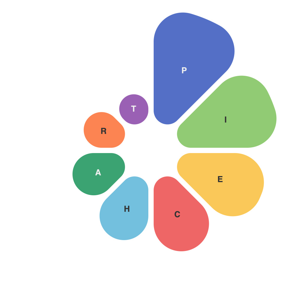
In the realms of information design, where clarity meets aesthetics, pie charts have never ceased to be a staple in the visual repertory. However, crafting a pie chart that transcends mere representation to become a masterwork of data visualization is not an easy feat. PieChartMaster: Mastery Unveiled—the title could itself be a metaphor—focuses on the core strategies for creating irresistible data visualizations that not only convey information clearly but captivate viewers as well. Let’s delve into the intricate process of pie chart perfection.
Begin with a Clear Objective
The foundation of mastering data visualization is setting a clear goal. Before you even start piecing together your pie, understand why you are creating the chart. Is it to inform, to instruct, to persuade, or perhaps to entertain? Aligning your goal with the right type of pie chart is a crucial step.
Choose the Right Pie
Pie charts come in various flavors. A standard pie chart is the traditional circle divided into sections by a compass. However, more dynamic pie types such as donuts, 3D, and sunburst charts also exist. Evaluate your data and purpose to determine which format best serves your needs. If it’s numerical distribution, a regular pie is usually the go-to. If it’s to compare percentages, a donut with empty space can be more effective.
Balance Your Sections
Ensure that the pie chart sections are proportional to the data they represent. No matter how visually appealing a pie chart looks, if the readers can’t discern the differences between sections, the message is lost. One common pitfall is to have too many slices, which can lead to an overloaded visual. Simplify or merge slices if necessary.
Employ Color Wisely
Color choice is powerful in data visualization. It needs to evoke the right emotions, convey the message, and aid in differentiation. Start with a solid color theme that aligns with your brand or the subject matter. Then, select colors that have good contrast with each other to differentiate sections clearly. Too many colors can overwhelm, so keep your palette clean, concise, and consistent.
Utilize Labels and Text Strategically
Too much text can clutter a pie chart. However, labels are essential for clarity. Employ the following techniques:
1. Use data labels sparingly and only when absolutely necessary.
2. Consider making labels clickable buttons that pop up text for when users need more information.
3. Align text labels so they are easily legible without overlapping sections.
Interactivity is Key
Modern tools allow for interactive pie charts that let users explore data by selecting slices or hovering over them. This interactivity can transform a static chart into an engaging tool providing insights at a glance.
Play with Perspectives and Angles
A common practice is to have the pie chart sections in the upper right quadrant. However, a pie is also a circle that can be presented from different angles, such as a horizontal axis for a different visual dynamic. Adding a slight tilt or rotation can sometimes give the chart a more eye-catching appearance.
Maintain Visual Consistency
For a pie chart to be effective, it should blend seamlessly with the rest of your data visualization suite. Use consistent fonts, colors, and thematic elements in all your visualizations for a cohesive end product.
Embrace the PieChartMaster within You
PieChartMaster: Mastery Unveiled is not about the tools you wield but the strategy and understanding behind them. By refining your objective, selecting the right format, managing color, and considering text, interaction, and perspective, you are embarking on the journey of crafting pie charts that truly tell your story and captivate your audience. Remember, every slice of pie is a story waiting to be unraveled, so be the master of the narrative, not just a presenter of numbers.

