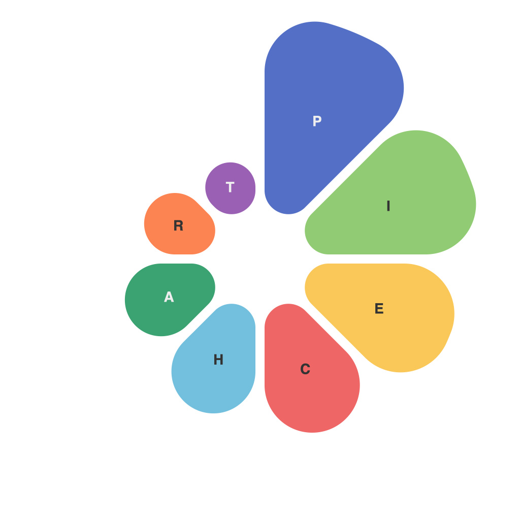
Data visualization is the art and science of transforming raw data into insights. One of its most fundamental tools is the pie chart. At its core, a pie chart is a circular statistical graph dividing data into slices to illustrate numerical proportion. It’s a visual metaphor for the way whole things are composed of parts, with each segment representing a percentage of the whole. But beneath the simplicity of its structure lies a rich tapestry of considerations and techniques that data analysts, designers, and scientists must navigate to craft an effective and informative pie chart.
### The Foundational Circle
A pie chart’s starting point is its circumference, which must be set precisely to represent the entire dataset. This circle is where the structure begins to reveal its nuanced layers. The first and most basic layer is understanding the purpose of the chart: Does it highlight percentages of a whole, compare data across categories, or perhaps demonstrate trends over time?
### Segmenting the data
As the data is added to the pie chart, it’s divided into different slices. Each slice, or segment, represents a part of the whole, and the size of this segment is proportionally matched to its percentage. Ensuring that the values are accurately represented is key in this stage, as any inaccuracies can lead to misinterpretation of the data.
Care must be taken to decide whether slices should follow a logical order. This could be alphabetical, by the size of the categories, or even prioritizing visually significant divisions. The order influences the viewer’s ability to discern which segment is larger, potentially affecting the chart’s readability.
### Color Coding Conundrum
The visual layering continues with the use of colors. Color is a powerful tool in data visualization, helping to convey meaning at a glance. However, color choices must be deliberate to be effective, ensuring no two segments share a color with important nuances for the meaning of the data.
Using color combinations that have high contrast can help distinguish different slices. In cases where pie charts are printed in black and white, the order of slices should be determined by texture or pattern rather than color, because the visual difference can be harder to discern in monochrome visuals.
### The Science of Labels
Designers also must decide how best to label the slices. Placing labels inside the segments is an intuitive approach, but can be clashing if text size and font are not carefully balanced with the segment size. The label’s location can also hinder legibility if the text overlaps the edge of the pie, prompting the choice to place the label on the outside edge or even on the opposite side of the central axis for balance.
One advanced technique is to use data labels that can scale or rotate based on the slice’s size—allowing more detail on larger slices while keeping smaller segments’ information concise.
### Readability in the Details
Pie charts, like all graphs, must cater to the audience who will view and interpret them. This calls for a balancing act between showing enough detail to inform and not overwhelming the viewer with numbers and text. This layer of craftsmanship is crucial for readability.
The text size and font type must be selected with careful consideration of the audience and the context in which the pie chart will appear. In print and screens of various resolutions, legibility can become an issue, so it’s important to maintain a balance that makes the pie chart informative regardless of medium.
### The Art of the Presentation
Lastly, a pie chart’s presentation also involves aesthetic and artistic judgment. How the graph fits into a larger context, such as a report or a slide presentation, is also part of its construction. It should contribute to the overall narrative, not distract from it.
Pie charts do have limitations, such as difficulty in showing multiple variable data points and conveying changes over time clearly. Still, their utility in data visualization cannot be overstated.
### Crafting Perfect Slices
In crafting the art and science of pie charts, there are several key layers to consider:
1. **Foundation:** Define the purpose and understand the data’s full context.
2. **Segmentation:** Divide data accurately and thoughtfully.
3. **Color Coding:** Use contrast to enhance understanding without confusing the viewer.
4. **Labeling:** Choose the right label location and size for clarity across mediums.
5. **Details:** Balance the need for detail against readability and aesthetic.
6. **Presentation:** Make sure the chart complements the environment in which it’s presented.
With these layers in mind, the pie chart becomes more than just a static depiction of data—it evolves into a dynamic tool that can provide clear, accurate, and engaging insights into the complex interrelation of parts in the whole. Crafting the art and science of pie charts is thus a meticulous process, one that is a blend of data analytics, graphic design, and psychological understanding of human perception.

