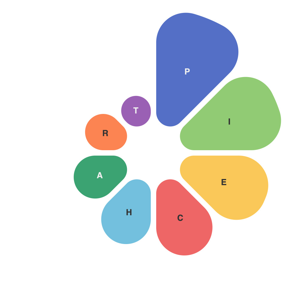
Streamlining Data Visualization: Mastering the Art of Pie Charts
Data visualization is the art of presenting complex information in an easily comprehensible manner. It has always been a vital tool for businesses, academics, and organizations to convey data insights effectively. Pie charts are amongst the most basic yet crucial tools in this area.
Pie charts facilitate the viewer to understand proportions and relationships between different categories in your dataset by displaying them visually in a circular graph divided into sectors, each signifying a proportion of data. They are excellent for comparing the relative sizes of different values at a glance. However, to benefit fully from these charts and maximize their effectiveness in data communication, it is necessary to master the art of pie charts.
Firstly, simplicity and clarity are paramount. The primary principle behind pie charts is to make complex data simple to analyze. Avoid overcrowding your chart with too many slices or detailed information. A pie chart should ideally display a maximum of 5-7 categories. The more categories there are, the more difficult the data will be to comprehend.
When deciding on slice sizes, ensure that the differences between categories are visually distinguishable. Typically, a good rule of thumb is to make your slice sizes larger than 25% of the pie. If slices are too small, it may become challenging for the viewer to grasp the distinctions. On the other hand, if categories are too similar, making it hard to differentiate between them becomes equally problematic.
Color plays an instrumental role in the readability and attractiveness of a pie chart. Each category should have a consistent color or a different one. Colors need to be visually appealing and distinguishable so that a simple look at the pie chart can distinguish the differences between various sectors without much effort. Consider using color palettes in a way that is inclusive, favoring accessibility and sensitivity to color blindness or color vision deficiency.
Legends are the key component of a pie chart that ensures clarity. They provide a quick visual reference that links colors to corresponding data categories. It is necessary to create a legend for any pie chart if it contains more than 3-4 distinct colors. An alternative option, though more space-consuming, is placing the categories around the perimeter of the chart, allowing a viewer to associate each color with its label instantly.
Interactivity is another essential feature of pie charts that can significantly enhance user experience. With digital data visualization, interactive elements like tooltips, hover-over effects, and zoom functionalities can make pie charts dynamic and meaningful. These elements offer users deeper insights into individual data points, giving a clearer perspective on where the data stands.
Labeling is crucial, but it should be done judiciously to maintain readability. It is typically best to label only essential data points, making sure not to overcrowd the chart. Labels provide additional context to the viewer and help interpret the significance of each slice.
Lastly, pie charts, like any tool, are not universal in their utility. They excel in comparative scenarios where the proportional differences between categories are primary. Pie charts are less appropriate for absolute comparisons or data with significant fluctuation over time. Furthermore, when the values in each category are similar or very close, pie charts may become less effective, and other types of graphs might be more suitable.
Mastering pie charts is not solely about creating them but understanding when and how to use them. These charts are a staple in the arsenal of data visualization. With proper execution and strategic application, pie charts can transform complex datasets into easily digestible visuals, enhancing communications and decision-making processes. It’s about knowing when pie charts shine and when other tools might serve better.

