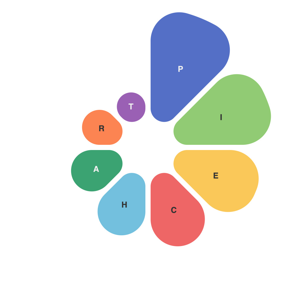
In the intricate dance of data visualization, pie charts have long been a favored partner. They offer a sleek, circular way to illustrate proportions and percentages in a visually appealing manner. Crafting an effective and informative pie chart is more than an artistic endeavor—it requires a scientific approach, merging aesthetics with data representation. This article delves into the art and science of mastering pie charts for data visualization mastery.
### Understanding the Basics of Pie Charts
Pie charts are among the oldest forms of data visualization, used to display data that cannot be easily shown using bar graphs or line plots. Their design is simple: a circle is divided into slices, where each slice represents a part of the whole. The size of the slice corresponds to the proportion it represents in the total value.
### The Art of Aesthetics
Aesthetics is paramount in pie charts. Here’s how to get started:
**1. Simplicity is Key**: Keep your pie charts simple. Avoid complicating them with too many categories, which can make them overwhelming and hard to interpret.
**2. Color Usage**: Use colors sparingly. The aim is to differentiate slices but keep the chart pleasant to the eye. A good rule of thumb is to use a single color with different shades for different slices.
**3. Aesthetically Challenging Slices**: When a segment is small, it can be difficult to differentiate. Group similar slices together to simplify the chart.
**4. Text Size and legibility**: Ensure that all labels and values are legible. Use a legible font size that does not clutter the chart.
### Science of Data Representation
Data representation in pie charts is a delicate balance. Follow these scientific principles to enhance the accuracy and clarity of your chart:
**1. Segmentation Logic**: Sort slices in a logical order, typically from largest to smallest. However, sometimes it makes sense to sort them by category or frequency for better context.
**2. Slicing Technique**: Avoid starting at the top-right corner to keep the chart symmetrical. This technique also enhances the aesthetic appeal and ease of interpretation.
**3. Proportional Representation**: Ensure that slices are proportionate to the corresponding data. This is particularly important when the audience is comparing two or more data sets.
**4. Use of Decimal Representations**: Present percentages with decimals for accuracy. Rounding can distort the viewers’ perception of the data.
### Tips for Effective Pie Charts
**1. Avoid Pie Charts if Possible**: They are not the best graph for comparing multiple pieces of data or representing data sets with many categories. Bar charts, line plots, or other types of visualizations might be more appropriate.
**2. Highlight Key Data**: Use an outlier or a different color to highlight the most critical slice, providing emphasis to key insights.
**3. Consider 3D Pie Charts with Caution**: While visually appealing, 3D pie charts can be misleading due to perspective errors. Stick to 2D for simplicity and clarity.
**4. Be Mindful of Cognitive Biases**: Be cautious about how you present your data. Avoid using dark colors or shapes that could sway the viewer’s perception without supporting the actual data.
### Conclusion
Mastering the art and science of pie charts involves a harmonious fusion of design aesthetics and data accuracy. By understanding the principles behind their creation and adhering to best practices, you can transform pie charts into powerful tools for conveying complex data in a clear, understandable, and aesthetically pleasing manner. As you experiment and refine your techniques, remember that the journey of data visualization is never complete, as there is always room for improvement and innovation.

