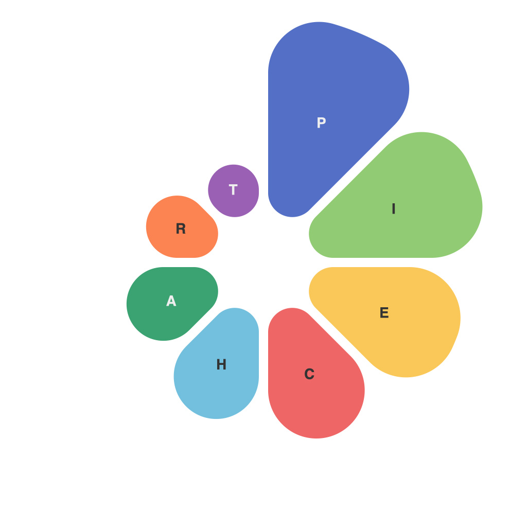
In our digital age, data is not just information; it’s the very canvas on which stories are painted and trends are charted. Among the varied mediums through which we communicate data, pie charts have emerged as a potent tool for visual storytelling. This article explores the art and science behind these ubiquitous graphs, showcasing how they convey the essence of information in a digestible and aesthetically pleasing format.
The Aesthetic of Pie Charts
Pie charts may seem simple—dividing a circle into wedges, each representing a proportionate share of a whole. But beneath their round faces lies a rich aesthetic that mirrors the art of design. From colors to layout, the design of a pie chart can reveal as much about its creation as about the data it presents.
Color, for instance, is the painter’s palette of pie chart design. When thoughtfully used, it draws viewers’ attention to important data points and enhances the narrative of the chart. Contrast and color harmony, when balanced, result in a chart that is not only informative but also a pleasure to the eye.
The Layout and Composition
The composition of a pie chart is crucial for its readability. The placement of segments in a logical order, often starting from the largest piece moving towards the smallest, aids in the viewer’s understanding. Moreover, labels should be placed thoughtfully so as not to clutter the chart, ensuring that the viewer can grasp the data at a glance.
The science behind pie chart design concerns these elements and more. Each decision made about the chart contributes to the overall narrative:
– Segment Ordering: Should the largest segment be on the right to align with our left-to-right reading pattern?
– Segment Spacing: Minimal spacing can make the chart more cluttered and harder to read, whereas too much can distort the proportions.
– 3-D vs. 2-D: While creating a 3-D pie chart might make it look more dynamic, it often also reduces the accuracy of the proportions.
Telling a Story through Data Proportions
Pie charts excel in representing parts of the whole and are excellent for illustrating relative proportions. They often serve as the go-between for data analysis and storytelling. A well-crafted pie chart can make complex datasets more intuitive and reveal insights that might not be apparent from raw numbers alone.
For example, a pie chart depicting market share percentages can transform abstract business data into a clear, visual narrative of market leadership. The viewer can immediately grasp dominant players and compare the strength of competitors without the need for detailed computations.
Limitations and Misconceptions
Despite their value, pie charts are not without their limitations. One common misconception is that pie charts are inherently the best choice for all data presentation needs. In reality, pie charts can be misleading when the number of categories exceeds three or four. Other types of charts, like bar graphs or histograms, can often provide a clearer visual story.
Additionally, the human brain tends to misjudge angles when interpreting pie chart segments. Our tendency to place more importance on larger angles can misrepresent actual proportions, especially in datasets where the segments are close in size.
Mastering the Art and Science
The creation of a compelling pie chart requires a careful blend of artistry and analytical skill. Pie charts, at their best, tell a story not just through their data, but through the careful consideration of their appearance and layout.
In conclusion, whether through the thoughtful use of color, the strategic ordering of segments, or the precise placement of labels, pie charts are a powerful storytelling tool. They encapsulate the essence of data through visual representation, making it easier for the audience to engage with the information and draw conclusions. As the world continues to generate vast amounts of data, the art and science of pie charts will persist as an essential means of communication, bridging the gap between our analytical and visual worlds.

