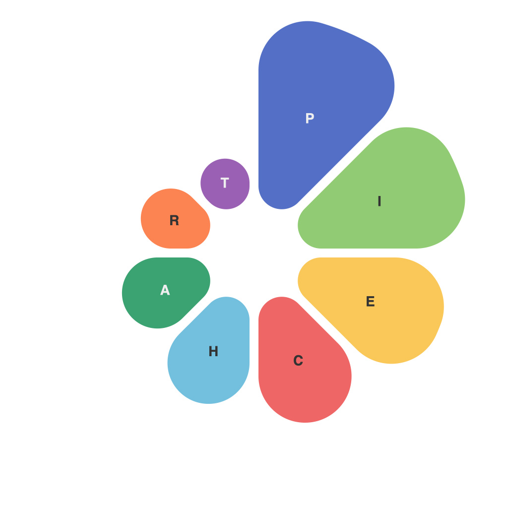
The Ultimate Guide to Mastering Pie Charts: Tips, Tricks, and Best Practices by PieChartMaster
Are you ready to unlock the full potential of pie charts and gain a deep understanding on how to create compelling visual representations? Welcome to our exclusive guide, where we present a comprehensive overview of pie charts, tailored to suit beginners and seasoned experts alike. Drawing on a wealth of experience and the expertise of PieChartMaster, you will uncover the latest tips, tricks, and best practices for crafting informative and beautifully designed pie charts that communicate critical insights with ease. Let’s dive in!
### Introduction to Pie Charts
Pie charts are a staple in the world of data visualization, offering a quick and easy way to compare different categories within a whole. They are particularly useful for showcasing percentages or proportions of a total, making it an ideal choice when dealing with categorical data that adds up to a whole—like market shares, budget allocations, or demographic distributions.
### Key Components of Pie Charts
#### 1. Data Representation
– **Sectors**: Represent categories as sectors of the circle, the size of which corresponds to the proportion of each category relative to the total.
– **Labels**: Include clear, concise labels for each sector, highlighting what each piece represents.
– **Legend**: Use a legend if there are not enough space constraints to add labels directly to sectors.
– **Colors**: Employ a variety of distinct yet harmonious colors to differentiate sectors and make the chart visually appealing and accessible.
#### 2. Pie Chart Design
– **Proportional vs. Size**: Ensure the size of each sector visually corresponds to the data, maintaining the integrity of the underlying information.
– **Slice Visibility**: Avoid creating slices that are too small or too close to the chart’s edge, as these can be hard to read and compare.
– **Aesthetic Consistency**: Use consistent fonts and styles throughout the chart to maintain a professional appearance and improve readability.
### Best Practices for Pie Charts
#### 1. Data Selection
– **Segment Importance**: Generally, pie charts work best when showing no more than five to seven segments to avoid clutter. More categories might be better conveyed using other types of charts like bar charts or stacked bar charts.
– **Avoid Misleading Visuals**: Ensure that segments do not touch each other, thus avoiding any potential misinterpretation of their sizes.
#### 2. Labeling and Tipping
– **Minimalism**: Avoid cluttering the chart with too much text. Aim to label only the most significant categories, especially if space is limited or segments are relatively small.
– **Visibility**: Make sure labels are big enough and readable. They should be placed inside the chart when possible, helping viewers make quick comparisons.
#### 3. Design Elements
– **Color Scheme**: Choose a color scheme that is visually appealing and accessible. Consider the contrast between background and text colors to ensure readability.
– **Transparency and Shadows**: Experiment with adding a little transparency to sectors or subtle shadows to create depth within the pie chart.
### Tips for Pie Charts
#### 1. Use in Appropriate Contexts
– **Percentage Representation**: Pie charts excel when the relationship between parts and the whole is key. Use them when the focus is on proportions.
– **Avoid Overuse**: Consider alternatives like bar charts, especially when comparing multiple pie charts or when precision is needed.
#### 2. Enhance with Contextual Elements
– **Title and Explanatory Notes**: Always include a descriptive title and consider adding a brief explanation or context notes if necessary.
– **Consistent Themes**: Employ consistent themes across similar charts, aiding in understanding and retention.
#### 3. Dynamic Presentation
– **Interactive Pie Charts**: Utilize digital platforms to create interactive pie charts, allowing viewers to explore different slices or change data to see immediate results.
### Conclusion
Mastering pie charts is not just about creating visually appealing graphics; it’s about effectively conveying complex information in a simple, accessible, and accurate manner. By following the tips, tricks, and best practices outlined here, you can elevate your pie charts to a higher level of communicative power, ensuring that your audience not only sees the data but truly understands the story it tells. Remember, the key to a successful pie chart lies in its ability to make data clearer, not more confusing. With practice and a little creativity, you’ll be well on your way to becoming a PieChartMaster yourself.
Happy charting!

