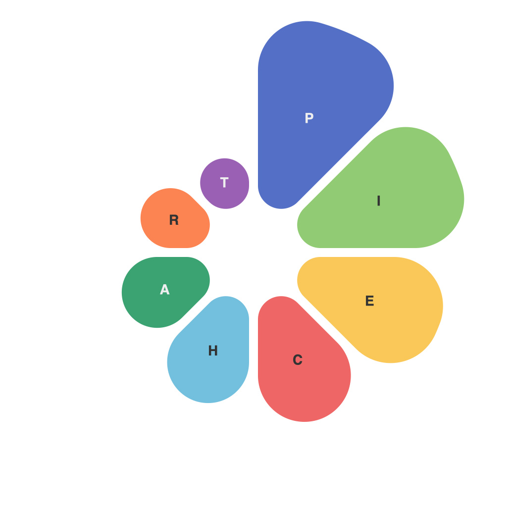
Transforming Data Visualization: The Mastery of Piecharts in Contemporary Graphic Design
In the era of big data, the demand for effective and appealing data visualization tools is rising. A piece of essential graphical representation that has been in the graphic design world for decades remains the pie chart. Despite recent preferences for sleek, minimalistic aesthetics and evolving data trends, pie charts continue to hold relevance, especially when it comes to conveying proportions effectively. The evolution and mastery of pie charts in contemporary graphic design involves understanding their power and limitations, and integrating this knowledge to create impactful visual communication.
The Evolution of Piecharts in Graphic Design
When pie charts originated, they featured complex legends and cluttered labels. However, with advancements in tooling and the need for clarity, graphic designers have evolved how to present pie charts, making them an accessible and integral part of modern graphic design workflow.
Firstly, visual simplicity has been prioritized. Designers now use fewer slices and more straightforward labels, eliminating unnecessary elements and focusing on the essential information. Also, the practice of using colors to distinguish the slices has improved, leading to better visual differentiation and improved readability even from a distance.
Secondly, pie charts are being used innovatively in storytelling. Often combined with other data visualization tools, pie charts are utilized to present significant proportions within larger data sets. This method adds another layer to the narrative, demonstrating the relevance of each aspect of data in the story being told.
Mastering Piecharts: Key Tips for Designers
Proficiency in pie charts means more than just knowing how to create them. It involves strategic placement, data selection, and storytelling.
1. **Data Suitability:** Not all data types are suitable for pie charts. They work best when comparing parts to the whole. For instance, showing departmental budget distribution or demographic breakdowns suits pie charts well. Charts become less effective when dealing with numerous categories with many data points of similar magnitude, as the visual differentiation can become blurred.
2. **Simplicity and Readability:** Designers must ensure that pie charts are easy to understand. This often involves limiting the number of slices (ideally to five or fewer) and using consistent, readable labels. Additionally, applying the principle of contrast in color can help differentiate and highlight specific slices without overwhelming the visual space.
3. **Creative Placement:** Pie charts do not need to be confined to the center of a design. By strategically placing them in alignment with the data they’re representing or near an axis, they can provide a compelling addition to a story or narrative. This placement should enhance the overall layout of the design, without distracting from the main focus or story.
4. **Integration with Other Visuals:** Pie charts are often combined with other visualizations such as line charts, bar plots, or heat maps to provide a more comprehensive representation of data. This allows for a layered and informative graphic design that can help users understand complex relationships and proportions more easily.
5. **Accessibility:** When designing pie charts, it’s crucial to consider accessibility. Using high-contrast colors and ensuring that labels are legible, even when the chart is used in a digital context, is vital. Avoiding too many segments and maintaining adequate spacing between slices also contribute to a more inclusive visual design.
Conclusion: Piecharts in Contemporary Graphic Design
As graphic designers continue to adapt and innovate in the face of today’s data-driven world, the role of pie charts in effective data communication remains strong. Through strategic approaches to their use, designers can leverage the simplicity, clarity, and power of pie charts to create impactful visual stories. By mastering the technique, designers can make data more accessible and engaging, driving insights and decision-making through compelling visualizations.

