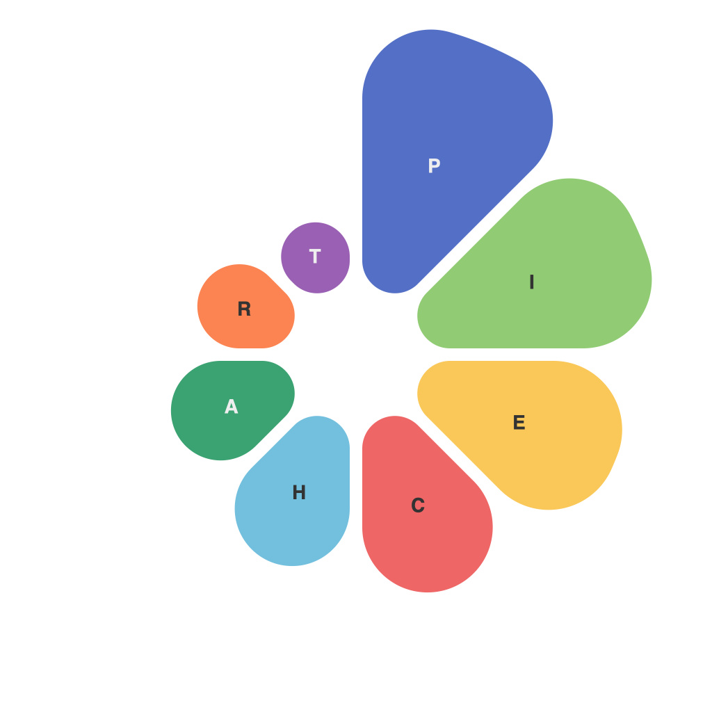
Visual data has become an increasingly integral part of communicating information in various media platforms. From presentations to reports and even in social media, graphical representations of data allow us to quickly grasp complex information at a glance. Among these visual tools, pie charts have stood the test of time, offering both simplicity and insight. This comprehensive guide explores various aspects of pie charts, including their utility and limitations.
**Pie Charts: The Basics**
At their core, pie charts are designed to represent parts of a whole and provide an immediate visual comparison between sections of the data. Each section of the chart, or “slice,” is proportional to the data it represents, with the entire circle totaling 100%.
The primary use of pie charts is to illustrate the composition of something and highlight the proportions of its segments. For instance, they are excellent for showing the breakdown of sales by product category or the distribution of resources across various departments.
**What Pie Charts Can Tell Us**
1. **Proportions**: Pie charts convey the size of each part in relation to the whole, making it easy to compare proportions at a glance.
2. **Comparative Analysis**: Observers can quickly identify the largest and smallest segments, enabling a rapid assessment of what is most or least significant within the given data.
3. **At A Glance**: They present a digestible summary of data without overwhelming the viewer with too much detail.
4. **Ease of Interpretation**: When used appropriately, a well-designed pie chart can make complex information comprehensible.
**pie charts limitations**
While pie charts are a useful tool, they come with several limitations:
1. **Number Limitations**: Pie charts should ideally have only a few slices for ease of reading. More than 5-7 segments can make the chart difficult to interpret because the reader’s brain can’t quickly differentiate between so many colors and sizes.
2. **Misleading Information**: If the slices are not clearly defined or if small slices are too close to larger ones, it can be easy for the viewer to misinterpret the data.
3. **Hard to Compare Averages**: Pie charts are not ideal for comparing averages or means across different segments because the angles and sizes of segments do not translate to numerical comparisons easily.
4. **Limited Data Representation**: The circular form of the pie chart can restrict the representation of some data types. For example, if a particular section represents a negative value, pie charts cannot handle this situation without graphical clutter.
**Best Practices for Using Pie Charts**
To maximize the effectiveness of a pie chart, consider the following best practices:
1. **Keep it Simple**: Use only as many segments as necessary, ideally no more than 6-7, to maintain clarity.
2. **Color Contrast**: Choose colors that have high contrast so that all slices can be clearly distinguished from each other.
3. **Labeling**: Clearly label each slice with its corresponding item and, if space allows, include percentages within or adjacent to each slice.
4. **Consider Alternatives**: If the data is best represented in a different format, don’t hesitate to choose a different chart type.
**Choosing Between Pie Charts and Other Visual Tools**
It is often beneficial to ask whether a pie chart is the best choice before creating it. Are there other chart types like bar graphs, line charts, or even dendrograms that might better convey the information? The key is to match the chart type to the nature of the data and the intended audience.
In conclusion, while pie charts are a powerful tool for representing parts-to-whole relationships, they are not the panacea for every data visualization need. Understanding what pie charts can and cannot tell us will help you select the appropriate tool for your data communication objectives and design charts that effectively inform and educate your audience.

