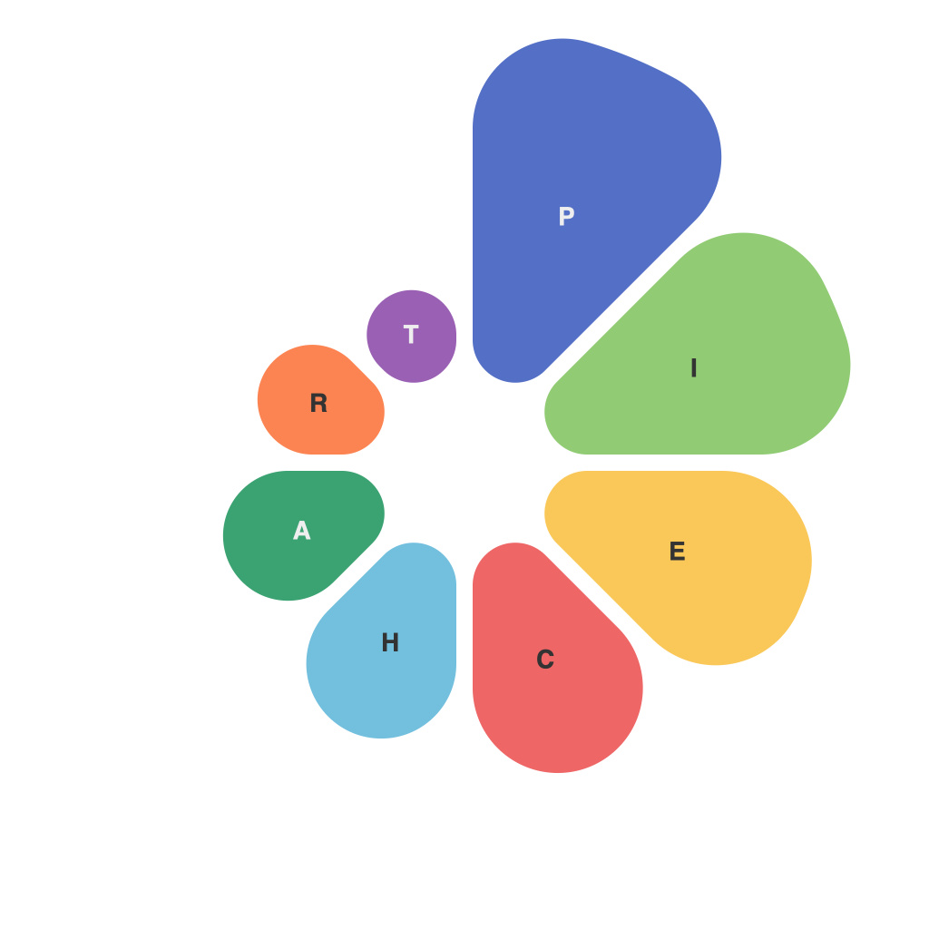
Unleashing the Power of Visual Storytelling: A Comprehensive Guide to Mastering the Pie Chart
In the grand tapestry of data visualization, pie charts often hold a crucial place. They are powerful tools for storytelling, enabling complex data to be transformed into easily digestible, visually appealing formats that stimulate understanding and facilitate decision-making. However, the art of using pie charts effectively doesn’t simply involve slapping a few wedges onto a disc. It’s a craft that requires precision, creativity, and a deep understanding of how humans interpret visual information. This guide aims to navigate through these intricacies, offering insights and strategies to master creating pie charts that genuinely empower insights, not just present data.
### Understanding Why Pie Charts Matter
At their core, pie charts display the relationship between a whole and its parts. This contrasts with bar charts, for example, which excel at showing comparisons among categories. Pie charts are particularly effective when you have a fixed number of categories and each category has a clear relative proportion. They are most beneficial in visualizing whole-part relationships, such as showing the distribution of global internet usage across different devices, or how annual spend is divided into various budget categories.
### Essential Elements for a Compelling Pie Chart
1. **Clarity**: Ensure that each part of the pie clearly represents a distinct category. Use contrasting colors and labels that are neither too busy nor too sparse. Too many sections or labels can confuse the eye, making the chart unwieldy and hard to read.
2. **Simplicity**: Prefer fewer number of segments to make the chart more readable. Aim for a maximum of four to six segments for a pie chart to maintain clarity and ease of interpretation.
3. **Proportions**: The size of each sector should accurately reflect the underlying data. This allows viewers to quickly assimilate the relative importance of the quantities in just a glance.
4. **Context**: Always include a title that succinctly describes what the pie chart represents, and consider annotations for key segments if the data requires a more nuanced understanding.
### Best Practices for Design
– **Use color wisely**: Employ different colors for each section but keep a consistent color scheme if multiple pie charts are compared. Color should not replace text labels, especially for smaller, crowded sections.
– **Gradual color contrast**: To aid visual understanding, arrange color segments by their value size, either in ascending or descending order, starting from the slice with the smallest segment.
– **Add data labels sensibly**: Include labels for sections that carry crucial information, except those that are larger than a certain threshold, which can typically be deduced from their size. For large sections, use data labels but reduce font sizes for smaller ones to avoid clutter.
### Conclusion
Mastering the art of visual storytelling through pie charts is about balancing aesthetics with utility, making critical data immediately comprehensible to viewers. By focusing on clarity, simplicity, attention to proportions, and thoughtful design, you can create pie charts that not only present data beautifully but also communicate insights effectively and efficiently. Remember, the goal of any data visualization is to enhance understanding, spark discussion, and facilitate informed decision-making, and the pie chart, when wielded skillfully, is an indispensable tool in this arsenal.

