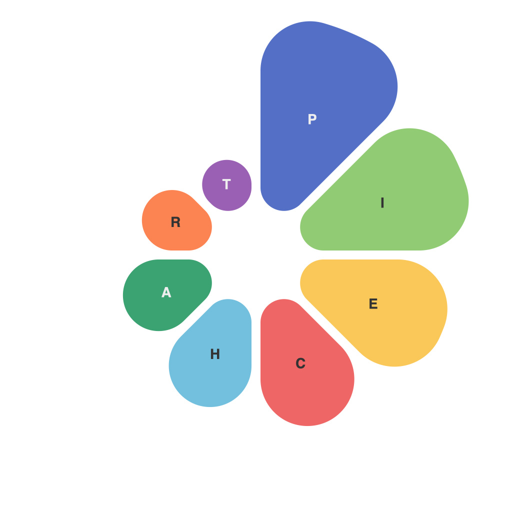
In an age where data rules and decision-making is increasingly dependent on analytics, the art of data visualization has emerged as crucial to conveying insights effectively. One of the most universally recognized types of visual representation, the pie chart, has stood the test of time as a powerful tool to simplify complex data comparisons. As a pioneer in the field of data visualization, becoming adept at piechart mastery is a skill well worth unlocking. Here, we embark on a comprehensive guide to help you ascend to the zenith of piechart wisdom.
**1. Understanding the Basics**
Pie charts, essentially a circular chart, divide a data set into segments to illustrate proportional parts of a whole. Each segment, or slice, is proportional to the amount it represents, giving a clear visual guide to the relative portion of each category. Despite their simplicity, it is important to understand the limitations as well as the advantages of this technique.
**2. Choosing Appropriate Data**
The versatility of pie charts makes them appealing for a variety of data types. They are best employed when illustrating simple comparisons where the whole must be easily discernible and the individual slices are comparable. However, avoid overcomplicating a pie chart with too many categories. Typically, no more than seven categories is recommended to maintain clarity.
**3. Pie Chart Perspectives**
Orientation matters; deciding whether your pie chart is viewable as a 2D or 3D representation can impact perception. A 3D pie chart may be visually appealing, but it can also mislead by creating an impression of depth that isn’t there. In contrast, you can use the 2D perspective to help the viewer differentiate between the slices more accurately.
**4. Color Coding Wisdom**
Pie charts are made readable and effective through the strategic use of colors. When choosing pie chart colors, opt for distinct hues so the slices are easily recognizable. It’s also beneficial to use a palette where neighboring slices have contrasting colors, thereby aiding in differentiation and readability.
**5. Labeling for Clarity**
While labeling slices individually is not always practical, especially in complex charts, when you do label them, place them outside the chart or in the legend to avoid clutter. The label font should be as consistent as possible to help users make comparisons without confusion.
**6. Avoiding Pie Chart Myths**
One of the most critical rules of pie chart construction is to avoid using a pie chart to compare more than two data sets. When used to compare multiple categories, pie charts can become overly complicated and confusing. Instead, opt for other techniques such as bar charts or line graphs that are better suited to such tasks.
**7. Making Pie Charts Dynamic**
To keep your pie charts current and engaging, consider the use of interactive elements. Interactive pie charts can allow users to hover over slices to uncover more detailed information, making complex data more digestible.
**8. Reviewing and Iterating**
When finalizing your pie chart, always ensure it is reviewed by a third party. They can help identify potential misinterpretations or nuances that you may have overlooked. Iterative design isn’t just about aesthetics; it’s about refining the visual message until it is as clear as possible.
In summary, pie charts are an influential tool in the arsenal of the data visualization pioneer. By navigating the intricacies of piechart creation and understanding how to maximize their impact, you’ll be able to unlock their secrets and make data-driven decisions more comprehensible and influential. Remember, good pie chart designers know the power of simplicity, clarity, and the strategic use of color and space. Embrace these principles, and you’re well on your way to becoming a master at piechart mastery.

