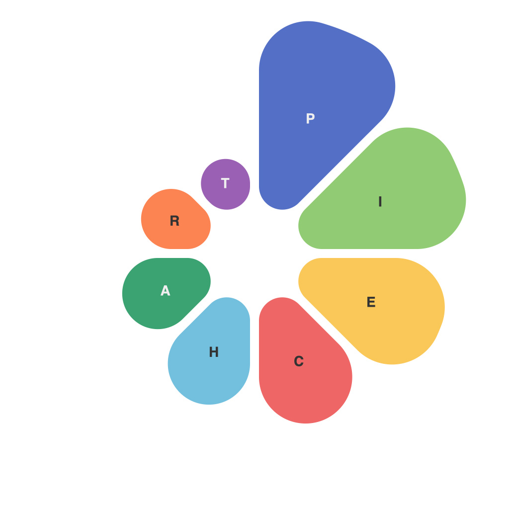
In the age of information overload, the ability to present data with clarity and precision is a superpower. Pie charts, often undervalued and misused, play a pivotal role in delivering this power. They provide a clear, visually engaging snapshot of complex datasets. Whether you are presenting to peers, clients, or a boardroom packed with stakeholders, mastering the use of pie charts can elevate your visual communication game. Let’s delve into the world of pie charts and discover their data beauty.
Pie charts are popular for their simplicity, converting a large dataset into a circular graph divided into sectors. Each sector represents a portion of the whole, with the size of the slice corresponding to the value it represents. This innate attribute makes pie charts a favorite among presenters and viewers who prefer a quick, comprehensible snapshot over raw numbers.
Choosing the Right Data
In the realm of pie charts, not all data are created equal. Selecting data that best suits this visual form is key. Pie charts excel at showing percentages of a whole and can be especially effective when comparing whole-to-whole scenarios. They are a poor choice for representing time series data or small values with a large number of categories, as they can become cluttered and difficult to decipher.
When selecting data, ensure that the categories you choose for your pie chart have a clear mutual dependence — each should be a part of a shared whole. Be mindful of the number of slices, as more than five or six can result in a chart that is hard to read, as is widely considered to be a general guideline to prevent clutter.
Sizing Up the Slices
The most visually impactful aspect of a pie chart is the relative sizes of its slices, which is why it’s crucial to order the sectors from largest to smallest. This practice enhances the chart’s readability by allowing viewers to understand the relationships between the categories with a single glance.
However, the largest segment in a pie chart can become too large or too dense, overshadowing other important segments. In such cases, consider using the “explode” technique, which separates the largest pie slice slightly to draw more attention to it. Alternatively, you might consider using a donut chart, which is essentially two overlapping circles that give you the illusion of having a slice removed from the main circle but maintains the same information density.
Color Me Persuasive
Color is a potent component of visual storytelling, and pie charts are no exception. Carefully selected hues can highlight your key data and help to guide your audience’s gaze. When picking colors, stay consistent within the same chart series and ensure the contrasts stand out against the chart’s background. However, avoid overuse of color because it can overwhelm the chart and dilute its effectiveness.
Use contrasting colors for the outline of the slices to ensure each can be perceived individually. For a more sophisticated look, you can use gradients or patterns within the segments, but be cautious as overly complex designs can backfire.
The Context of the Storytelling
Data visualization is inherently linked to storytelling. To truly master pie charts, you must recognize their role in shaping the narrative of your data presentation. Ask yourself, ‘What story do these pieces of the pie tell about our data?’ Are you trying to convey distribution, comparison, or progression? Align the colors, patterns, and order of slices with the key message you wish to communicate.
Engage Your Audience through Interaction
One of the advantages of contemporary data visualization tools is interactivity. You can animate pie charts so that they rotate or expand and contract in real-time to reveal data points through storytelling. This dynamic approach can captivate your audience in real-time and provide a more engaging, immersive experience than static pie charts.
Keep it Real and Readable
Despite their attractiveness, pie charts can easily fall victim to design pitfalls. Make sure your pie chart is legible at a glance. Too much clutter or too many labels make it hard for viewers to quickly understand what’s being presented.
Also, incorporate labels that clearly state the percentage or value represented by a slice, or provide a key or legend to avoid confusion. Avoid using 3D charts or shadows that can misrepresent the angles, giving slices a misleading size appearance.
Unveiling Data Through Visual Craftsmanship
Pie charts, with their distinctive aesthetic appeal, are a powerful tool in your visual communication arsenal. By focusing on the selection of the right data, careful placement and sizing of slices, thoughtfully chosen colors, and an engaging narrative structure, you can transform data into a compelling visual story.
Remember, the beauty of the pie chart lies in the story it communicates, not the raw data itself. Whether you’re presenting insights to a room of investors, stakeholders, or colleagues, mastering pie charts for impactful visual communication will undoubtedly help you stand out in converting data into decisions.

