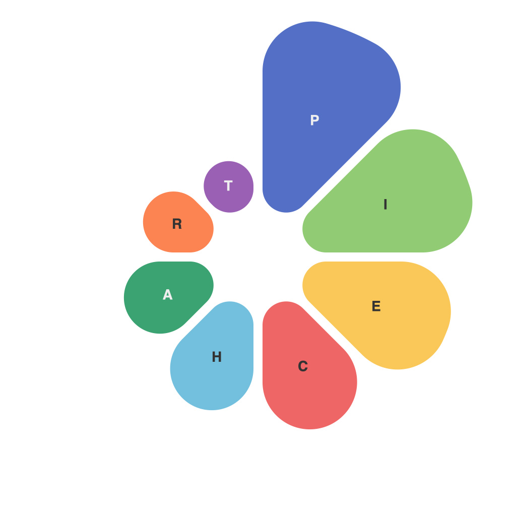
**Unlocking Data Insights: Mastering the World of Pie Charts – A Comprehensive Guide to Data Visualization**
Pie charts, as a fundamental tool within the vast array of data visualization techniques, have undeniably become an essential asset for understanding complex data patterns in simpler, more digestible forms. Yet, like any other visualization tool, they are not just a static representation of data but an artifact of strategic insights, design choices, and interpretations. This comprehensive guide aims to demystify the intricacies surrounding pie charts, assisting you in mastering their nuances, effective uses, limitations, and design principles.
### Understanding the Basics
At the core of any pie chart is its primary function: to visually articulate the proportion of different categories within a dataset. Each slice, or sector, of the pie chart represents a category, with the size of the slice proportionally indicating the category’s share of the whole. This simple yet potent form of representation makes it an attractive choice for comparing parts of a whole without delving into numbers directly.
### Key Components and Considerations
**1. Design Elements**: The aesthetic choices, such as color schemes, legends, and labels, are crucial as they influence both the interpretability and the visual appeal of the chart. Colors should be chosen carefully to highlight differences in proportions and avoid misleading representations, while legends and labels should be concise and clear, enhancing rather than complicating the chart’s readability.
**2. Data Suitability**: Pie charts shine when datasets have a limited number of relatively equal-sized categories. They are highly effective for illustrating simple comparisons, such as the distribution of market shares, audience preferences, or budget allocations. However, their utility wanes in larger datasets with numerous categories or smaller proportions, leading to a potential misinterpretation of values.
### Enhancing Impact with Effective Use
**1. **Limit Category Numbers**: To maintain clarity and prevent visual clutter, pie charts are best suited for datasets with a limited number of categories (ideally no more than 5-7) with balanced sizes.
**2. **Use of 3D and Exploded Slices**: While decorative, these features often distort the perception of size and proportion, thus should be used sparingly and only when they add significant visual impact to the message.
### Common Pitfalls and Best Practices
**Avoid Overloading**: Ensure each pie chart conveys one key message without overwhelming the viewer with excessive data or unnecessary design elements.
**Prioritize Clarity**: Focus on labels that clearly and accurately describe each slice, enhancing readability, and maintaining consistency across slices.
**Interactive Options**: Consider incorporating interactive elements in digital formats where possible, which can allow users to hover for more detailed information, enhancing the chart’s ability to function as a self-explanatory tool.
### Conclusion
Pie charts, in the realm of data visualization, serve both as a tool of simplicity and a medium for complex communication. By understanding their foundational mechanics, appreciating their nuanced limitations, and crafting them with careful consideration, they can become not just a graphic element but a powerful means to unlock valuable insights, effectively communicating the narrative behind the numbers.
Whether you find yourself navigating the intricacies of a financial report, crafting an audience survey insight, or analyzing a breakdown of sales, the art and science of creating impactful pie charts stand as a testament to visual storytelling’s power in demystifying the hidden within the data’s vast expanse.

