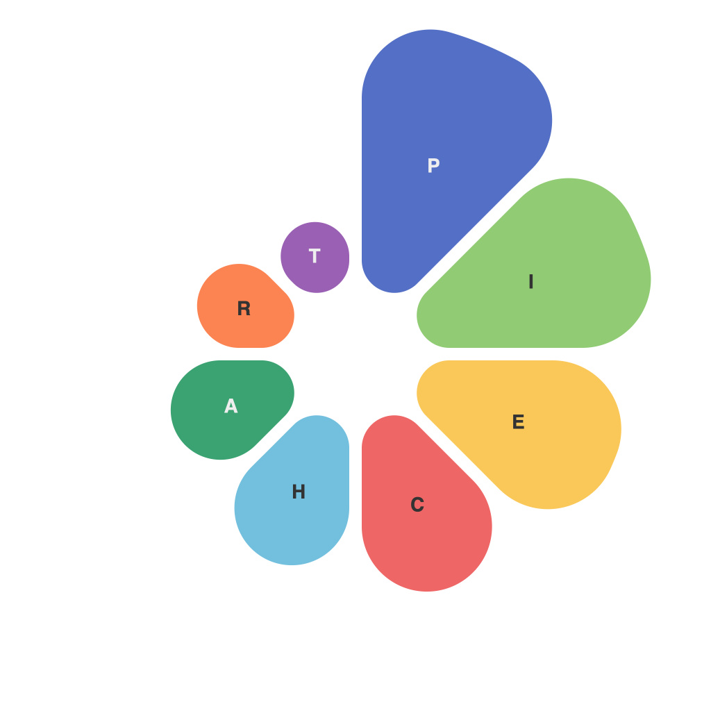
Unlocking Excellence in Data Visualization: Mastering the Art of Pie Charts
In the vast, complex landscape of data visualization, pie charts serve as a versatile yet often underappreciated tool. These circular charts, segmented into distinct sectors, visually demarcate proportions in a dataset, making it easy to comprehend comparative values at a glance. However, like any creative medium, excellence in pie charts transcends mere data representation. It requires a delicate balance of aesthetics, clarity, and storytelling prowess.
### Understanding Pie Charts
Pie charts are graphical representations that illustrate the relative sizes of items in a dataset. Each sector’s size corresponds directly to its proportion of the total, making it an effective way to visualize part-whole relationships. For example, a pie chart could be used to show the distribution of sales across different product categories, or the allocation of a budget across various departments.
### The Art of Designing Effective Pie Charts
#### 1. **Simplicity vs Complexity**
– **Simplicity** often reigns supreme in pie charts. Typically, they are most impactful when they display no more than five to seven segments. More slices can lead to visual clutter and make it difficult for the viewer to accurately gauge the size of each sector.
– **Exception Handling**: In cases where datasets need to be segmented into more than seven categories, consider using a stacked pie chart, radar chart, or a donut chart to maintain clarity and avoid distortion.
#### 2. **Color Usage**
– **Color Harmony**: Use a color palette that enhances readability and aesthetic appeal. Ensure that colors are distinct enough to avoid confusion between different segments.
– **Accessibility**: It’s crucial to include a color legend for accessibility, especially when considering users with visual impairments. Color blindness detection tools and guidelines can inform color selection.
– **Emphasis and Contrast**: Assign colors based on their importance. Typically, the most significant category might be represented in a primary color or by using a different style (like an offset from the rest of the pie).
#### 3. **Labeling**
– **Precision and Simplicity**: Clearly label each sector with its title and, ideally, percentage or value to provide concrete information. Overlabeling with too much detail can overwhelm viewers, while underlabeling can diminish comprehension.
– **Orientation and Consistency**: Always place labels outside the pie chart, typically below or next to the respective segment, to maintain balance and ensure that the text does not obstruct the chart’s overall integrity.
#### 4. **Focus on Comparisons**
– **Comparison Over Details**: Pie charts excel in illustrating proportions. Focus on how one item compares to the whole, or how one item contrasts with others, rather than on the precise numerical values within a sector.
– **Limit to Comparative Analysis**: Pie charts stand out when used for comparative analysis, not for sequential or detailed data comparisons where other chart types might be more appropriate.
### Utilizing Tools and Resources
As data visualization continues to evolve, specialized software tools like Microsoft Excel, Google Charts, or dedicated data visualization platforms offer customized options for designing effective pie charts. Their features, from interactive elements to advanced design templates, can enhance the final output, making the data more accessible and engaging for audiences.
### Conclusion
Mastering the art of pie charts involves a blend of technical precision and artistic flair. By adhering to design principles, making strategic color choices, and ensuring clarity, you can create pie charts that not only accurately represent data but also captivate and retain the attention of your audience. Remember, the essence of data visualization lies in making complex information accessible and understandable, something that pie charts, when used wisely, excel at delivering.

