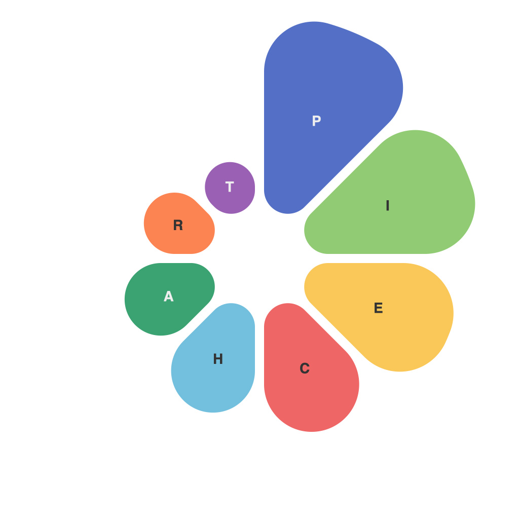
The visual representation of data has become a critical component in our increasingly data-driven culture. Among a variety of visualization tools, pie charts stand out for their simplicity and ease of implementation. However, crafting pie charts that are not only visually appealing but also effective in communicating data-driven insights is both an art and a science.
Understanding the Pie Chart Audience
The first principle in designing pie charts is understanding the audience. Who are you aiming to communicate with? What level of background knowledge do they possess about data visualization? Are you conveying information to colleagues in a sales department, or are you presenting it to a policy-making body? The answer to these questions will significantly influence the style and level of detail in your pie chart design.
Pie Chart Layout and Composition
A well-designed pie chart starts with a clear layout. The central idea is to ensure that the chart is as readable as possible. Begin by selecting the right software or tool; some options include Excel, Tableau, Power BI, and specialized design software such as Adobe Illustrator.
Start by choosing an appropriate pie chart type, either a standard sector pie chart or a donut chart (a ringed version of the pie chart) for comparison. The decision hinges on whether you need to emphasize the center group or not. For instance, if the center data is critical, a donut chart may be more effective.
In terms of composition, the first sector of the pie chart should usually be pieced together within the rightmost 45 degrees of the circle, thereby reducing the likelihood that pie slices would be truncated when viewed in print or digital formats. Be mindful that too many slices lead to a cramped chart, while too few might give the impression that the data is unimportant.
Colours and Slices: Communicating Data through Aesthetics
Colour choice is pivotal for good pie chart design. The right palette can make a chart more engaging and the data more digestible. It’s advisable to select a palette that contrasts well with the background and other visuals while avoiding overly vibrant or distracting shades.
Color-blind accessibility is also critical. When assigning colors to slices, ensure that these colors can also be distinguished by color-blind individuals to avoid excluding them from understanding the data.
The angle at which you place labels within each pie slice can enhance the chart’s clarity. For instance, labels that run perpendicular to the pie often work best. However, ensure that long labels don’t obscure adjacent slices, leading to confusion.
Communication through Slice Sizing and Ordering
Another key aspect of effective pie chart design is the sizing and ordering of slices. To improve readability, it’s common to order slices from largest to smallest, with the largest pie slice being placed at about 12 o’clock for visual emphasis. This approach is known as ‘clocking’, but it’s not a hard-and-fast rule—what matters most is clarity and a logical progression.
Be aware of what statisticians call “salience,” which refers to the tendency for the eye to be drawn to larger slices. Slices need to be large enough to be distinct, yet not so large that the viewer assumes the data is more significant than it really is.
Data Aggregation Issues
Care must be given to how data is grouped and presented. Aggregating data for various slices can help make smaller percentages more visible. But be cautious of loss of nuance; too much aggregation might lead to a lack of detail that could compromise the accuracy of the information conveyed.
Interactivity for Enhanced Understanding
Finally, in a world where interactivity is often sought after, designing a pie chart with interactive features can take clarity to the next level. Allowing viewers to hover over slices to see detailed values can be beneficial, especially for complex datasets.
Keep in mind that while the interactive element adds depth to the pie chart, it should be used judiciously and should not detract from the overall readability of the chart.
Conclusion: Crafting Insightful Designs
The art and science of designing pie charts for effective data communication is a meticulous task. It requires an understanding of audience needs, a knowledge of how to layout the chart, skillful use of colors, and a careful consideration of slices and their order to deliver meaningful insights. With these principles in place, pie charts can become powerful tools, translating complex data into a digestible format that audiences can understand and act upon.

