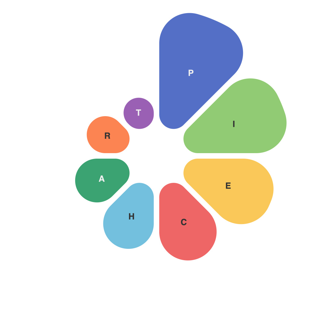
Are you tired of presenting data using the same old bar graphs and line charts? Ready to elevate your communication game and make your data pop? Look no further—welcome to the ultimate guide toPieChartMaster, where we will unlock the secrets of creating stunning, clear, and compelling pie charts that convey your message with a single glance.
Understanding Pie Charts
Pie charts have been a staple in data visualization for more than a century, first appearing in an 1857 publication by Kirchner & Preller. They are round charts divided into segments, which represent proportions of a whole. At their best, pie charts can make your data tell a story; at their worst, they can confuse your audience and dilute your message.
This guide provides a comprehensive approach to mastering the art of pie chart creation. We will cover the fundamentals of pie chart structure, best practices for designing effective pie charts, common pitfalls to avoid, and innovative techniques to push the limits of this classic visualization tool.
**Pie Chart Structure**
The core of pie chart design lies in its structure. Pie charts include the following components:
– **The Center Point**: The central point of the pie chart serves as its axis, where the segments are all emanating from.
– **The Radius**: This is the distance from the center point to the outer edge of the pie chart. The radius should be consistent across all slices to ensure accurate comparisons.
– **The Segments**: Each segment represents a category or subset within the overall data, with the size of the segment corresponding to the proportion of that category within the whole.
**Best Practices for Designing Pie Charts**
Now that you understand the core components of pie charts, here are several best practices for creating compelling visualizations:
1. **Limit Categories**: Avoid overloading your pie charts with too many segments. More than seven or eight distinct sections can lead to confusion, as our brains tend to have a hard time distinguishing between multiple objects within a space.
2. **Use Color to Communicate**: Choose a color palette that enhances the chart. Ensure color differences are distinct, and use color for a deliberate purpose, such as grouping related items together.
3. **Label Slices Clearly**: Include clear and concise labels within or overlapping slices, so that viewers can quickly identify each segment.
4. **Keep Labels for All Segments**: For audience clarity, even if segments are exceedingly small, include a label on the segment or its endpoint to indicate its category.
5. **Consider Pie Direction**: Positioning the whole pie can change perception. For example, a slice starting at the top appears to be larger if it is depicted with the clockwise direction.
6. **Avoid Annoying Features**: Don’t use 3D effects, shadows, or bevels. These features can distort the perspective and make the chart less clear.
7. **Use Secondary Slices for Data Points**: For small segments, it may be difficult to see the exact percentage or number. In these cases, a small secondary slice at the tip of the pie can be used to label the precise value.
**Common Pitfalls to Avoid**
Despite the simplicity of pie charts, common pitfalls can turn an informative visualization into an eyesore:
– **Too Many Categories**: As previously mentioned, overcrowded pie charts can be difficult to interpret, leading to a loss in efficacy.
– **Sequential Errors**: The human brain often makes the assumption that the segments are ordered, meaning a slice might be perceived as a larger proportion simply because it is toward the end.
– **Overcomplicating Design**: Sometimes, less is more. Avoid cluttering your pies with too much design elements.
**Techniques for Innovation**
With a solid foundation in the fundamentals and an understanding of best practices and common errors, you may feel inclined to challenge the status quo by experimenting and implementing these innovative techniques:
– **Pie-wedge Angles**: Adjust the angles of pie wedges to communicate relative sizes explicitly, with large angles for more significant categories and smaller angles for less vital ones.
– **Exploded Pie Charts**: An ‘exploded’ pie chart removes one or more segments from the center, bringing them to the outer edge, helping to highlight specific categories separately.
Becoming a PieChartMaster is not just about creating charts but about understanding how to communicate effectively through data visualization. With this guide as your roadmap, you can now embark on your journey to unlock pie chart mastery. Remember that practice makes perfect, and the key is to combine your technical skills with creativity and empathy for how your audience perceives the data. Happy charting!

